

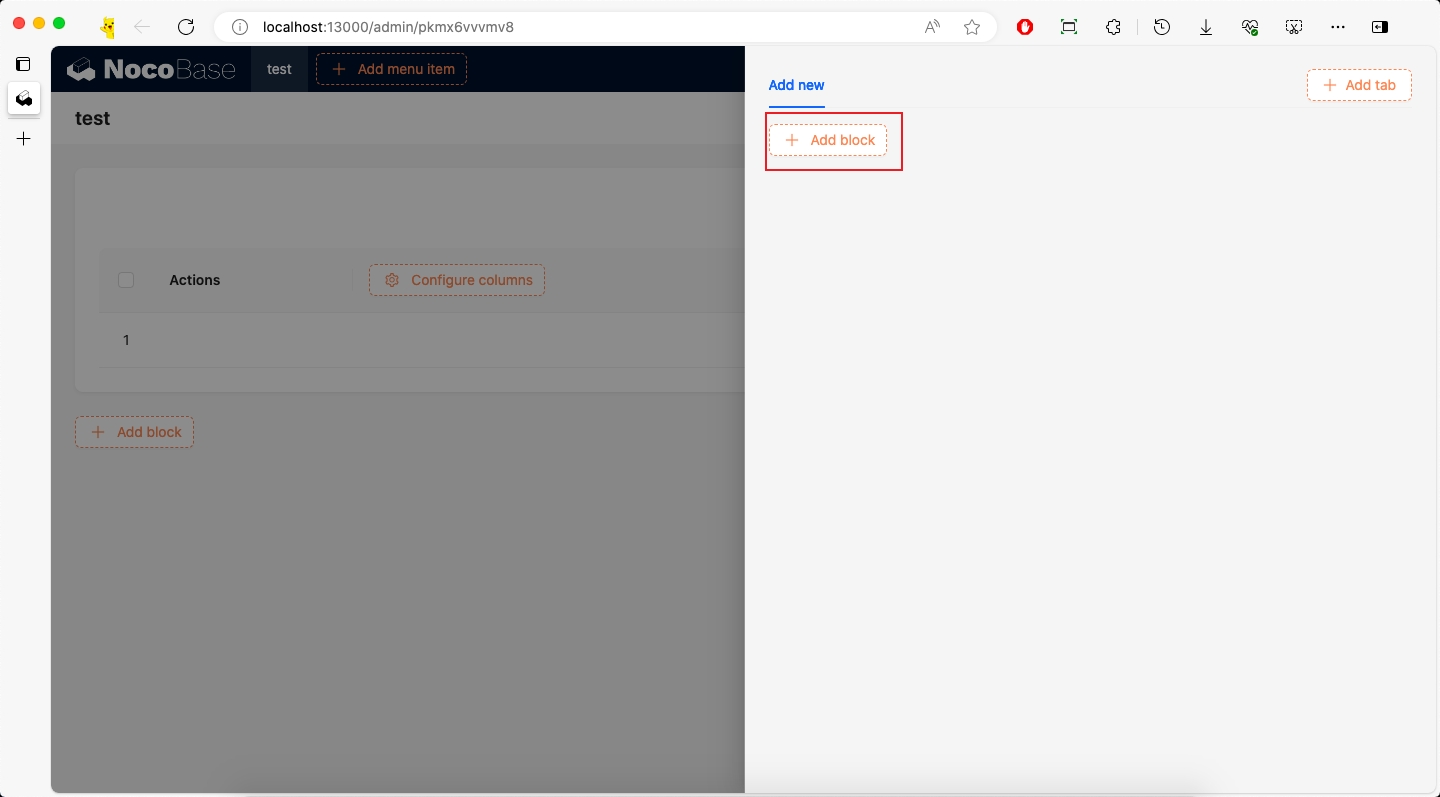
Adding Data Block
Scenario
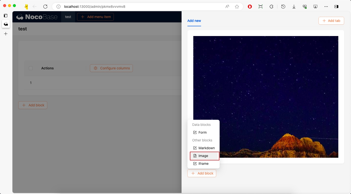
NocoBase has many Add block buttons for adding blocks to the interface. Some are related to data tables and are called data blocks Data Block, while others that are not related to data tables are called simple blocks Simple Block.
However, the existing block types may not meet our requirements, so we need to develop custom blocks according to our needs. This article focuses on explaining data blocks Data Block.
Example
This example will create an Info block and add it to the Add block in Page, Table, and mobile.
This example is mainly to demonstrate the use of initializer. For more information about block extension, please refer to the Block Extension documentation.
The complete example code for this document can be found in plugin-samples.
Initialize Plugin
Following the Write Your First Plugin documentation, if you don't have a project yet, you can create one first. If you already have one or have cloned the source code, you can skip this step.
Then initialize a plugin and add it to the system:
Then start the project:
After logging in, visit http://localhost:13000/admin/pm/list/local/ to see that the plugin has been installed and enabled.
Implementation
Before implementing this example, we need to understand some basic knowledge:
- SchemaInitializer Tutorial: Used to add various blocks, fields, operations, etc. to the interface
- SchemaInitializer API: Used to add various blocks, fields, operations, etc. to the interface
- UI Schema: Used to define the structure and style of the interface
- Designable Designer: Used to modify Schema
1. Define Name
First, we need to define the block name, which will be used in various places.
We create packages/plugins/@nocobase-sample/plugin-initializer-block-data/src/client/constants.ts:
2. Implement Block Component
2.1 Define Block Component
This example is about an Info block component with the following specific requirements:
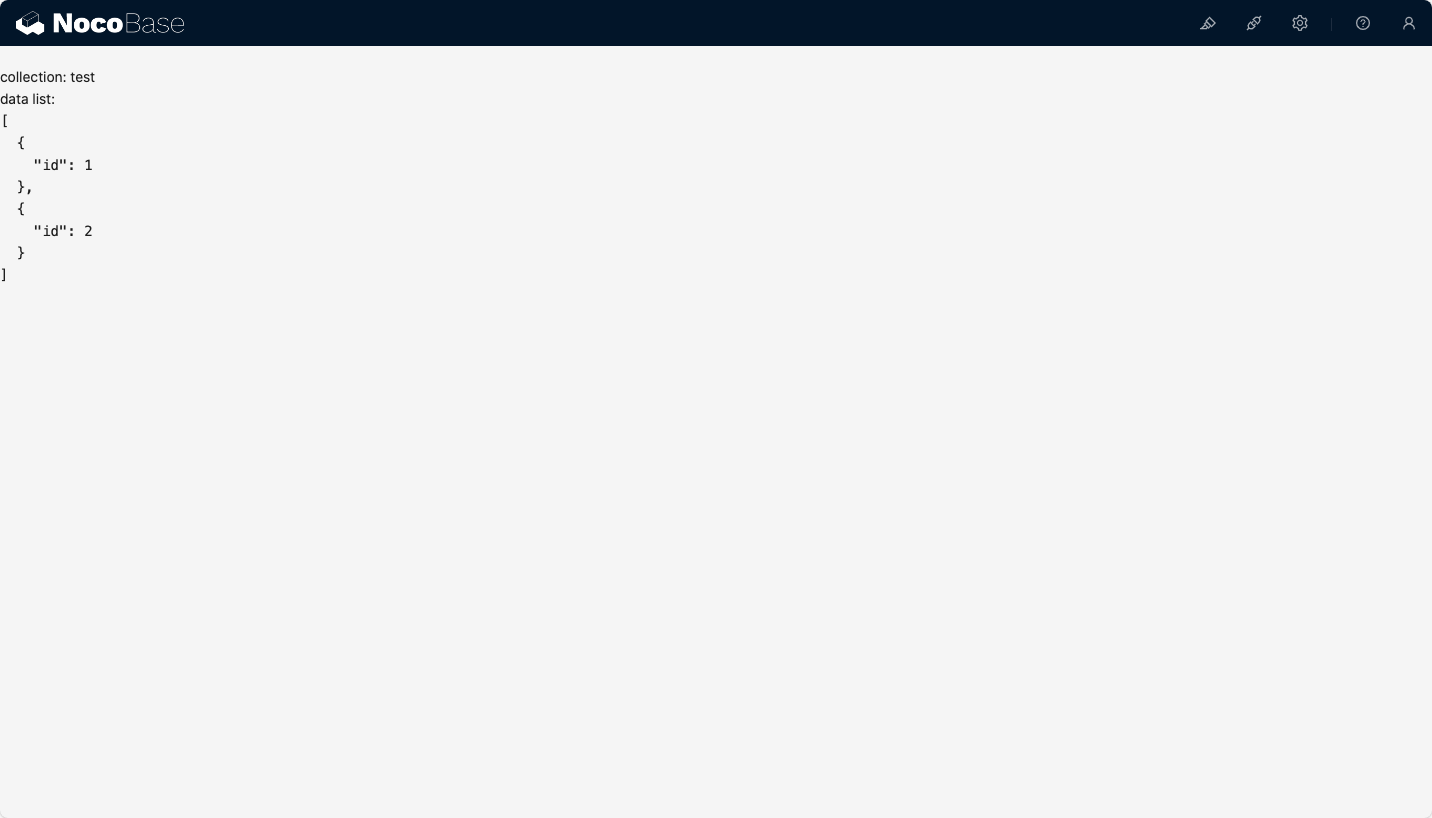
- Display the current block's data table name
- Display the current block's data list
First, we create packages/plugins/@nocobase-sample/plugin-initializer-block-data/src/client/component/Info.tsx file with the following content:
The Info component is essentially a functional component wrapped by withDynamicSchemaProps. withDynamicSchemaProps is a higher-order component used to handle dynamic properties in Schema.
If we ignore withDynamicSchemaProps, Info is just a simple functional component.
Then export it in packages/plugins/@nocobase-sample/plugin-initializer-block-data/src/client/component/index.ts:
2.2 Register Block Component
We need to register Info to the system through the plugin.
2.3 Verify Block Component
There are 2 ways to verify components:
- Temporary page verification: We can temporarily create a page and render the
Infocomponent to check if it meets the requirements - Documentation example verification: You can start the documentation
yarn doc plugins/@nocobase-sample/plugin-initializer-block-data, and verify if it meets the requirements by writing documentation examples (TODO)
We use temporary page verification as an example. We create a new page and add one or more Info components according to property parameters to check if they meet the requirements.
Then visit http://localhost:13000/admin/info-component to see the corresponding test page content.
After verification, the test page needs to be deleted.
3. Define Block Schema
3.1 Define Block Schema
NocoBase's dynamic pages are all rendered through Schema, so we need to define a Schema, which will be used later to add the Info block to the interface. Before implementing this section, we need to understand some basic knowledge:
- UI Schema Protocol: Detailed introduction to the structure of Schema and the role of each property
- DataBlockProvider: Data block
We create packages/plugins/@nocobase-sample/plugin-initializer-block-data/src/client/schema/index.ts file:
There are 2 points to explain here:
getInfoSchema(): The reason for defining it as a function is thatdataSourceandcollectionare dynamic and determined by the clicked data tableuseInfoProps(): Used to handle the dynamic properties of theInfocomponent, and because it needs to be stored in the database, the value type here is a string type.
getInfoSchema(): Returns the Schema of Info
type: 'void': Indicates no datax-decorator: 'DataBlockProvider': Data block provider, used to provide data. For more information about DataBlockProvider, please refer to DataBlockProviderx-decorator-props: Properties ofDataBlockProviderdataSource: Data sourcecollection: Data tableaction: 'list': Operation type, here it islist, to get the data list
x-component: 'CardItem': CardItem component, currently all blocks are wrapped in cards, which provide styles, layouts, and drag-and-drop functionalityproperties: Child nodesinfo: Info block
useInfoProps(): Dynamic properties of the Info component
- useCollection: Get the current data table, provided by DataBlockProvider
- useDataBlockRequest Get the data block request, provided by DataBlockProvider
The above Schema is equivalent to the following React component:
3.2 Register scope
We need to register useInfoProps to the system, so that x-use-component-props can find the corresponding scope.
For more information about Scope, please refer to Global Registration of Component and Scope
3.3 Verify Block Schema
Same as verifying components, we can verify the Schema by temporary page verification or documentation example verification. Here we use temporary page verification as an example:
- SchemaComponentOptions: Used to pass
componentsandscoperequired in Schema. For details, please refer to Local Registration of Component and Scope - SchemaComponent: Used to render Schema
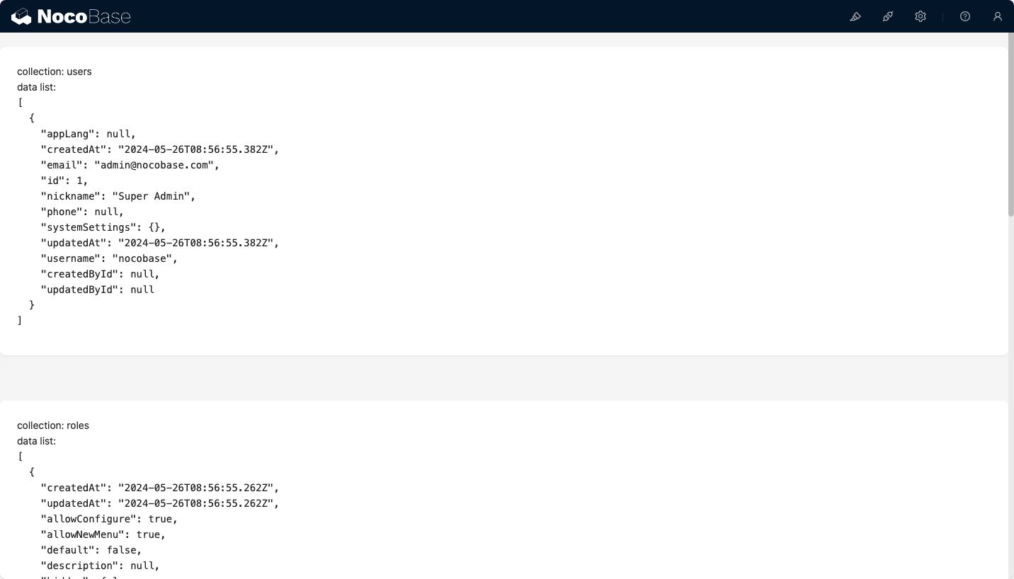
We visit http://localhost:13000/admin/info-schema to see the corresponding test page content.
After verification, the test page needs to be deleted.
4. Define Schema Initializer Item
We create packages/plugins/@nocobase-sample/plugin-initializer-block-data/src/client/initializer/index.tsx file:
The core to achieving the data block effect is DataBlockInitializer (documentation TODO).
infoInitializerItem:
Component: Unlike Adding Simple Block Simple Block which usestype, here we useComponent. 2 ways to define are both acceptableuseComponentProps: Properties ofDataBlockInitializercomponenttitle: Titleicon: Icon, more icons can be found at Ant Design IconscomponentType: Component type, here it isInfoonCreateBlockSchema: Callback after clicking the data tableitem: Information of the clicked data tableitem.name: Data table nameitem.dataSource: Data source of the data table
- useSchemaInitializer: Provides methods for inserting Schema
"x-toolbar": "BlockSchemaToolbar":BlockSchemaToolbaris used to display the current data table in the upper left corner, usually used withDataBlockProvider
For more information about Schema Initializer definitions, please refer to the Schema Initializer documentation.
5. Implement Schema Settings
5.1 Define Schema Settings
A complete Block also needs to have Schema Settings, which are used to configure some properties and operations, but Schema Settings is not the focus of this example, so we only have a remove operation here.
We create packages/plugins/@nocobase-sample/plugin-initializer-block-data/src/client/settings/index.ts file:
5.2 Register Schema Settings
5.3 Use Schema Settings
We modify the getInfoSchema method in the packages/plugins/@nocobase-sample/plugin-initializer-block-data/src/client/schema/index.ts file to set x-settings to infoSettings.name.
6. Add to Add block
There are many Add block buttons in the system, but their names are different.
6.1 Add to Page-level Add block
If we need to add it to the page-level Add block, we need to know the corresponding name. We can view the corresponding name through TODO method.
TODO
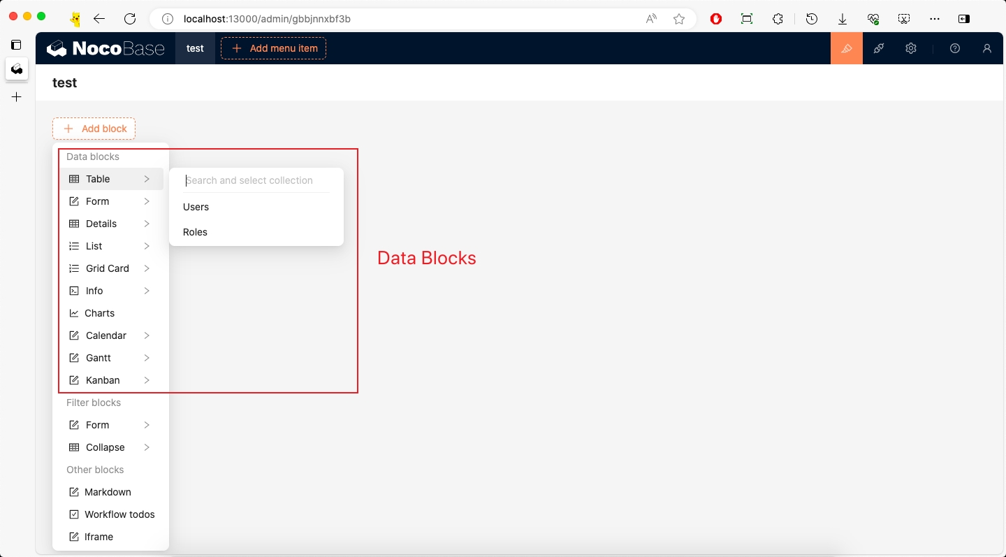
From the above figure, we can see that the page-level Add block corresponds to the name page:addBlock, and Data Blocks corresponds to the name dataBlocks.
Then we modify packages/plugins/@nocobase-sample/plugin-initializer-block-data/src/client/index.tsx file:
6.2 Add to Modal Add block
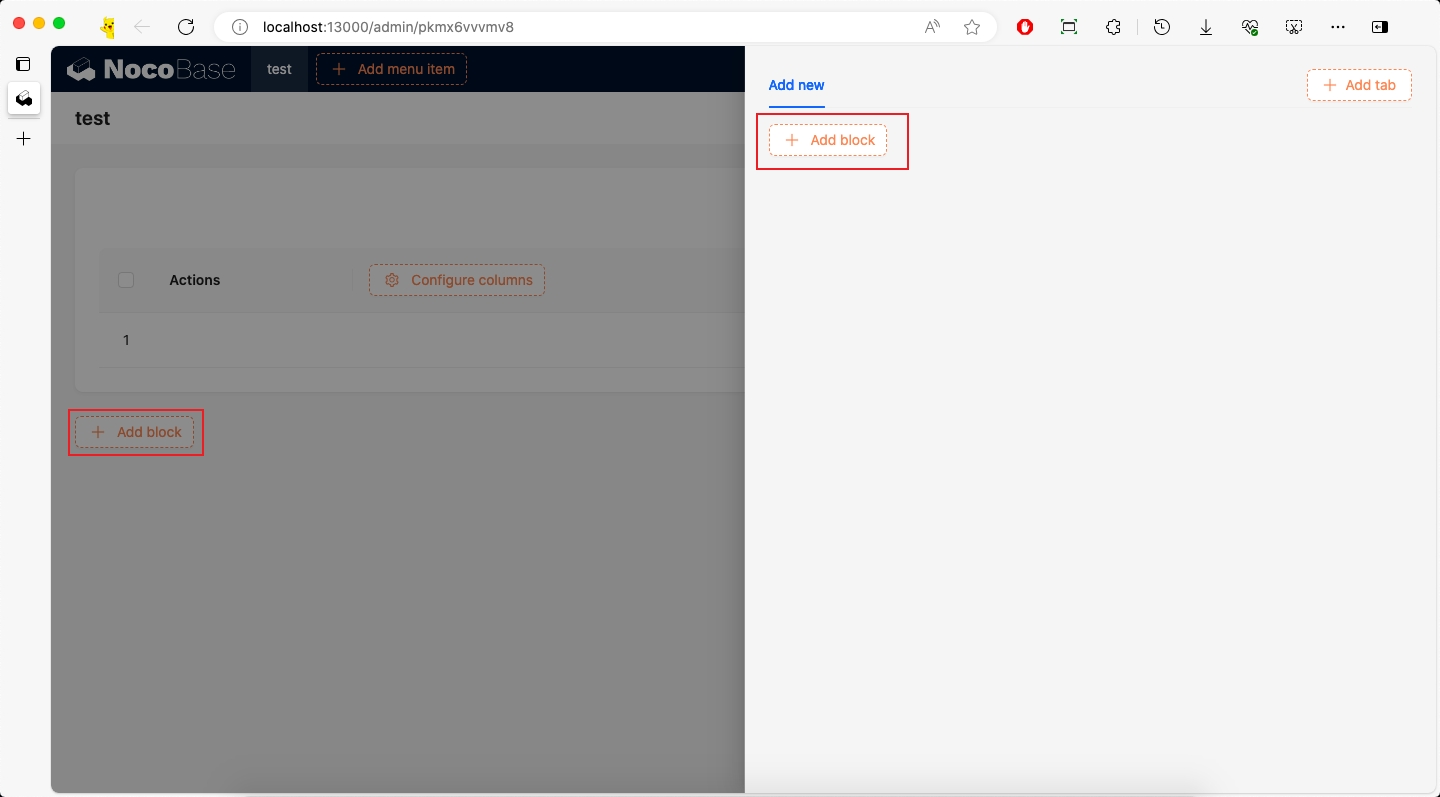
We need to add it not only to the page-level Add block, but also to the Add block in the Table block Add new modal.
According to the method of obtaining the page-level name, we get the Add block name of the Table block as popup:addNew:addBlock, and Data Blocks corresponds to the name dataBlocks.
Then modify packages/plugins/@nocobase-sample/plugin-initializer-block-data/src/client/index.tsx file:
6.3 Add to Mobile Add block
First, you need to activate the mobile plugin, refer to the Activate Plugin documentation.
We can add it to the mobile Add block. The method of obtaining the name will not be repeated here.
Then modify packages/plugins/@nocobase-sample/plugin-initializer-block-data/src/client/index.tsx file:
If you need more Add block, you can continue to add them, just need to know the corresponding name.
Packaging and Uploading to Production Environment
According to the Build and Package Plugin documentation, we can package the plugin and upload it to the production environment.
If you cloned the source code, you need to execute a full build first to build the plugin's dependencies as well.
If you used create-nocobase-app to create the project, you can directly execute:
This way you can see the storage/tar/@nocobase-sample/plugin-initializer-block-data.tar.gz file, and then install it by uploading.