logologo
Get Started
Guide
Development
Plugins
API
Home
English
简体中文
日本語
한국어
Español
Português
Deutsch
Français
Русский
Italiano
Türkçe
Українська
Tiếng Việt
Bahasa Indonesia
ไทย
Polski
Nederlands
Čeština
العربية
עברית
हिन्दी
Svenska
Get Started
Guide
Development
Plugins
API
Home
logologo

Plugin Samples

Overview
SchemaInitializer
Next PageOverview

#Adding Data Block with Modal

#Scenario

In many cases, before clicking to create a block, we need to first select configuration information. For example:

  • Kanban block requires selecting Grouping field and Sorting field after clicking
  • Calendar block requires selecting Title field, Start date field, End date field first
  • Chart block requires configuring chart-related information first

#Example

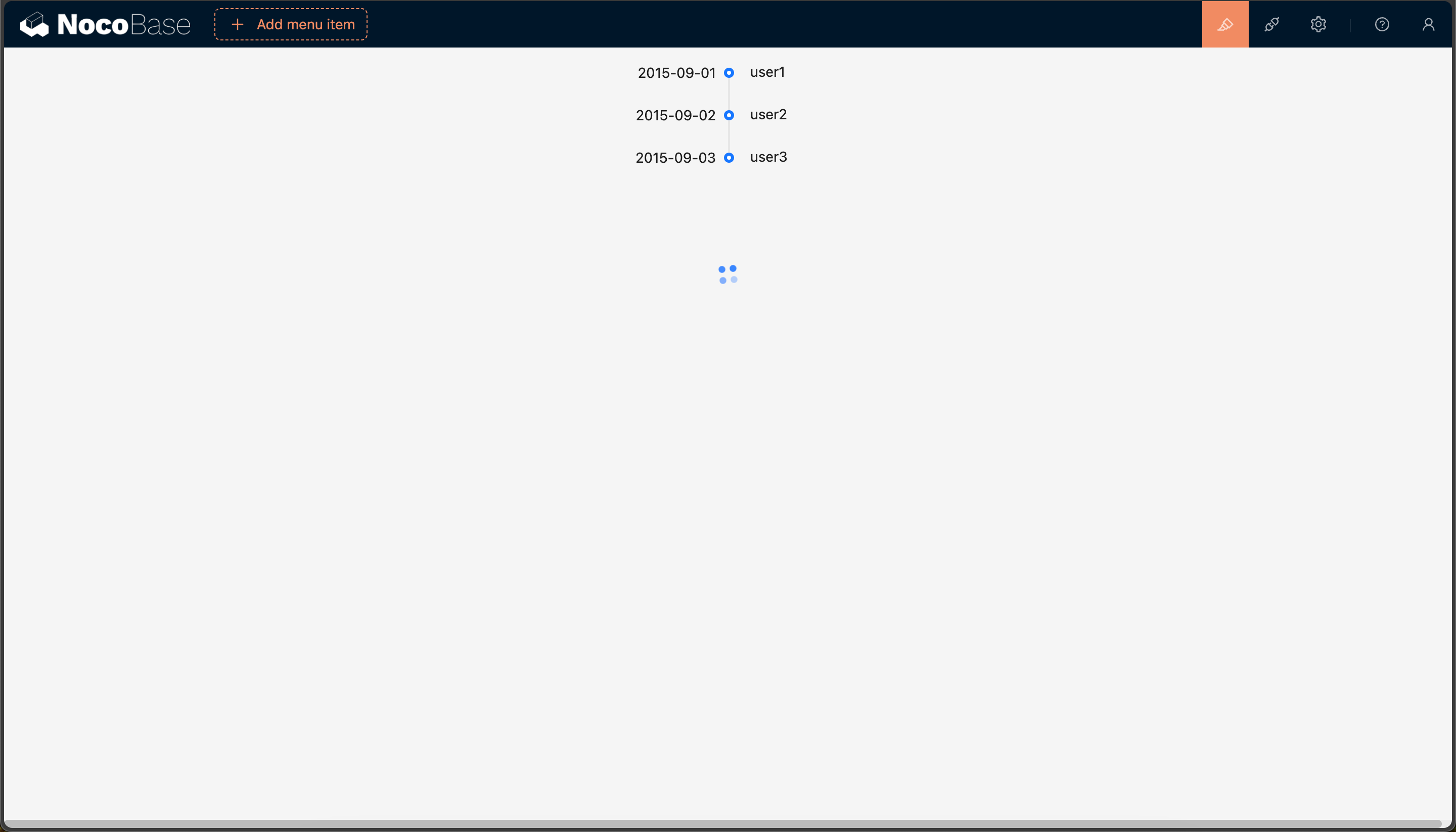
This example will create a Timeline block based on ant-design Timeline component, and before creating the block, select Time Field and Title Field.

This example is mainly to demonstrate the use of initializer. For more information about block extension, please refer to the Block Extension documentation.

The complete example code for this document can be found in plugin-samples.

#Initialize Plugin

Following the Write Your First Plugin documentation, if you don't have a project yet, you can create one first. If you already have one or have cloned the source code, you can skip this step.

yarn create nocobase-app my-nocobase-app -d postgres
cd my-nocobase-app
yarn install
yarn nocobase install

Then initialize a plugin and add it to the system:

yarn pm create @nocobase-sample/plugin-initializer-block-data-modal
yarn pm enable @nocobase-sample/plugin-initializer-block-data-modal

Then start the project:

yarn dev

After logging in, visit http://localhost:13000/admin/pm/list/local/ to see that the plugin has been installed and enabled.

#Implementation

Before implementing this example, we need to understand some basic knowledge:

  • ant-design Timeline component
  • SchemaInitializer Tutorial: Used to add various blocks, fields, operations, etc. to the interface
  • SchemaInitializer API: Used to add various blocks, fields, operations, etc. to the interface
  • UI Schema: Used to define the structure and style of the interface
  • Designable Designer: Used to modify Schema
.
├── client # Client plugin
│   ├── initializer # Initializer
│   ├── component # Block component
│   ├── index.tsx # Client plugin entry
│   ├── locale.ts # Multi-language utility function
│   ├── constants.ts # Constants
│   ├── schema # Schema
│   └── settings # Schema Settings
├── locale # Multi-language files
│   ├── en-US.json # English
│   └── zh-CN.json # Chinese
├── index.ts # Server plugin entry
└── server # Server plugin

#1. Define Name

First, we need to define the block name, which will be used in various places.

We create packages/plugins/@nocobase-sample/plugin-initializer-block-data-modal/src/client/constants.ts:

export const BlockName = 'Timeline';
export const BlockNameLowercase = BlockName.toLowerCase();

#2. Implement Block Component

#2.1 Define Block Component

This example is about a Timeline block component with the following specific requirements:

First, we create packages/plugins/@nocobase-sample/plugin-initializer-block-data-modal/src/client/component/Timeline.tsx file with the following content:

import React, { FC } from 'react';
import { Timeline as AntdTimeline, TimelineProps as AntdTimelineProps, Spin } from 'antd';
import { withDynamicSchemaProps } from "@nocobase/client";
import { BlockName } from '../constants';

export interface TimelineProps {
  data?: AntdTimelineProps['items'];
  loading?: boolean;
}

export const Timeline: FC<TimelineProps> = withDynamicSchemaProps((props) => {
  const { data, loading } = props;
  if (loading) return <div style={{ height: 100, textAlign: 'center' }}><Spin /></div>
  return <AntdTimeline mode='left' items={data}></AntdTimeline>
}, { displayName: BlockName });

The Timeline component is essentially a component wrapped by withDynamicSchemaProps, which accepts 2 parameters:

  • loading: Data loading state
  • data: items property of Timeline component

withDynamicSchemaProps is a higher-order component used to handle dynamic properties in Schema.

#2.2 Register Block Component

We need to register Timeline to the system through the plugin.

import { Plugin } from '@nocobase/client';
import { Timeline } from './component';

export class PluginInitializerBlockDataModalClient extends Plugin {
  async load() {
    this.app.addComponents({ Timeline })
  }
}

export default PluginInitializerBlockDataModalClient;

#2.3 Verify Block Component

There are 2 ways to verify components:

  • Temporary page verification: We can temporarily create a page and render the Timeline component to check if it meets the requirements
  • Documentation example verification: You can start the documentation yarn doc plugins/@nocobase-sample/plugin-initializer-block-data-modal, and verify if it meets the requirements by writing documentation examples (TODO)

We use temporary page verification as an example. We create a new page and add one or more Timeline components according to property parameters to check if they meet the requirements.

import { Plugin } from '@nocobase/client';
import { Timeline } from './component';
import React from 'react';

export class PluginInitializerBlockDataModalClient extends Plugin {
  async load() {
    this.app.addComponents({ Timeline })

    this.app.router.add('admin.timeline-block-component', {
      path: '/admin/timeline-block-component',
      Component: () => {
        return <>
          <div style={{ marginTop: 20, marginBottom: 20 }}>
            <Timeline
              data={[
                {
                  label: '2015-09-01',
                  children: 'user1',
                },
                {
                  label: '2015-09-02',
                  children: 'user2',
                },
                {
                  label: '2015-09-03',
                  children: 'user3',
                },
              ]} />
          </div>
          <div style={{ marginTop: 20, marginBottom: 20 }}>
            <Timeline loading={true} />
          </div>
        </>
      }
    })
  }
}

export default PluginInitializerBlockDataModalClient;

Then visit http://localhost:13000/admin/timeline-block-component to see the corresponding test page content.

20240529210122

After verification, the test page needs to be deleted.

#3. Define Configuration Form

According to the requirements, we need to configure Time Field and Title Field after selecting the data table, so we need to define a configuration form, named TimelineInitializerConfigForm.

#3.1 Define Configuration Form Component

We need to understand the following knowledge first:

  • Action
  • Action.Modal: Modal
  • ActionContextProvider: Action context
  • SchemaComponent: Used to render Schema

We create packages/plugins/@nocobase-sample/plugin-initializer-block-data-modal/src/client/initializer/ConfigForm.tsx file with the following content:

import React, { FC, useMemo } from "react";
import { ISchema } from '@formily/react';
import { ActionContextProvider, SchemaComponent, useApp, CollectionFieldOptions } from '@nocobase/client';
import { useT } from "../locale";

const createSchema = (fields: CollectionFieldOptions, t: ReturnType<typeof useT>): ISchema => {
  // TODO
}

interface TimelineConfigFormValues {
  timeField: string;
  titleField: string;
}

export interface TimelineConfigFormProps {
  collection: string;
  dataSource?: string;
  onSubmit: (values: TimelineConfigFormValues) => void;
  visible: boolean;
  setVisible: (visible: boolean) => void;
}

export const TimelineInitializerConfigForm: FC<TimelineConfigFormProps> = ({ visible, setVisible, collection, dataSource, onSubmit }) => {
  const app = useApp();
  const fields = useMemo(() => app.getCollectionManager(dataSource).getCollection(collection).getFields(), [collection, dataSource])
  const t = useT();
  const schema = useMemo(() => createSchema(fields, t), [fields]);

  return <ActionContextProvider value={{ visible, setVisible }}>
    <SchemaComponent schema={schema}  />
  </ActionContextProvider>
}

TimelineInitializerConfigForm component accepts 4 parameters:

  • visible: Whether to display
  • setVisible: Set whether to display
  • collection: Data table name
  • dataSource: Data source name
  • onSubmit: Form submit callback

Among them, collection and dataSource are obtained after clicking the data table, so they are dynamic here.

  • app: Get application instance through useApp()
  • app.getCollectionManager: Get CollectionManager instance
  • getCollection: Get data table
  • getFields: Get data table fields

ActionContextProvider is used to pass visible and setVisible to child nodes, SchemaComponent is used to render Schema.

#3.2 Implement Configuration Form Schema

We need to understand the following knowledge first:

  • FormV2: Form component
  • Select: Selector
const useCloseActionProps = () => {
  const { setVisible } = useActionContext();
  return {
    type: 'default',
    onClick() {
      setVisible(false);
    },
  };
};

const useSubmitActionProps = (onSubmit: (values: TimelineConfigFormValues) => void) => {
  const { setVisible } = useActionContext();
  const form = useForm<TimelineConfigFormValues>();

  return {
    type: 'primary',
    async onClick() {
      await form.submit();
      const values = form.values;
      onSubmit(values);
      setVisible(false);
    },
  };
};

const createSchema = (fields: CollectionFieldOptions[]): ISchema => {
  return {
    type: 'void',
    name: uid(),
    'x-component': 'Action.Modal',
    'x-component-props': {
      width: 600,
    },
    'x-decorator': 'FormV2',
    properties: {
      titleField: {
        type: 'string',
        title: 'Title Field',
        required: true,
        enum: fields.map(item => ({ label: item.uiSchema?.title || item.name, value: item.name })),
        'x-decorator': 'FormItem',
        'x-component': 'Select',
      },
      timeField: {
        type: 'string',
        title: 'Time Field',
        required: true,
        enum: fields.filter(item => item.type === 'date').map(item => ({ label: item.uiSchema?.title || item.name, value: item.name })),
        'x-decorator': 'FormItem',
        'x-component': 'Select',
      },
      footer: {
        type: 'void',
        'x-component': 'Action.Modal.Footer',
        properties: {
          close: {
            title: 'Close',
            'x-component': 'Action',
            'x-component-props': {
              type: 'default',
            },
            'x-use-component-props': 'useCloseActionProps',
          },
          submit: {
            title: 'Submit',
            'x-component': 'Action',
            'x-use-component-props': 'useSubmitActionProps',
          },
        },
      },
    }
  };
}

We defined a createSchema function to generate the configuration form Schema, which accepts a fields parameter, which is the fields of the data table.

The above effect is that there is a form inside the modal, and there are 2 selectors in the form, one is Title Field, one is Time Field, and there are a Close and Submit button.

  • The Close and Submit buttons need to use Hooks, so we use x-use-component-props
  • Title Field: All fields can be selected
  • Time Field: Only date type fields can be selected

Then we also need to modify TimelineInitializerConfigForm to register useSubmitActionProps and useCloseActionProps to scope.

-   <SchemaComponent schema={schema}/>
+   <SchemaComponent schema={schema} scope={{ useSubmitActionProps: useSubmitActionProps.bind(null, onSubmit), useCloseActionProps }} />

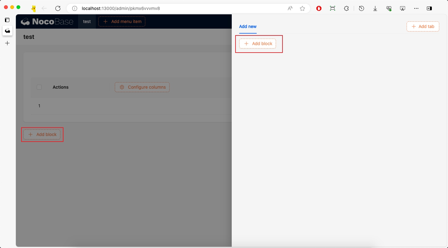
#3.3 Verify Configuration Form

import { Plugin } from '@nocobase/client';
import { Timeline } from './component';
import React, { useState } from 'react';
import { TimelineInitializerConfigForm } from './initializer/ConfigForm';

export class PluginInitializerBlockDataModalClient extends Plugin {
  async load() {
    this.app.addComponents({ Timeline })

    this.app.router.add('admin.timeline-config-form', {
      path: '/admin/timeline-config-form',
      Component: () => {
        const [visible, setVisible] = useState(true);
        function onSubmit(values) {
          console.log(values);
        }
        return <>
          <div style={{ marginTop: 20, marginBottom: 20 }}>
            <TimelineInitializerConfigForm visible={visible} onSubmit={onSubmit} setVisible={setVisible} collection='users' />
          </div>
        </>
      }
    })
  }
}

export default PluginInitializerBlockDataModalClient;

Then visit http://localhost:13000/admin/timeline-config-form to see the corresponding test page content.

After verification, the test page needs to be deleted.

#4. Define Block Schema

#4.1 Define Block Schema

NocoBase's dynamic pages are all rendered through Schema, so we need to define a Schema, which will be used later to add the Timeline block to the interface. Before implementing this section, we need to understand some basic knowledge:

  • UI Schema Protocol: Detailed introduction to the structure of Schema and the role of each property
  • DataBlockProvider: Data block

We create packages/plugins/@nocobase-sample/plugin-initializer-block-data-modal/src/client/schema/index.tsx file:

import { useDataBlockProps, useDataBlockRequest } from "@nocobase/client";
import { TimelineProps } from '../component';
import { BlockName, BlockNameLowercase } from "../constants";

interface GetTimelineSchemaOptions {
  dataSource?: string;
  collection: string;
  titleField: string;
  timeField: string;
}

export function getTimelineSchema(options: GetTimelineSchemaOptions) {
  return {
    type: 'void',
    "x-toolbar": "BlockSchemaToolbar",
    'x-decorator': 'DataBlockProvider',
    'x-decorator-props': {
      dataSource,
      collection,
      action: 'list',
      params: {
        sort: `-${timeField}`
      },
      [BlockNameLowercase]: {
        titleField,
        timeField,
      }
    },
    'x-component': 'CardItem',
    properties: {
      [BlockNameLowercase]: {
        type: 'void',
        'x-component': BlockName,
        'x-use-component-props': 'useTimelineProps',
      }
    }
  }
}

export function useTimelineProps(): TimelineProps {
  const dataProps = useDataBlockProps();
  const props = dataProps[BlockNameLowercase];
  const { loading, data } = useDataBlockRequest<any[]>();
  return {
    loading,
    data: data?.data?.map((item) => ({
      label: item[props.timeField],
      children: item[props.titleField],
    }))
  }
}

There are 2 points to explain here:

getTimelineSchema() accepts dataSource, collection, titleField, timeField and returns a Schema, which is used to render the Timeline block:

  • type: 'void': Indicates no data
  • x-decorator: 'DataBlockProvider': Data block provider, used to provide data. For more information about DataBlockProvider, please refer to DataBlockProvider
  • x-decorator-props: Properties of DataBlockProvider
  • dataSource: Data source
  • collection: Data table
  • action: 'list': Operation type, here it is list, to get the data list
  • params: { sort }: Request parameters, here we sort timeField in descending order. For more information about request parameters, please refer to useRequest
  • x-component: 'CardItem': CardItem component, currently all blocks are wrapped in cards, which provide styles, layouts, and drag-and-drop functionality
  • 'x-component': 'Timeline': Block component, which is the Timeline component we defined
  • 'x-use-component-props': 'useTimelineProps': Used to handle the dynamic properties of the Timeline component, and because it needs to be stored in the database, the value type here is a string type.

useTimelineProps(): Dynamic properties of the Timeline component

  • useDataBlockProps: Get the props property of DataBlockProvider, which is the value of x-decorator-props
  • useDataBlockRequest Get the data block request, provided by DataBlockProvider

The above Schema is equivalent to the following React component:

<DataBlockProvider collection={collection} dataSource={dataSource} action='list' params={{ sort: `-${timeField}` }} timeline={{ titleField, timeField }}>
  <CardItem>
    <Timeline {...useTimelineProps()} />
  </CardItem>
</DataBlockProvider>

#4.2 Register scope

We modify packages/plugins/@nocobase-sample/plugin-initializer-block-data-modal/src/client/index.tsx file to register useTimelineProps to the system, so that x-use-component-props can find the corresponding scope.

import { Plugin } from '@nocobase/client';
import { Timeline } from './component';
import { useTimelineProps } from './schema';

export class PluginInitializerBlockDataModalClient extends Plugin {
  async load() {
    this.app.addComponents({ Timeline })
    this.app.addScopes({ useTimelineProps });
  }
}

export default PluginInitializerBlockDataModalClient;

For more information about Scope, please refer to Global Registration of Component and Scope

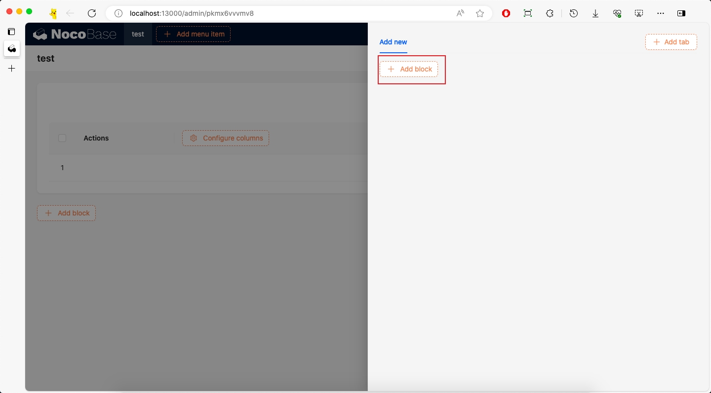
#4.3 Verify Block Schema

Same as verifying components, we can verify the Schema by temporary page verification or documentation example verification. Here we use temporary page verification as an example:

import { Plugin, SchemaComponent } from '@nocobase/client';
import { Timeline, getTimelineSchema, useTimelineProps } from './component';
import React from 'react';

export class PluginInitializerBlockDataModalClient extends Plugin {
  async load() {
    // ...

    this.app.router.add('admin.timeline-schema', {
      path: '/admin/timeline-schema',
      Component: () => {
        return <>
          <div style={{ marginTop: 20, marginBottom: 20 }}>
            <SchemaComponent schema={{ properties: { test1: getTimelineSchema({ collection: 'users' })({ timeField: 'createdAt', titleField: 'nickname' }) } }} />
          </div>
        </>
      }
    })
  }
}

export default PluginInitializerBlockDataModalClient;
  • SchemaComponentOptions: Used to pass components and scope required in Schema. For details, please refer to Local Registration of Component and Scope
  • SchemaComponent: Used to render Schema

We visit http://localhost:13000/admin/timeline-schema to see the corresponding test page content.

After verification, the test page needs to be deleted.

#5. Define Schema Initializer Item

We create packages/plugins/@nocobase-sample/plugin-initializer-block-data-modal/src/client/initializer/index.tsx file to define Schema Initializer Item:

import React, { useCallback, useState } from 'react';
import { FieldTimeOutlined } from '@ant-design/icons';
import { DataBlockInitializer, SchemaInitializerItemType, useSchemaInitializer } from "@nocobase/client";

import { getTimelineSchema } from '../schema';
import { useT } from '../locale';
import { TimelineConfigFormProps, TimelineInitializerConfigForm } from './ConfigForm';
import { BlockName, BlockNameLowercase } from '../constants';

export const TimelineInitializerComponent = () => {
  const { insert } = useSchemaInitializer();
  const [collection, setCollection] = useState<string>();
  const [dataSource, setDataSource] = useState<string>();
  const [showConfigForm, setShowConfigForm] = useState(false);
  const t = useT()

  const onSubmit: TimelineConfigFormProps['onSubmit'] = useCallback((values) => {
    const schema = getTimelineSchema({ collection, dataSource, timeField: values.timeField, titleField: values.titleField });
    insert(schema);
  }, [collection, dataSource])

  return <>
    {showConfigForm && <TimelineInitializerConfigForm
      visible={showConfigForm}
      setVisible={setShowConfigForm}
      onSubmit={onSubmit}
      collection={collection}
      dataSource={dataSource}
    />}
    <DataBlockInitializer
      name={BlockNameLowercase}
      title={t(BlockName)}
      icon={<FieldTimeOutlined />}
      componentType={BlockName}
      onCreateBlockSchema={({ item }) => {
        const { name: collection, dataSource } = item;
        setCollection(collection);
        setDataSource(dataSource);
        setShowConfigForm(true);
      }}>

    </DataBlockInitializer>
  </>
}

export const timelineInitializerItem: SchemaInitializerItemType = {
  name: 'Timeline',
  Component: TimelineInitializerComponent,
}

The operation flow is to first click on the data table to get the values of collection and dataSource, then get the timeField and titleField fields through the configuration form TimelineInitializerConfigForm, and when the form is submitted, create a schema based on the data and insert it into the page.

The core to achieving the data block effect is DataBlockInitializer (documentation TODO).

timelineInitializerItem:

  • name: Unique identifier, used for CRUD
  • Component: Unlike Adding Simple Block Simple Block which uses type, here we use Component. 2 ways to define are both acceptable

TimelineInitializerComponent:

  • DataBlockInitializer
    • title: Title
    • icon: Icon, more icons can be found at Ant Design Icons
    • componentType: Component type, here it is Timeline
    • onCreateBlockSchema: Callback after clicking the data table
      • item: Information of the clicked data table
        • item.name: Data table name
        • item.dataSource: Data source of the data table
    • useSchemaInitializer: Provides methods for inserting Schema

For more information about Schema Initializer definitions, please refer to the Schema Initializer documentation.

#6. Implement Schema Settings

#6.1 Define Schema Settings

A complete Block also needs to have Schema Settings, which are used to configure some properties and operations, but Schema Settings is not the focus of this example, so we only have a remove operation here.

We create packages/plugins/@nocobase-sample/plugin-initializer-block-data-modal/src/client/settings/index.ts file with the following content:

import { SchemaSettings } from "@nocobase/client";

export const timelineSettings = new SchemaSettings({
  name: 'blockSettings:info',
  items: [
    {
      type: 'remove',
      name: 'remove',
      componentProps: {
        removeParentsIfNoChildren: true,
        breakRemoveOn: {
          'x-component': 'Grid',
        },
      }
    }
  ]
})
  • componentProps
    • removeParentsIfNoChildren: Whether to delete the parent node if there are no child nodes
    • breakRemoveOn: Break condition when deleting. Because Add Block automatically wraps children in Grid, we set breakRemoveOn: { 'x-component': 'Grid' } here, so when deleting Grid, it doesn't delete upwards anymore.

#6.2 Register Schema Settings

import { Plugin } from '@nocobase/client';
import { timelineSettings } from './settings';

export class PluginInitializerBlockDataModalClient extends Plugin {
  async load() {
    // ...
    this.app.schemaSettingsManager.add(timelineSettings)
  }
}

export default PluginInitializerBlockDataModalClient;

#6.3 Use Schema Settings

We need to modify the getTimelineSchema() in packages/plugins/@nocobase-sample/plugin-initializer-block-data-modal/src/client/schema/index.tsx:

+ import { timelineSettings } from '../settings';

export function getTimelineSchema(options: GetTimelineSchemaOptions) {
  const { dataSource, collection, titleField, timeField } = options;
  return {
    type: 'void',
    'x-decorator': 'DataBlockProvider',
+   'x-settings': timelineSettings.name,
    // ...
  }
}

#7. Add to Add block

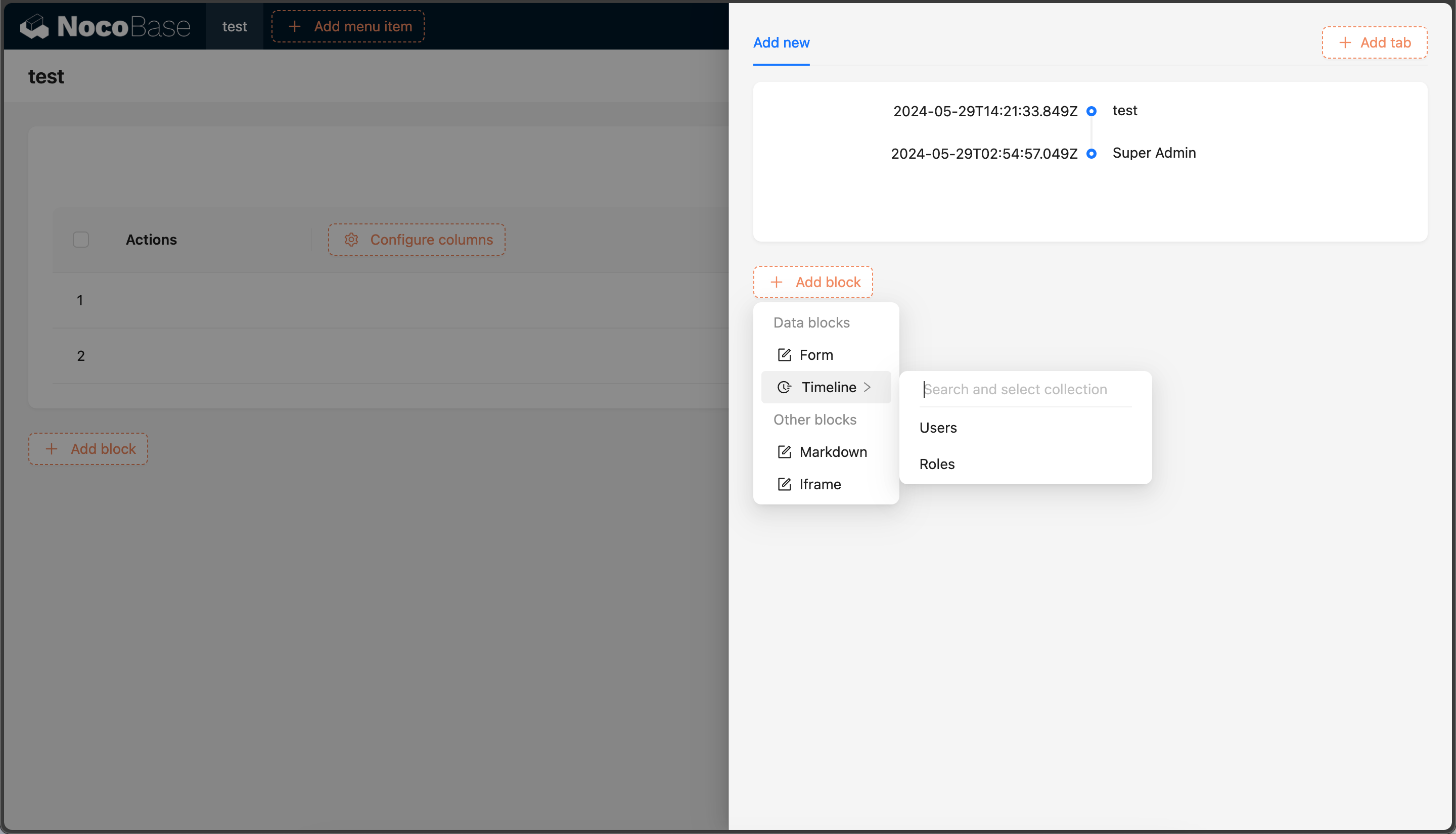
There are many Add block buttons in the system, but their names are different.

img_v3_02b4_049b0a62-8e3b-420f-adaf-a6350d84840g

#7.1 Add to Page-level Add block

If we need to add it to the page-level Add block, we need to know the corresponding name. We can view the corresponding name through TODO method.

TODO

From the above figure, we can see that the page-level Add block corresponds to the name page:addBlock, and Data Blocks corresponds to the name dataBlocks.

Then we modify packages/plugins/@nocobase-sample/plugin-initializer-block-data-modal/src/client/index.tsx file:

import { Plugin } from '@nocobase/client';
import { Timeline } from './component';
import { useTimelineProps } from './schema';
import { timelineSettings } from './settings';
import { timelineInitializerItem } from './timelineInitializerItem';

export class PluginInitializerBlockDataModalClient extends Plugin {
  async load() {
    this.app.addComponents({ Timeline })
    this.app.addScopes({ useTimelineProps });
    this.app.schemaSettingsManager.add(timelineSettings)

    this.app.schemaInitializerManager.addItem('page:addBlock', `dataBlocks.${timelineInitializerItem.name}`, timelineInitializerItem)
  }
}

export default PluginInitializerBlockDataModalClient;

#7.2 Add to Modal Add block

We need to add it not only to the page-level Add block, but also to the Add block in the Table block Add new modal.

img_v3_02b4_fc47fe3a-35a1-4186-999c-0b48e6e001dg

According to the method of obtaining the page-level name, we get the Add block name of the Table block as popup:addNew:addBlock, and Data Blocks corresponds to the name dataBlocks.

Then modify packages/plugins/@nocobase-sample/plugin-initializer-block-data-modal/src/client/index.tsx file:

import { Plugin } from '@nocobase/client';
import { Timeline } from './component';
import { useTimelineProps } from './schema';
import { timelineSettings } from './settings';
import { timelineInitializerItem } from './timelineInitializerItem';

export class PluginInitializerBlockDataModalClient extends Plugin {
  async load() {
    this.app.addComponents({ Timeline })
    this.app.addScopes({ useTimelineProps });
    this.app.schemaSettingsManager.add(timelineSettings)
    this.app.schemaInitializerManager.addItem('page:addBlock', `dataBlocks.${timelineInitializerItem.name}`, timelineInitializerItem)
+   this.app.schemaInitializerManager.addItem('popup:addNew:addBlock', `dataBlocks.${timelineInitializerItem.name}`, timelineInitializerItem);
  }
}

export default PluginInitializerBlockDataModalClient;

20240529223046

#7.3 Add to Mobile Add block

First, you need to activate the mobile plugin, refer to the Activate Plugin documentation.

We can add it to the mobile Add block. The method of obtaining the name will not be repeated here.

Then modify packages/plugins/@nocobase-sample/plugin-initializer-block-data-modal/src/client/index.tsx file:

// ...

export class PluginInitializerBlockDataModalClient extends Plugin {
  async load() {
    // ...
    this.app.schemaInitializerManager.addItem('mobilePage:addBlock', `dataBlocks.${timelineInitializerItem.name}`, timelineInitializerItem);
  }
}

export default PluginInitializerBlockDataModalClient;

20240529223307

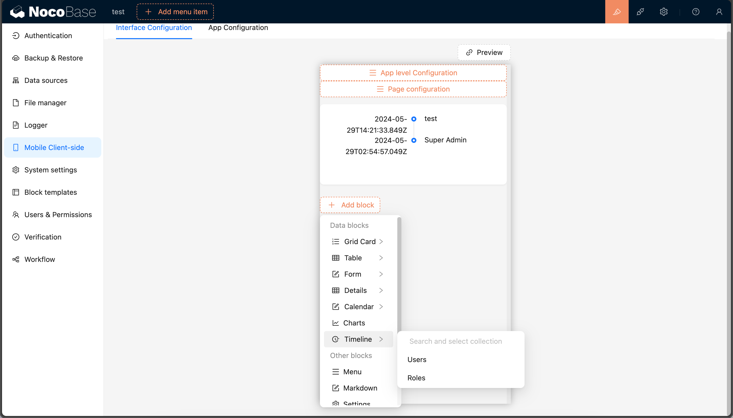
If you need more Add block, you can continue to add them, just need to know the corresponding name.

#8. Multi-language

#8.1 English

We edit packages/plugins/@nocobase-sample/plugin-initializer-block-data-modal/src/locale/en-US.json file:

{
  "Timeline": "Timeline",
  "Title Field": "Title Field",
  "Time Field": "Time Field"
}

#8.2 Chinese

We edit packages/plugins/@nocobase-sample/plugin-initializer-block-data-modal/src/locale/zh-CN.json file:

{
  "Timeline": "时间线",
  "Title Field": "标题字段",
  "Time Field": "时间字段"
}

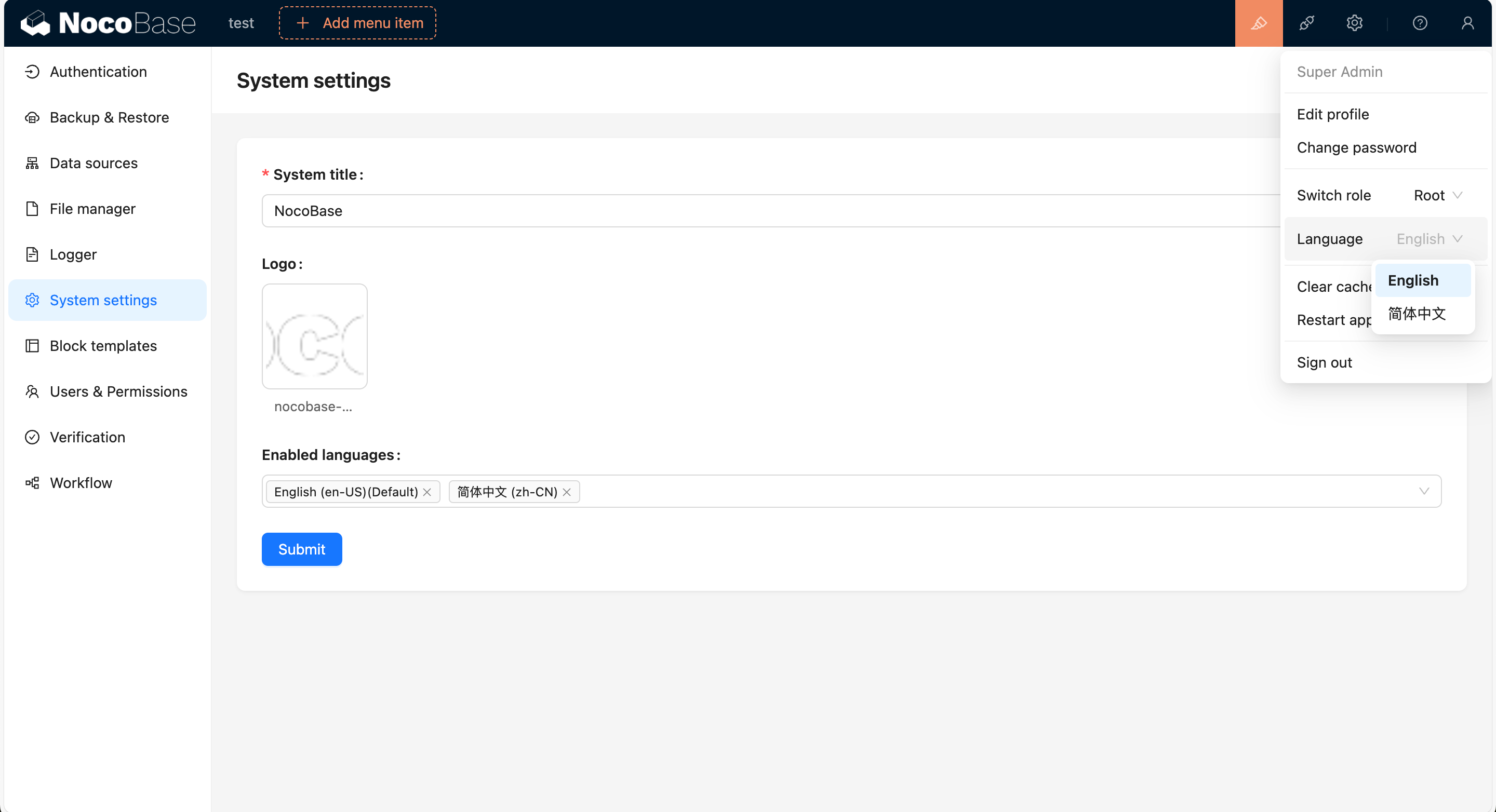
We can add multiple languages through http://localhost:13000/admin/settings/system-settings, and switch languages in the upper right corner.

20240611113758

#Packaging and Uploading to Production Environment

According to the Build and Package Plugin documentation, we can package the plugin and upload it to the production environment.

If you cloned the source code, you need to execute a full build first to build the plugin's dependencies as well.

yarn build

If you used create-nocobase-app to create the project, you can directly execute:

yarn build @nocobase-sample/plugin-initializer-block-data-modal --tar

This way you can see the storage/tar/@nocobase-sample/plugin-initializer-block-data-modal.tar.gz file, and then install it by uploading.