TIP
यह दस्तावेज़ AI द्वारा अनुवादित किया गया है। किसी भी अशुद्धि के लिए, कृपया अंग्रेजी संस्करण देखें
#स्टाइल और थीम
NocoBase की डायनामिक थीम क्षमताओं को बेहतर ढंग से अपनाने के लिए, प्लगइन में स्टाइल लिखने के लिए antd-style का उपयोग करने की सलाह दी जाती है। इसे मौजूदा थीम टोकन के साथ जोड़कर थीम की डायनामिक क्षमताओं को संभाला जा सकता है। साथ ही, NocoBase स्टाइल को आसानी से एडजस्ट करने के लिए एक थीम एडिटर प्लगइन भी प्रदान करता है।
#स्टाइल लिखना
#createStyles का उपयोग करके स्टाइल लिखें (अनुशंसित)
import { createStyles } from 'antd-style';

const useStyles = createStyles(({ token, css }) => ({
  // 支持 css object 的写法
  container: {
    backgroundColor: token.colorBgLayout,
    borderRadius: token.borderRadiusLG,
    maxWidth: 400,
    width: '100%',
    height: 180,
    display: 'flex',
    alignItems: 'center',
    justifyContent: 'center',
    flexDirection: 'column',
    marginLeft: 'auto',
    marginRight: 'auto',
  },
  // 也支持通过 css 字符串模板获得和 普通 css 一致的书写体验
  card: css`
    color: ${token.colorTextTertiary};
    box-shadow: ${token.boxShadow};
    &:hover {
      color: ${token.colorTextSecondary};
      box-shadow: ${token.boxShadowSecondary};
    }

    padding: ${token.padding}px;
    border-radius: ${token.borderRadius}px;
    background: ${token.colorBgContainer};
    transition: all 100ms ${token.motionEaseInBack};

    margin-bottom: 8px;
    cursor: pointer;
  `,
}));

export default () => {
  // styles 对象在 useStyles 方法中默认会被缓存,所以不用担心 re-render 问题
  const { styles, cx, theme } = useStyles();

  return (
    // 使用 cx 可以组织 className
    <div
      className={cx('a-simple-create-style-demo-classname', styles.container)}
    >
      <div className={styles.card}>createStyles Demo</div>
      {/* theme 对象包含了所有的 token 与主题等信息 */}
      <div>当前主题模式:{theme.appearance}</div>
    </div>
  );
};
विस्तृत उपयोग के लिए, createStyles API देखें।
#एक पुन: प्रयोज्य स्टाइल बनाने के लिए createStylish का उपयोग करना
import { createStyles, createStylish, css } from 'antd-style';

const useStylish = createStylish(({ token, css }) => {
  const containerBgHover = css`
    cursor: pointer;
    transition: 150ms background-color ease-in-out;
    &:hover {
      background: ${token.colorFillQuaternary};
    }
  `;

  const defaultButtonBase = css`
    color: ${token.colorTextSecondary};
    background: ${token.colorFillQuaternary};
    border-color: transparent;
  `;

  return {
    defaultButton: css`
      ${defaultButtonBase};

      &:hover {
        color: ${token.colorText};
        background: ${token.colorFillSecondary};
        border-color: transparent;
      }
      &:focus {
        ${defaultButtonBase};
        border-color: ${token.colorPrimary};
      }
    `,

    containerBgHover: css`
      cursor: pointer;
      transition: 150ms background-color ease-in-out;

      &:hover {
        background: ${token.colorFillQuaternary};
      }
    `,

    containerBgL2: css`
      ${containerBgHover};
      border-radius: 4px;
      background: ${token.colorFillQuaternary};

      &:hover {
        background: ${token.colorFillTertiary};
      }
    `,
  };
});

const useStyles = createStyles({
  // 支持 css object 的写法
  container: {
    backgroundColor: '#f5f5f5',
    maxWidth: 400,
    width: '100%',
    height: 180,
    display: 'flex',
    alignItems: 'center',
    justifyContent: 'center',
  },
  // 也支持通过 css 字符串模板获得和 普通 css 一致的书写体验
  btn: css`
    padding: 24px;
  `,
});

export default () => {
  const { styles, cx } = useStyles();
  const stylish = useStylish();

  return (
    <div className={styles.container}>
      <div className={cx(styles.btn, stylish.defaultButton)}>
        stylish Button
      </div>
    </div>
  );
};
विस्तृत उपयोग के लिए, createStylish API देखें।
#ग्लोबल स्टाइल इंजेक्ट करने के लिए createGlobalStyle का उपयोग करना
import { createGlobalStyle } from 'antd-style';

const Global = createGlobalStyle`
  .some-class {
    color: hotpink;
  }
`;

export default () => {
  return (
    <div>
      <Global />
      <div className="some-class">猛男最喜欢的颜色</div>
    </div>
  );
};
विस्तृत उपयोग के लिए, createGlobalStyle API देखें।
#थीम कस्टमाइज़ करना
#antd के थीम टोकन का उपयोग करना
createStyles उदाहरण
import { SmileOutlined } from '@ant-design/icons';
import { Button, Space } from 'antd';
import { createStyles } from 'antd-style';

const useStyles = createStyles(({ token, css }) => {
  const commonCard = css`
    border-radius: ${token.borderRadiusLG}px;
    padding: ${token.paddingLG}px;
  `;

  return {
    container: css`
      background-color: ${token.colorBgLayout};
      padding: 24px;
    `,

    primaryCard: css`
      ${commonCard};
      background: ${token.colorPrimary};
      color: ${token.colorTextLightSolid};
    `,

    defaultCard: css`
      ${commonCard};
      background: ${token.colorBgContainer};
      color: ${token.colorText};
    `,
  };
});

const App = () => {
  const { styles } = useStyles();

  return (
    <div className={styles.container}>
      <Space direction={'vertical'} style={{ width: '100%' }} size={16}>
        <Space>
          <Button title={'功能按钮的说明'} icon={<SmileOutlined />} />
          操作按钮
        </Space>
        <div className={styles.defaultCard}>普通卡片</div>
        <div className={styles.primaryCard}>主要卡片</div>
      </Space>
    </div>
  );
};

export default App;
createGlobalStyle उदाहरण
import { createGlobalStyle, ThemeProvider } from 'antd-style';

const Global = createGlobalStyle`
  .ant-custom-button {
    color: ${(p) => p.theme.colorPrimary};
    background: ${(p) => p.theme.colorPrimaryBg};
    height: ${(p) => p.theme.controlHeight}px;
    border-radius: ${(p) => p.theme.borderRadius}px;
    padding: 0 ${(p) => p.theme.paddingContentHorizontal}px;

    :hover {
      background: ${(p) => p.theme.colorPrimaryBgHover};
      color: ${(p) => p.theme.colorPrimaryTextActive};
    }

    :active {
      background: ${(p) => p.theme.colorPrimaryBorder};
      color: ${(p) => p.theme.colorPrimaryText};
    }

    border: none;
    cursor: pointer;
  }
`;

export default () => {
  return (
    <ThemeProvider>
      <Global />
      <button className="ant-custom-button">antd 中不存在的按钮</button>
    </ThemeProvider>
  );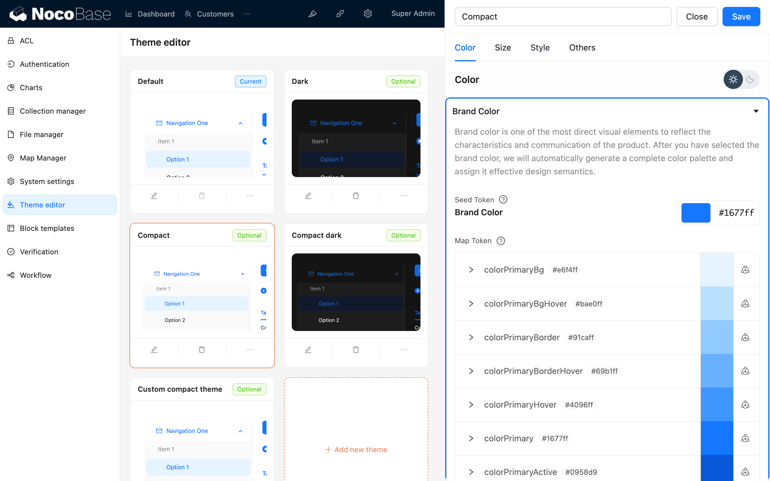
};#थीम डीबग करना
#थीम एडिटर प्लगइन का उपयोग करना