KI-Übersetzungshinweis
Diese Dokumentation wurde automatisch von KI übersetzt.
#Stile & Themes
Um die dynamischen Theme-Fähigkeiten von NocoBase optimal zu nutzen, empfehlen wir in Plugins die Verwendung von antd-style zum Schreiben von Stilen. In Kombination mit den bestehenden Theme-Tokens können Sie die dynamischen Theme-Fähigkeiten steuern. NocoBase bietet außerdem ein Theme-Editor-Plugin an, mit dem Sie Stile bequem anpassen können.
#Stile schreiben
#Stile mit createStyles schreiben (Empfohlen)
import { createStyles } from 'antd-style';

const useStyles = createStyles(({ token, css }) => ({
  // Unterstützt die CSS-Objekt-Syntax
  container: {
    backgroundColor: token.colorBgLayout,
    borderRadius: token.borderRadiusLG,
    maxWidth: 400,
    width: '100%',
    height: 180,
    display: 'flex',
    alignItems: 'center',
    justifyContent: 'center',
    flexDirection: 'column',
    marginLeft: 'auto',
    marginRight: 'auto',
  },
  // Ebenso werden CSS-String-Templates unterstützt, um ein konsistentes Schreiberlebnis wie bei regulärem CSS zu ermöglichen.
  card: css`
    color: ${token.colorTextTertiary};
    box-shadow: ${token.boxShadow};
    &:hover {
      color: ${token.colorTextSecondary};
      box-shadow: ${token.boxShadowSecondary};
    }

    padding: ${token.padding}px;
    border-radius: ${token.borderRadius}px;
    background: ${token.colorBgContainer};
    transition: all 100ms ${token.motionEaseInBack};

    margin-bottom: 8px;
    cursor: pointer;
  `,
}));

export default () => {
  // Das styles-Objekt wird in der useStyles-Methode standardmäßig gecacht, sodass Sie sich keine Sorgen um Re-Render-Probleme machen müssen.
  const { styles, cx, theme } = useStyles();

  return (
    // Verwenden Sie cx, um className zu organisieren.
    <div
      className={cx('a-simple-create-style-demo-classname', styles.container)}
    >
      <div className={styles.card}>createStyles Demo</div>
      {/* Das theme-Objekt enthält alle Tokens und Theme-Informationen. */}
      <div>Aktueller Theme-Modus: {theme.appearance}</div>
    </div>
  );
};
Eine detaillierte Anleitung finden Sie in der createStyles API.
#Wiederverwendbare Stile mit createStylish erstellen
import { createStyles, createStylish, css } from 'antd-style';

const useStylish = createStylish(({ token, css }) => {
  const containerBgHover = css`
    cursor: pointer;
    transition: 150ms background-color ease-in-out;
    &:hover {
      background: ${token.colorFillQuaternary};
    }
  `;

  const defaultButtonBase = css`
    color: ${token.colorTextSecondary};
    background: ${token.colorFillQuaternary};
    border-color: transparent;
  `;

  return {
    defaultButton: css`
      ${defaultButtonBase};

      &:hover {
        color: ${token.colorText};
        background: ${token.colorFillSecondary};
        border-color: transparent;
      }
      &:focus {
        ${defaultButtonBase};
        border-color: ${token.colorPrimary};
      }
    `,

    containerBgHover: css`
      cursor: pointer;
      transition: 150ms background-color ease-in-out;

      &:hover {
        background: ${token.colorFillQuaternary};
      }
    `,

    containerBgL2: css`
      ${containerBgHover};
      border-radius: 4px;
      background: ${token.colorFillQuaternary};

      &:hover {
        background: ${token.colorFillTertiary};
      }
    `,
  };
});

const useStyles = createStyles({
  // Unterstützt die CSS-Objekt-Syntax
  container: {
    backgroundColor: '#f5f5f5',
    maxWidth: 400,
    width: '100%',
    height: 180,
    display: 'flex',
    alignItems: 'center',
    justifyContent: 'center',
  },
  // Ebenso werden CSS-String-Templates unterstützt, um ein konsistentes Schreiberlebnis wie bei regulärem CSS zu ermöglichen.
  btn: css`
    padding: 24px;
  `,
});

export default () => {
  const { styles, cx } = useStyles();
  const stylish = useStylish();

  return (
    <div className={styles.container}>
      <div className={cx(styles.btn, stylish.defaultButton)}>
        stylish Button
      </div>
    </div>
  );
};
Eine detaillierte Anleitung finden Sie in der createStylish API.
#Globale Stile mit createGlobalStyle injizieren
import { createGlobalStyle } from 'antd-style';

const Global = createGlobalStyle`
  .some-class {
    color: hotpink;
  }
`;

export default () => {
  return (
    <div>
      <Global />
      <div className="some-class">Global gestylter Text</div>
    </div>
  );
};
Eine detaillierte Anleitung finden Sie in der createGlobalStyle API.
#Themes anpassen
#Verwendung von antds Theme-Tokens
createStyles-Beispiel
import { SmileOutlined } from '@ant-design/icons';
import { Button, Space } from 'antd';
import { createStyles } from 'antd-style';

const useStyles = createStyles(({ token, css }) => {
  const commonCard = css`
    border-radius: ${token.borderRadiusLG}px;
    padding: ${token.paddingLG}px;
  `;

  return {
    container: css`
      background-color: ${token.colorBgLayout};
      padding: 24px;
    `,

    primaryCard: css`
      ${commonCard};
      background: ${token.colorPrimary};
      color: ${token.colorTextLightSolid};
    `,

    defaultCard: css`
      ${commonCard};
      background: ${token.colorBgContainer};
      color: ${token.colorText};
    `,
  };
});

const App = () => {
  const { styles } = useStyles();

  return (
    <div className={styles.container}>
      <Space direction={'vertical'} style={{ width: '100%' }} size={16}>
        <Space>
          <Button title={'Beschreibung für den Funktions-Button'} icon={<SmileOutlined />} />
          Aktions-Button
        </Space>
        <div className={styles.defaultCard}>Standard-Karte</div>
        <div className={styles.primaryCard}>Primäre Karte</div>
      </Space>
    </div>
  );
};

export default App;createGlobalStyle-Beispiel
import { createGlobalStyle, ThemeProvider } from 'antd-style';

const Global = createGlobalStyle`
  .ant-custom-button {
    color: ${(p) => p.theme.colorPrimary};
    background: ${(p) => p.theme.colorPrimaryBg};
    height: ${(p) => p.theme.controlHeight}px;
    border-radius: ${(p) => p.theme.borderRadius}px;
    padding: 0 ${(p) => p.theme.paddingContentHorizontal}px;

    :hover {
      background: ${(p) => p.theme.colorPrimaryBgHover};
      color: ${(p) => p.theme.colorPrimaryTextActive};
    }

    :active {
      background: ${(p) => p.theme.colorPrimaryBorder};
      color: ${(p) => p.theme.colorPrimaryText};
    }

    border: none;
    cursor: pointer;
  }
`;

export default () => {
  return (
    <ThemeProvider>
      <Global />
      <button className="ant-custom-button">Ein Button, der in antd nicht existiert</button>
    </ThemeProvider>
  );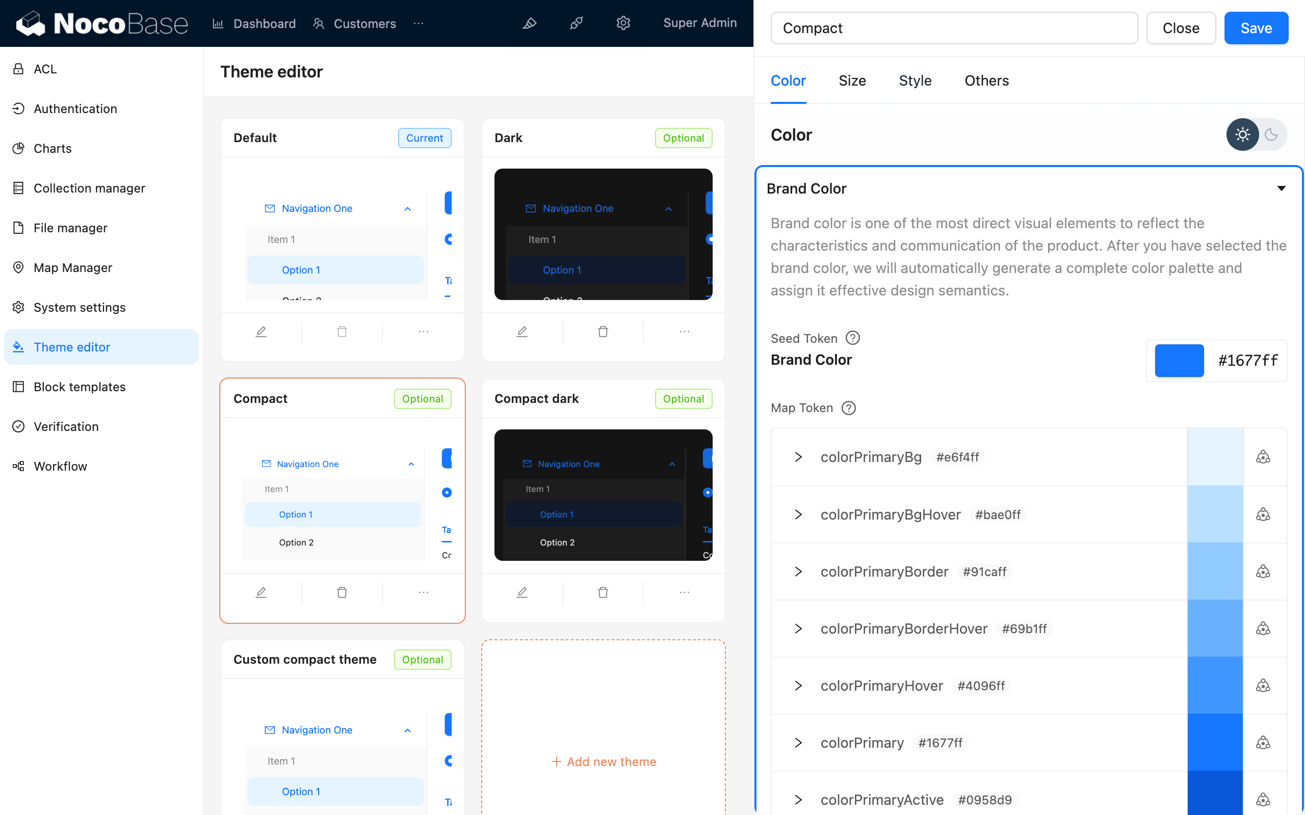
};#Themes debuggen
#Verwendung des Theme-Editor-Plugins