logologo
Bắt đầu
Hướng dẫn
Phát triển
Plugin
API
English
简体中文
日本語
한국어
Deutsch
Français
Español
Português
Русский
Italiano
Türkçe
Українська
Tiếng Việt
Bahasa Indonesia
ไทย
Polski
Nederlands
Čeština
العربية
עברית
हिन्दी
Svenska
Bắt đầu
Hướng dẫn
Phát triển
Plugin
API
logologo

Bắt đầu nhanh

Tổng quan phát triển plugin
Viết plugin đầu tiên
Cấu trúc thư mục dự án

Phát triển phía server

Tổng quan
Plugin
Collections (Bảng dữ liệu)
Thao tác Database
Quản lý DataSourceManager
Quản lý ResourceManager
Kiểm soát quyền ACL
Middleware
Cache
Event
Ngữ cảnh yêu cầu (Context)
Script nâng cấp (Migration)
Logger (Nhật ký)
I18n (Quốc tế hóa)
Command (Dòng lệnh)
Quản lý tác vụ định kỳ (CronJobManager)
Test

Phát triển phía client

Tổng quan
Plugin
Ngữ cảnh (Context)
Router
Kiểm soát quyền ACL
Quản lý DataSourceManager
Resource
Request
Styles & Themes
Logger (Nhật ký)
I18n (Quốc tế hóa)
Test

Khác

Hướng dẫn nâng cấp plugin
Danh sách ngôn ngữ
Quản lý phụ thuộc
Build
Previous PageRequest
Next PageLogger (Nhật ký)
TIP

Tài liệu này được dịch bởi AI. Đối với bất kỳ thông tin không chính xác nào, vui lòng tham khảo phiên bản tiếng Anh

#Kiểu dáng & Chủ đề

Để thích ứng tốt hơn với khả năng chủ đề động của NocoBase, trong các plugin, chúng tôi khuyến nghị sử dụng antd-style để viết kiểu dáng. Việc này kết hợp với theme token hiện có sẽ giúp xử lý các khả năng động của chủ đề. Đồng thời, NocoBase cũng cung cấp plugin Trình chỉnh sửa Chủ đề để quý vị có thể điều chỉnh kiểu dáng một cách tiện lợi.

#Viết kiểu dáng

#Sử dụng createStyles để viết kiểu dáng (Khuyến nghị)

import { createStyles } from 'antd-style';

const useStyles = createStyles(({ token, css }) => ({
  // Hỗ trợ cú pháp đối tượng css
  container: {
    backgroundColor: token.colorBgLayout,
    borderRadius: token.borderRadiusLG,
    maxWidth: 400,
    width: '100%',
    height: 180,
    display: 'flex',
    alignItems: 'center',
    justifyContent: 'center',
    flexDirection: 'column',
    marginLeft: 'auto',
    marginRight: 'auto',
  },
  // Cũng hỗ trợ các mẫu chuỗi css để có trải nghiệm viết nhất quán như css thông thường
  card: css`
    color: ${token.colorTextTertiary};
    box-shadow: ${token.boxShadow};
    &:hover {
      color: ${token.colorTextSecondary};
      box-shadow: ${token.boxShadowSecondary};
    }

    padding: ${token.padding}px;
    border-radius: ${token.borderRadius}px;
    background: ${token.colorBgContainer};
    transition: all 100ms ${token.motionEaseInBack};

    margin-bottom: 8px;
    cursor: pointer;
  `,
}));

export default () => {
  // Đối tượng styles được lưu vào bộ nhớ đệm theo mặc định trong phương thức useStyles, vì vậy không cần lo lắng về vấn đề re-render
  const { styles, cx, theme } = useStyles();

  return (
    // Sử dụng cx để tổ chức className
    <div
      className={cx('a-simple-create-style-demo-classname', styles.container)}
    >
      <div className={styles.card}>createStyles Demo</div>
      {/* Đối tượng theme chứa tất cả các token và thông tin chủ đề */}
      <div>Chế độ chủ đề hiện tại: {theme.appearance}</div>
    </div>
  );
};

Để biết chi tiết cách sử dụng, vui lòng tham khảo API của createStyles

#Sử dụng createStylish để tạo kiểu dáng có thể tái sử dụng

import { createStyles, createStylish, css } from 'antd-style';

const useStylish = createStylish(({ token, css }) => {
  const containerBgHover = css`
    cursor: pointer;
    transition: 150ms background-color ease-in-out;
    &:hover {
      background: ${token.colorFillQuaternary};
    }
  `;

  const defaultButtonBase = css`
    color: ${token.colorTextSecondary};
    background: ${token.colorFillQuaternary};
    border-color: transparent;
  `;

  return {
    defaultButton: css`
      ${defaultButtonBase};

      &:hover {
        color: ${token.colorText};
        background: ${token.colorFillSecondary};
        border-color: transparent;
      }
      &:focus {
        ${defaultButtonBase};
        border-color: ${token.colorPrimary};
      }
    `,

    containerBgHover: css`
      cursor: pointer;
      transition: 150ms background-color ease-in-out;

      &:hover {
        background: ${token.colorFillQuaternary};
      }
    `,

    containerBgL2: css`
      ${containerBgHover};
      border-radius: 4px;
      background: ${token.colorFillQuaternary};

      &:hover {
        background: ${token.colorFillTertiary};
      }
    `,
  };
});

const useStyles = createStyles({
  // Hỗ trợ cú pháp đối tượng css
  container: {
    backgroundColor: '#f5f5f5',
    maxWidth: 400,
    width: '100%',
    height: 180,
    display: 'flex',
    alignItems: 'center',
    justifyContent: 'center',
  },
  // Cũng hỗ trợ các mẫu chuỗi css để có trải nghiệm viết nhất quán như css thông thường
  btn: css`
    padding: 24px;
  `,
});

export default () => {
  const { styles, cx } = useStyles();
  const stylish = useStylish();

  return (
    <div className={styles.container}>
      <div className={cx(styles.btn, stylish.defaultButton)}>
        stylish Button
      </div>
    </div>
  );
};

Để biết chi tiết cách sử dụng, vui lòng tham khảo API của createStylish

#Sử dụng createGlobalStyle để thêm kiểu dáng toàn cục

import { createGlobalStyle } from 'antd-style';

const Global = createGlobalStyle`
  .some-class {
    color: hotpink;
  }
`;

export default () => {
  return (
    <div>
      <Global />
      <div className="some-class">Văn bản có kiểu dáng toàn cục</div>
    </div>
  );
};

Để biết chi tiết cách sử dụng, vui lòng tham khảo API của createGlobalStyle

#Tùy chỉnh chủ đề

#Sử dụng theme token của antd

Ví dụ về createStyles

import { SmileOutlined } from '@ant-design/icons';
import { Button, Space } from 'antd';
import { createStyles } from 'antd-style';

const useStyles = createStyles(({ token, css }) => {
  const commonCard = css`
    border-radius: ${token.borderRadiusLG}px;
    padding: ${token.paddingLG}px;
  `;

  return {
    container: css`
      background-color: ${token.colorBgLayout};
      padding: 24px;
    `,

    primaryCard: css`
      ${commonCard};
      background: ${token.colorPrimary};
      color: ${token.colorTextLightSolid};
    `,

    defaultCard: css`
      ${commonCard};
      background: ${token.colorBgContainer};
      color: ${token.colorText};
    `,
  };
});

const App = () => {
  const { styles } = useStyles();

  return (
    <div className={styles.container}>
      <Space direction={'vertical'} style={{ width: '100%' }} size={16}>
        <Space>
          <Button title={'Mô tả cho nút chức năng'} icon={<SmileOutlined />} />
          Nút thao tác
        </Space>
        <div className={styles.defaultCard}>Thẻ mặc định</div>
        <div className={styles.primaryCard}>Thẻ chính</div>
      </Space>
    </div>
  );
};

export default App;

Ví dụ về createGlobalStyle

import { createGlobalStyle, ThemeProvider } from 'antd-style';

const Global = createGlobalStyle`
  .ant-custom-button {
    color: ${(p) => p.theme.colorPrimary};
    background: ${(p) => p.theme.colorPrimaryBg};
    height: ${(p) => p.theme.controlHeight}px;
    border-radius: ${(p) => p.theme.borderRadius}px;
    padding: 0 ${(p) => p.theme.paddingContentHorizontal}px;

    :hover {
      background: ${(p) => p.theme.colorPrimaryBgHover};
      color: ${(p) => p.theme.colorPrimaryTextActive};
    }

    :active {
      background: ${(p) => p.theme.colorPrimaryBorder};
      color: ${(p) => p.theme.colorPrimaryText};
    }

    border: none;
    cursor: pointer;
  }
`;

export default () => {
  return (
    <ThemeProvider>
      <Global />
      <button className="ant-custom-button">Nút không tồn tại trong antd</button>
    </ThemeProvider>
  );
};

#Gỡ lỗi chủ đề

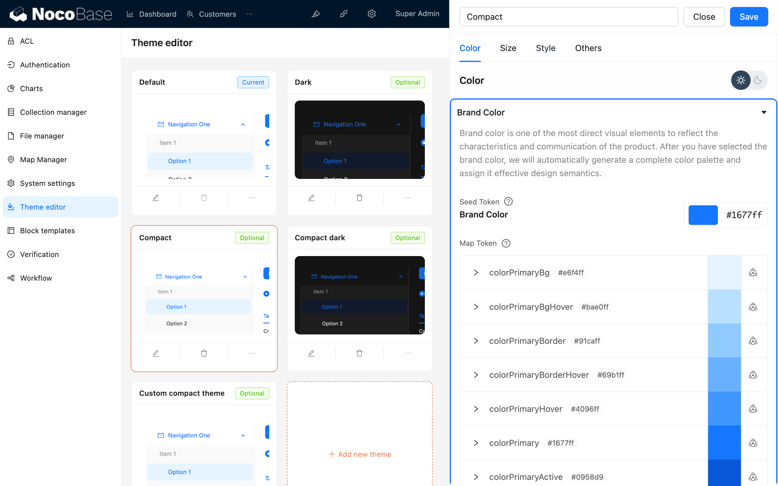
#Sử dụng plugin Trình chỉnh sửa Chủ đề

Trình chỉnh sửa Chủ đề