logologo
Get Started
Guide
Development
Plugins
API
English
简体中文
Get Started
Guide
Development
Plugins
API
English
简体中文
logologo
Overview
Quick Start

Features

Data Query
Chart Options
Preview and Save
Using Context Variables
Page Filters and Linkage

Advanced

Query Data in SQL Mode
Custom Chart Configuration
Custom Interaction Events
FAQ
Best Practices
Previous PageQuery Data in SQL Mode
Next PageCustom Interaction Events

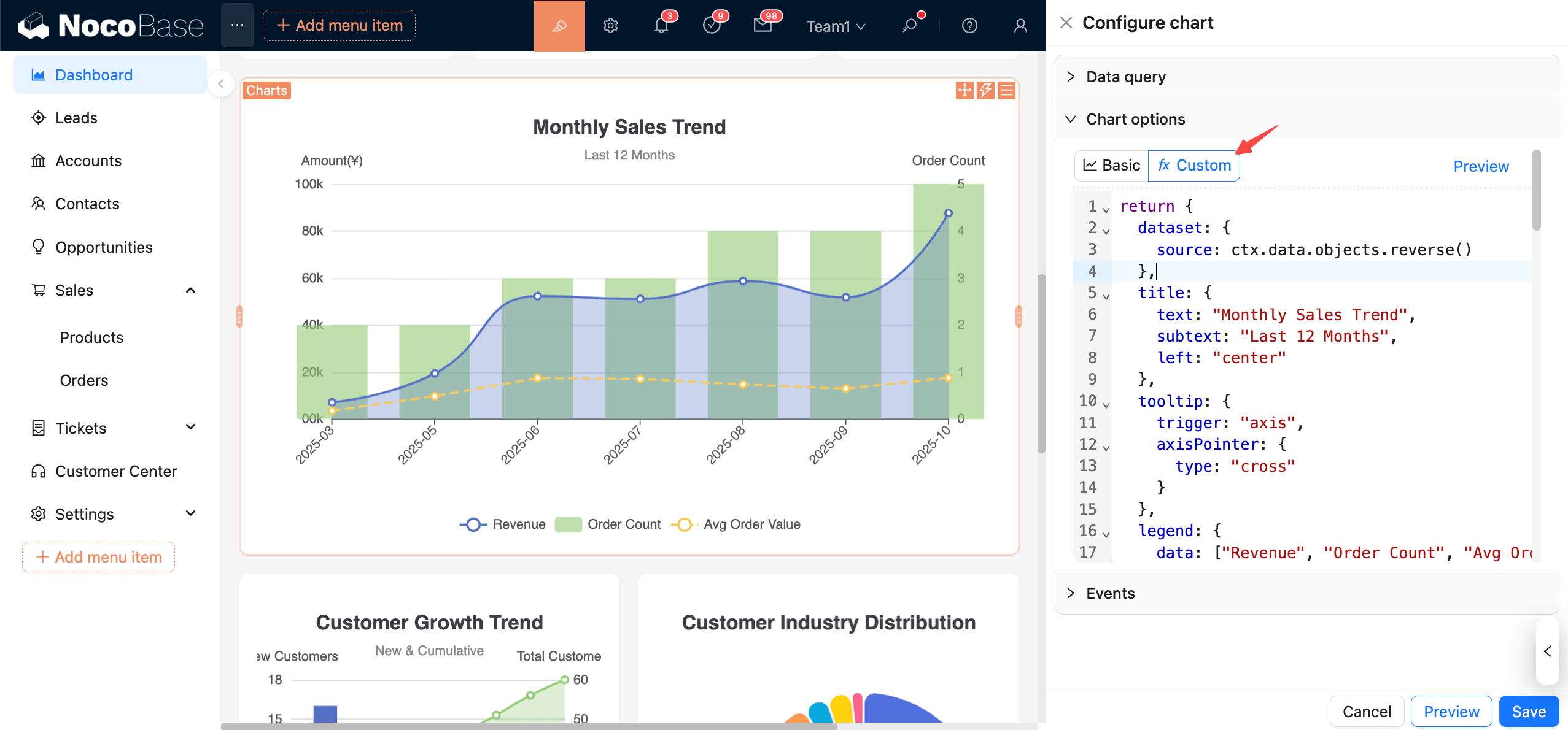
#Custom chart configuration

In Custom mode, configure charts by writing JS in the editor. Based on ctx.data, return a complete ECharts option. This suits merging multiple series, complex tooltips, and dynamic styles. In principle, all ECharts features and chart types are supported.

clipboard-image-1761524637

#Data context

  • ctx.data.objects: array of objects (each row as an object)
  • ctx.data.rows: 2D array (with header)
  • ctx.data.columns: 2D array grouped by columns

Recommended usage: Consolidate data in dataset.source. For detailed usage, please refer to the ECharts documentation:

Dataset

Axis

Examples

Let’s start with a simple example.

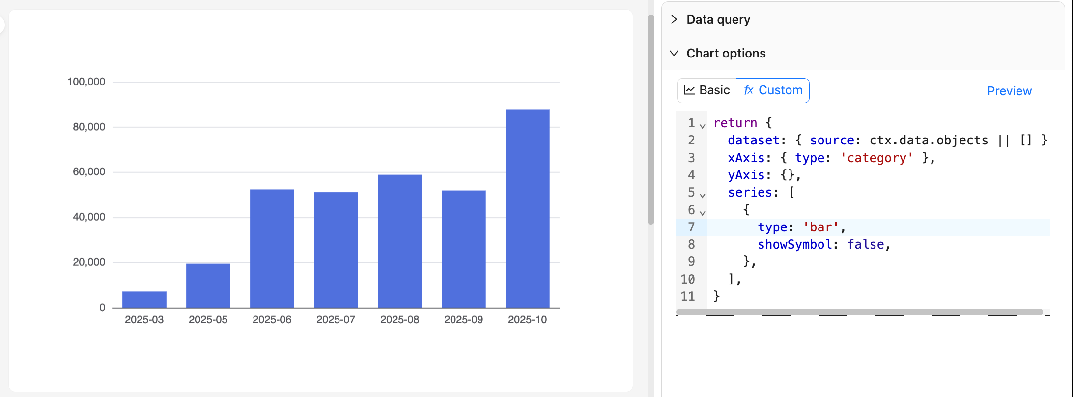
#Example 1: Monthly order bar chart

20251027082816

return {
  dataset: { source: ctx.data.objects || [] },
  xAxis: { type: 'category' },
  yAxis: {},
  series: [
    {
      type: 'bar',
      showSymbol: false,
    },
  ],
}

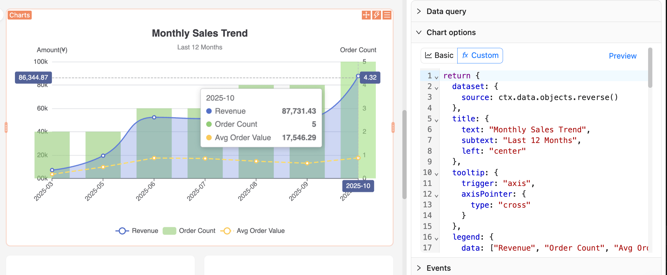
#Example 2: Sales trend chart

clipboard-image-1761525188

return {
  dataset: {
    source: ctx.data.objects.reverse()
  },
  title: {
    text: "Monthly Sales Trend",
    subtext: "Last 12 Months",
    left: "center"
  },
  tooltip: {
    trigger: "axis",
    axisPointer: {
      type: "cross"
    }
  },
  legend: {
    data: ["Revenue", "Order Count", "Avg Order Value"],
    bottom: 0
  },
  grid: {
    left: "5%",
    right: "5%",
    bottom: "60",
    top: "80",
    containLabel: true
  },
  xAxis: {
    type: "category",
    boundaryGap: false,
    axisLabel: {
      rotate: 45
    }
  },
  yAxis: [
    {
      type: "value",
      name: "Amount(¥)",
      position: "left",
      axisLabel: {
        formatter: (value) => {
          return (value/10000).toFixed(0) + '0k';
        }
      }
    },
    {
      type: "value",
      name: "Order Count",
      position: "right"
    }
  ],
  series: [
    {
      name: "Revenue",
      type: "line",
      smooth: true,
      encode: {
        x: "month",
        y: "monthly_revenue"
      },
      areaStyle: {
        opacity: 0.3
      },
      itemStyle: {
        color: "#5470c6"
      }
    },
    {
      name: "Order Count",
      type: "bar",
      yAxisIndex: 1,
      encode: {
        x: "month",
        y: "order_count"
      },
      itemStyle: {
        color: "#91cc75",
        opacity: 0.6
      }
    },
    {
      name: "Avg Order Value",
      type: "line",
      encode: {
        x: "month",
        y: "avg_order_value"
      },
      itemStyle: {
        color: "#fac858"
      },
      lineStyle: {
        type: "dashed"
      }
    }
  ]
}

Recommendations:

  • Keep a pure function style: generate option only from ctx.data and avoid side effects.
  • Changes to query column names affect indexing; standardize names and confirm in "View data" before editing code.
  • For large datasets, avoid complex synchronous computations in JS; aggregate during the query stage when necessary.

#More examples

For more usage examples, you can refer to the NocoBase Demo app.

You can also browse the official ECharts Examples to find your desired chart effect, then reference and copy the JS configuration code.

#Preview and Save

20251027083938

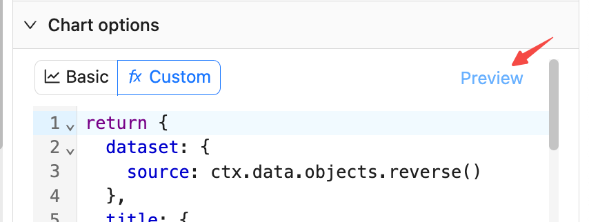
  • Click "Preview" on the right side or at the bottom to refresh the chart and validate the JS configuration.
  • Click "Save" to persist the current JS configuration to the database.
  • Click "Cancel" to revert to the last saved state.