

Chapter 7: Dashboard — The Big Picture at a Glance
In the last chapter, we used workflows to make the system send notifications and record timestamps automatically. The system is getting smarter, but we're still missing one thing — a bird's-eye view.
How many tickets are there? How many have been resolved? Which category has the most issues? How many new tickets come in each day? You can't answer these questions by scrolling through a list. We need a data dashboard — charts that turn raw data into something you can understand at a glance.
7.1 Adding a Dashboard Page
First, let's add a new menu item to the top navigation bar.
Enter configuration mode, click "Add menu item" (+ icon) on the top menu bar, select "Modern page (v2)", and name it "Dashboard."
This page is dedicated to charts — it's our dashboard home base.
7.2 Pie Chart: Ticket Status Distribution
For our first chart, we'll use a pie chart to show how many tickets are "Pending," "In Progress," and "Completed."
On the Dashboard page, click Add block → Chart.
After adding it, click the Configure button in the top-right corner of the block. A chart configuration panel will open on the right side.
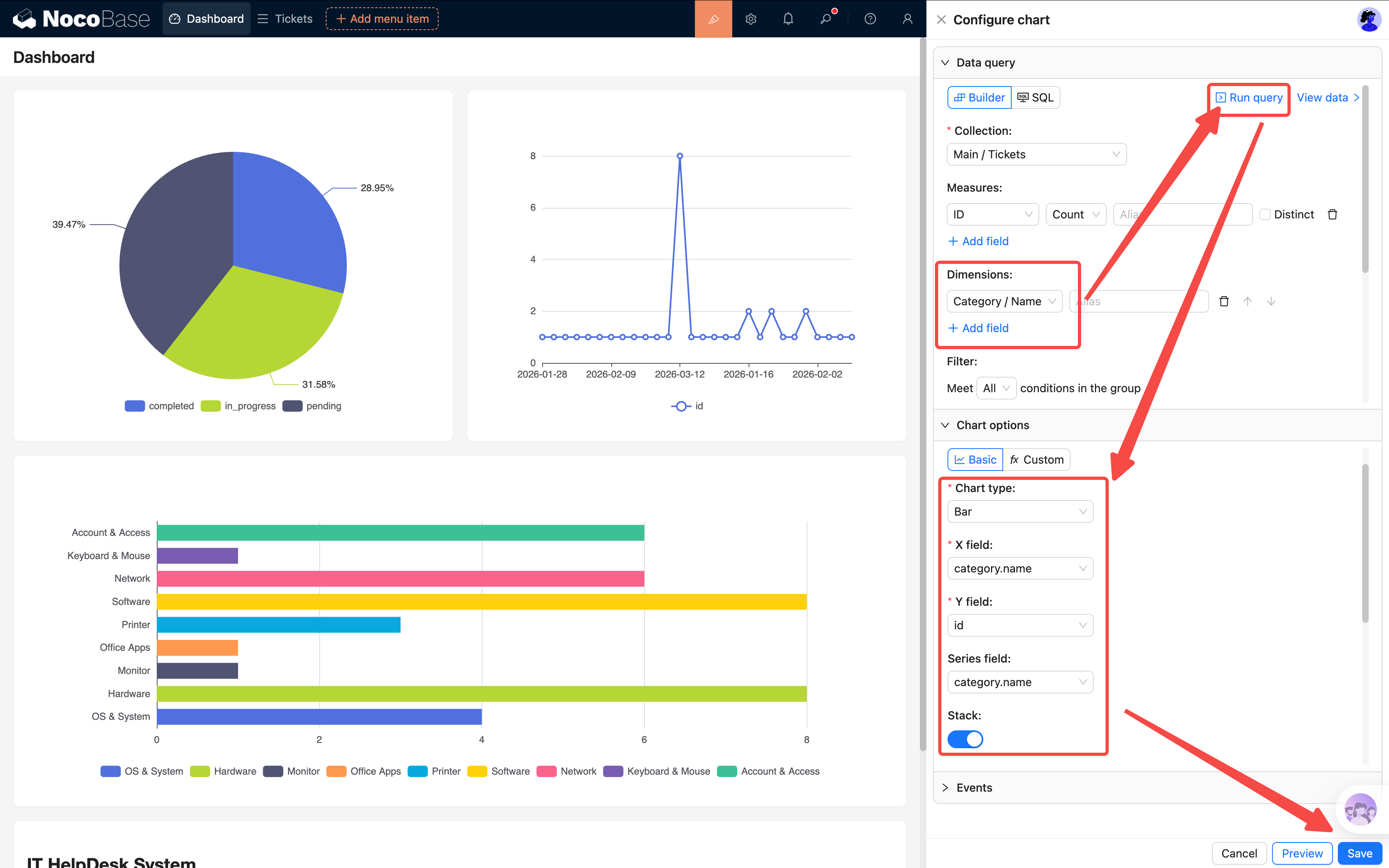
Configuring the Data Query
- Collection: Select "Tickets"
- Measures: Select any unique field (e.g., ID), set the aggregation to Count
- Dimensions: Select the "Status" field
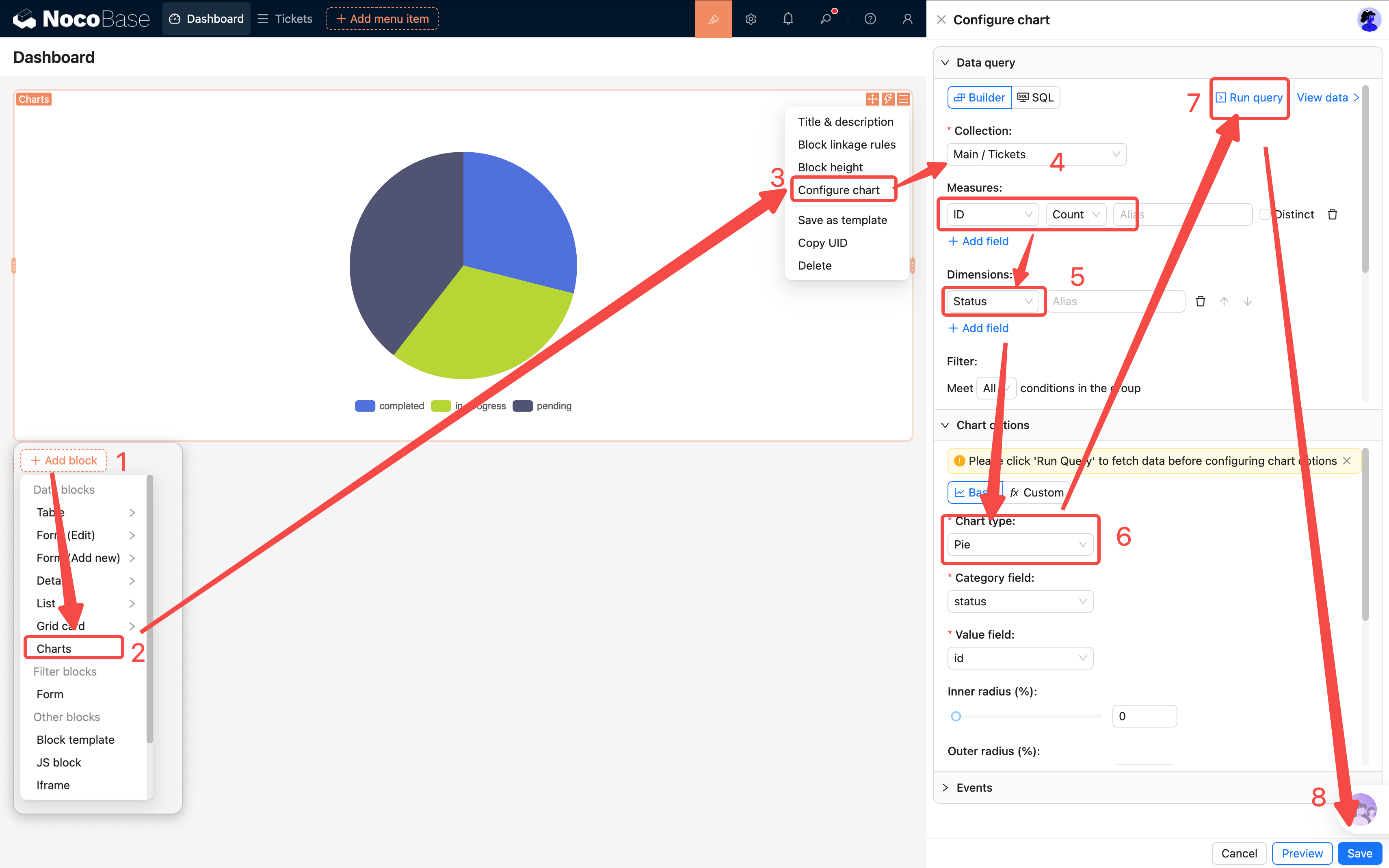
Click Run query to preview the returned data below.
Configuring Chart Options
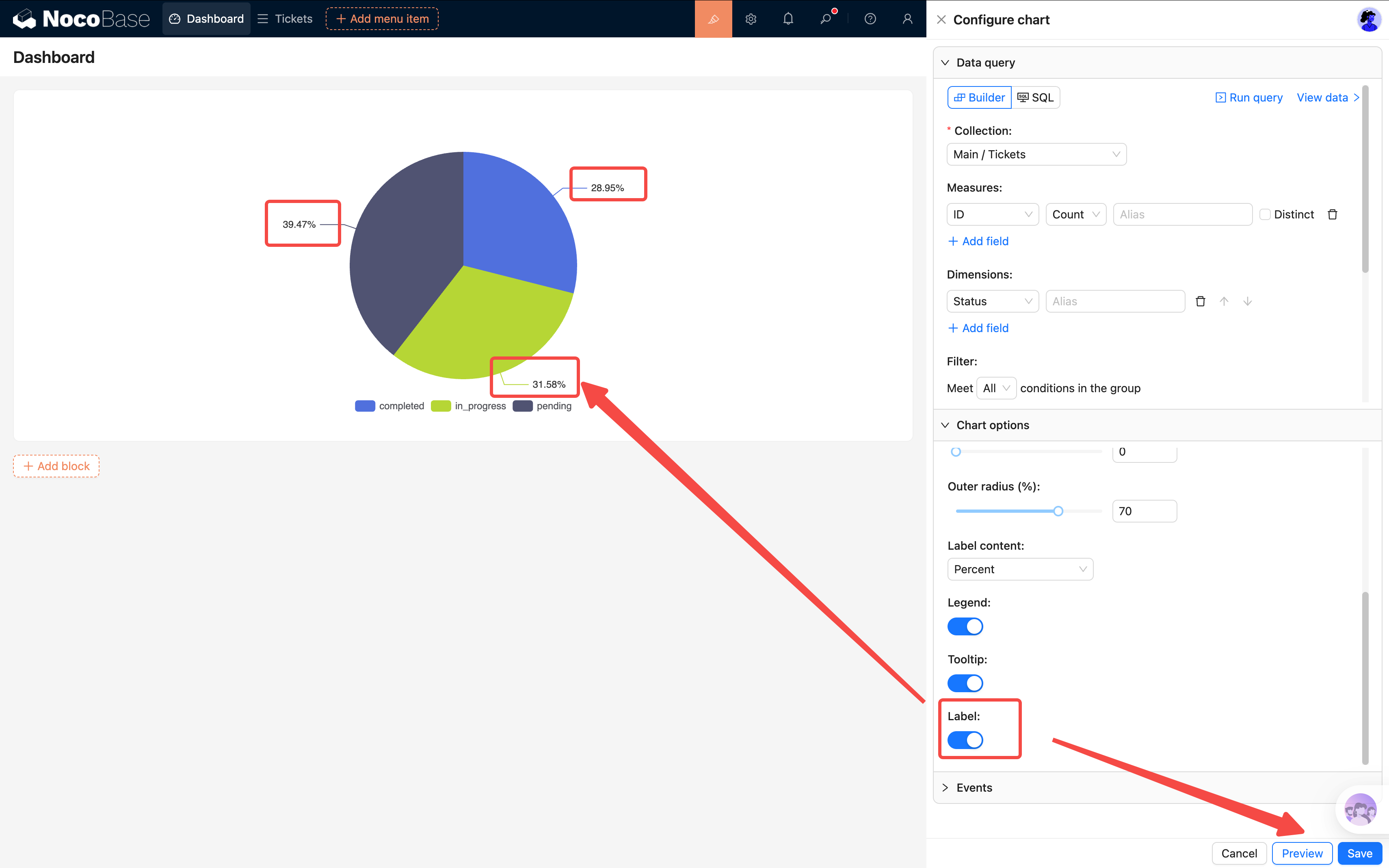
- Chart type: Select Pie
- Field mapping: Set Category to "Status" and Value to the count value
- Labels: Turn on the toggle
A nice-looking pie chart should now appear on the page. Each slice represents a status, showing the exact count and percentage by default.
Click Save — your first chart is done.
7.3 Line Chart: Daily New Ticket Trend
The pie chart shows "how things are distributed right now." A line chart shows "how things change over time."
Add another chart block to the page with the following configuration:
Data Query
- Collection: Select "Tickets"
- Measures: ID, Count
- Dimensions: Select the "Created at" field, set the format to YYYY-MM-DD (group by day)
Tip: The date dimension format matters. Choosing
YYYY-MM-DDgroups by day; choosingYYYY-MMgroups by month. Pick the right granularity based on your data volume.
Chart Options
- Chart type: Select Line
- Field mapping: Set xField to "Created at" and yField to the count value
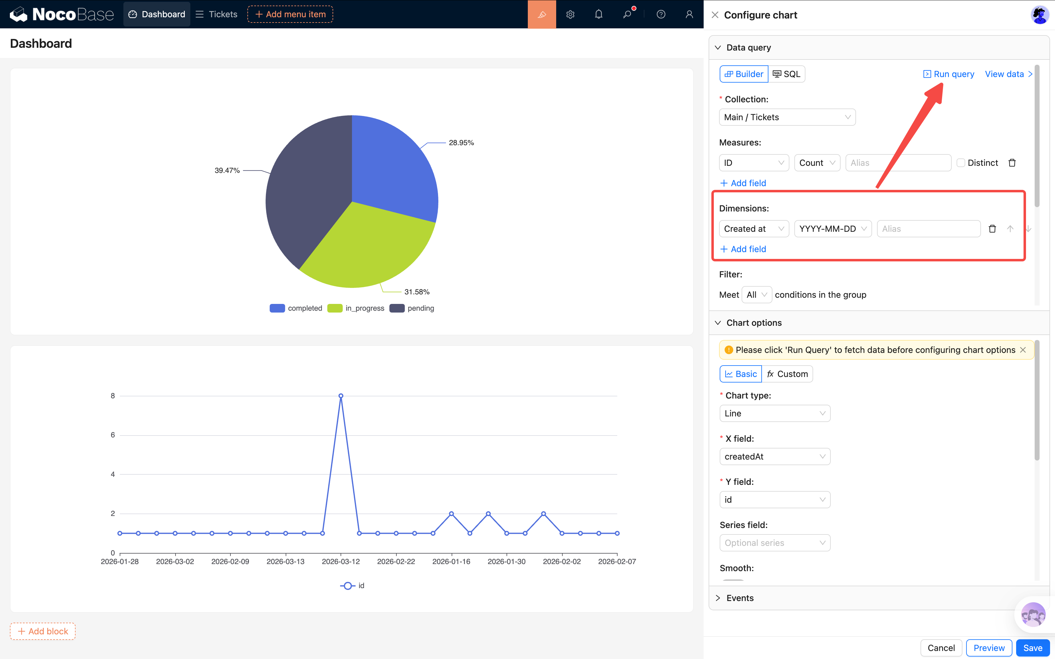
After saving, you'll see how ticket volume changes over time. If there's a sudden spike on a particular day, something happened worth looking into.
7.4 Bar Chart: Tickets by Category
For our third chart, let's see which category has the most tickets. We'll use a horizontal bar chart instead of a vertical column chart — when there are many categories, vertical X-axis labels tend to overlap and get hidden, so horizontal display is much clearer.
Add a third chart block:
Data Query
- Collection: Select "Tickets"
- Measures: ID Count
- Dimensions: Select the "Category" relation field (choose the category's Name field)
Chart Options
- Chart type: Select Bar
- Field mapping: Set xField to the count value (ID Count) and yField to "Category Name"
After saving, it's immediately clear which category has the most issues. If the "Network Failure" bar stretches far beyond the rest, maybe it's time to upgrade the network equipment.
7.5 Table Block: Unresolved Tickets
Charts give a summary view, but admins usually need to see specific details too. Let's add an Unresolved Tickets table that shows all tickets that haven't been completed yet.
Add a Table block to the page, selecting the "Tickets" collection.
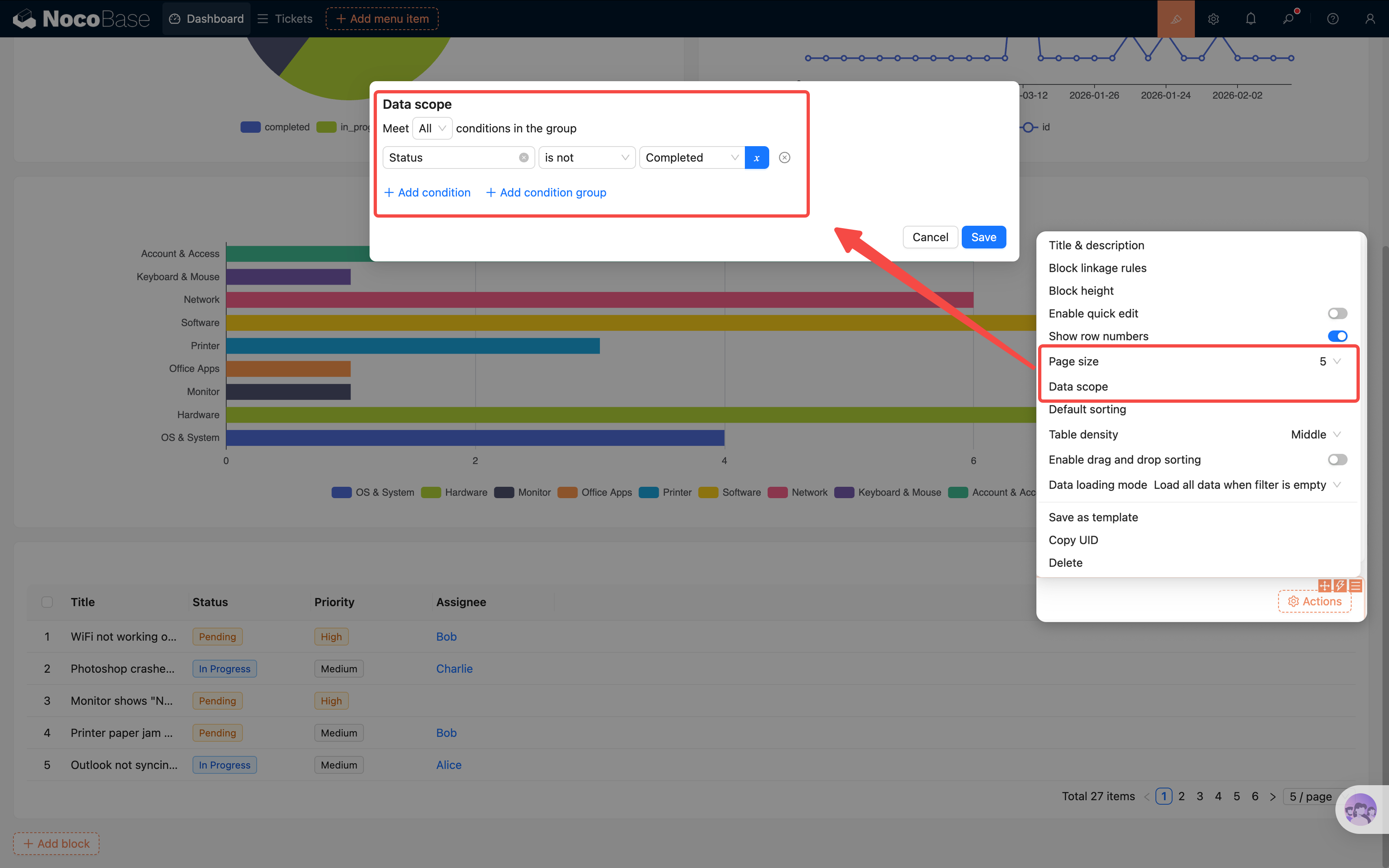
Configure Filter Conditions
Click the table block's settings and find Set data scope. Add a filter condition:
- Status is not equal to Completed
This way the table only shows unfinished tickets — once a ticket is completed, it automatically disappears from the list.
Configure Fields
Select the columns to display: Title, Status, Priority, Assignee, Created at.
Tip: You can also add a default sort (by Created at, descending) so the newest tickets appear at the top.
7.6 Markdown Block: System Announcements
Beyond charts, we can also put some text information on the dashboard.
Add a Markdown block and write a system announcement or usage instructions:
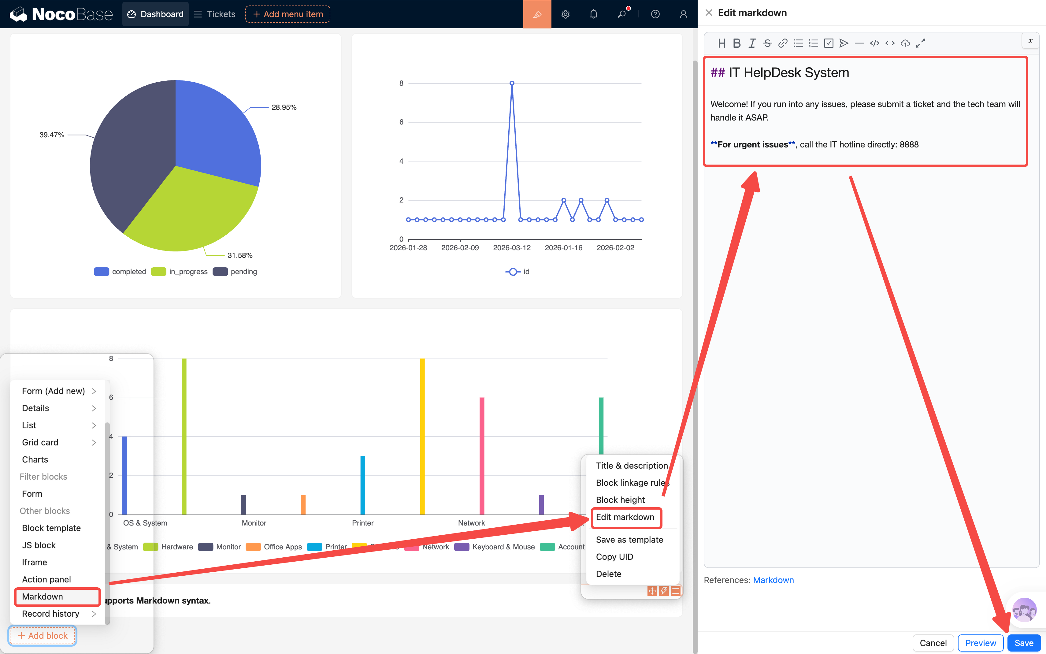
Place the Markdown block at the top of the dashboard — it works as both a welcome message and a bulletin board. The content can be updated anytime, making it very flexible.
7.7 JS Block: Personalized Welcome Banner
Markdown has a fairly fixed format — what if you want richer effects? NocoBase provides a JS Block (JavaScript Block) that lets you freely customize display content with code.
We'll use it to create a business-style welcome banner that shows a personalized greeting based on the current user and time of day.
Add a JS block to the page (Add block → Other blocks → JS block).
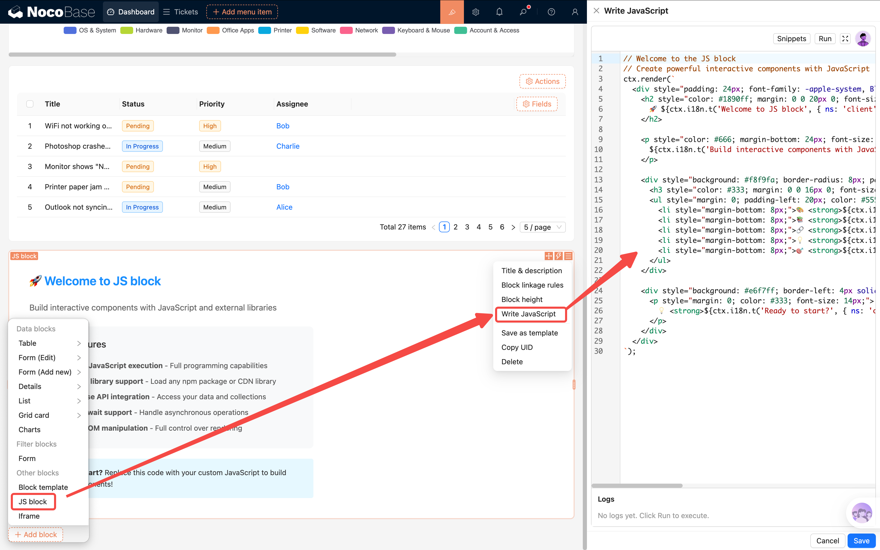
In the JS block, you can use {{ ctx.user.nickname }} to get the current user's display name. Here's a clean, business-style welcome banner:
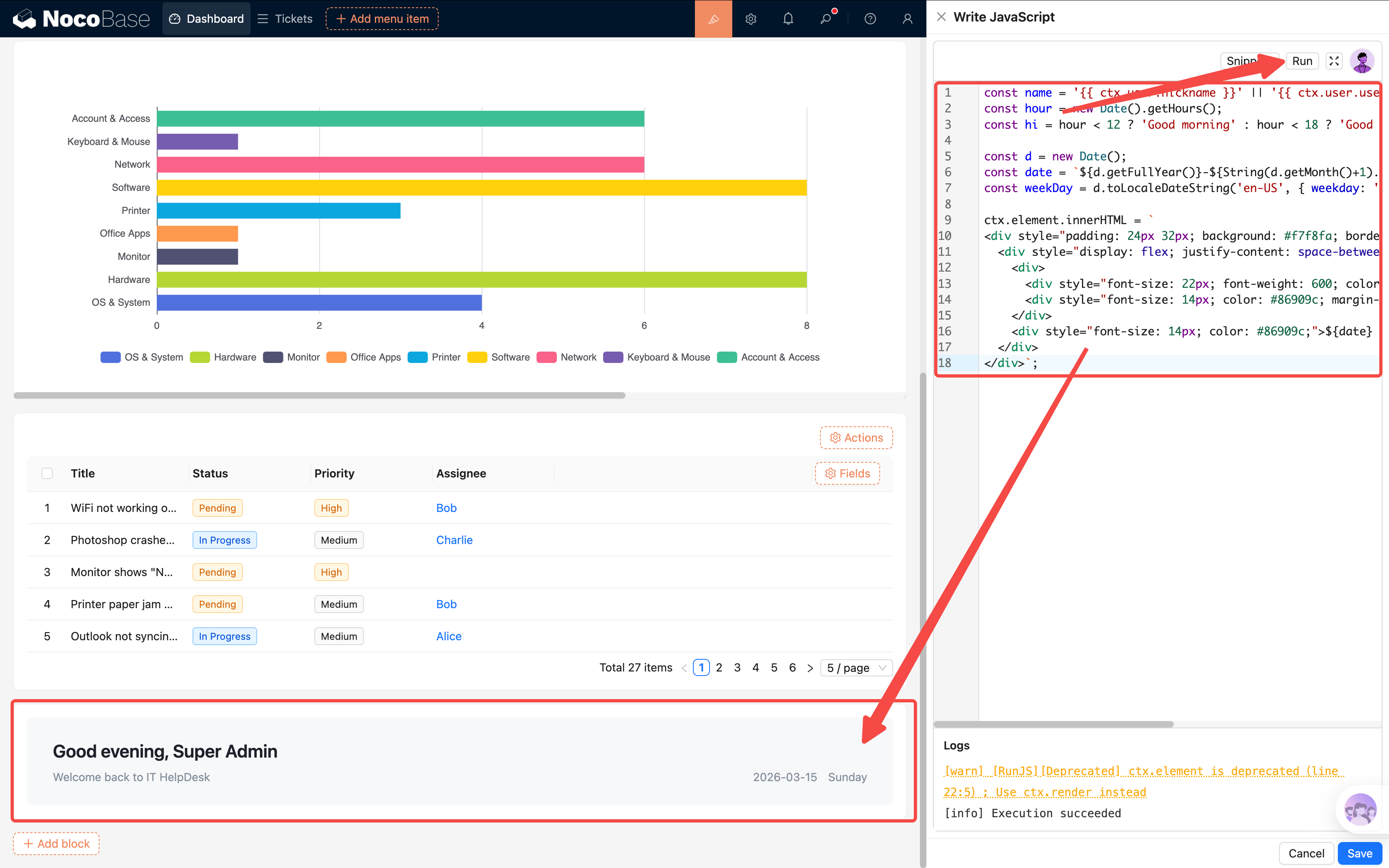
The result is a light gray card with the greeting on the left and date on the right. Clean, practical, and unobtrusive.
Tip:
{{ ctx.user.xxx }}is how you access current user info in JS blocks. Common fields includenickname,username, and
7.8 Action Panel: Quick Links + Popup Reuse
A dashboard isn't just for viewing data — it should also be a starting point for actions. Let's add an Action Panel so users can submit tickets and jump to the ticket list directly from the homepage.
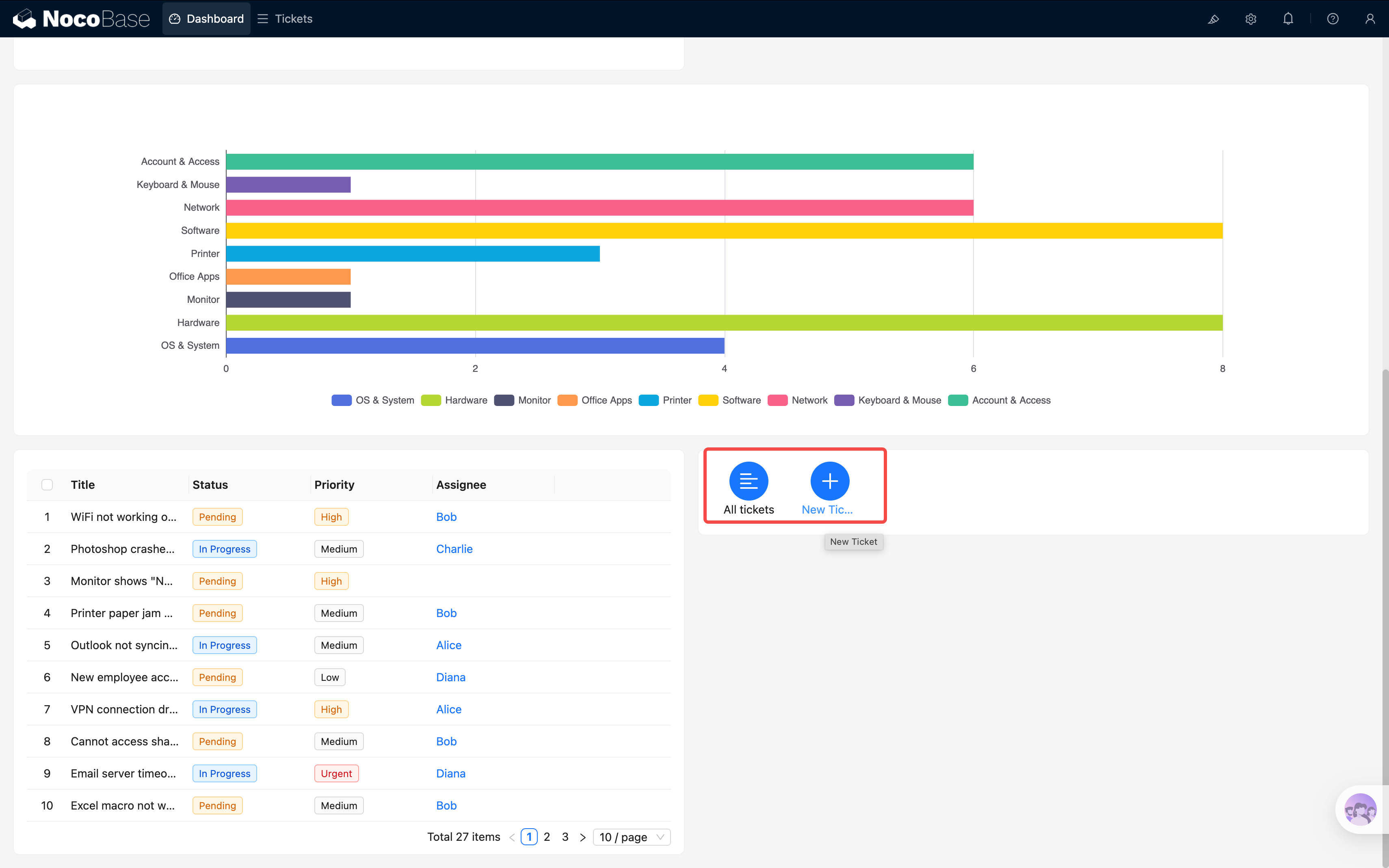
Add an Action Panel block (Add block → Other blocks → Action Panel), then add two actions inside it:
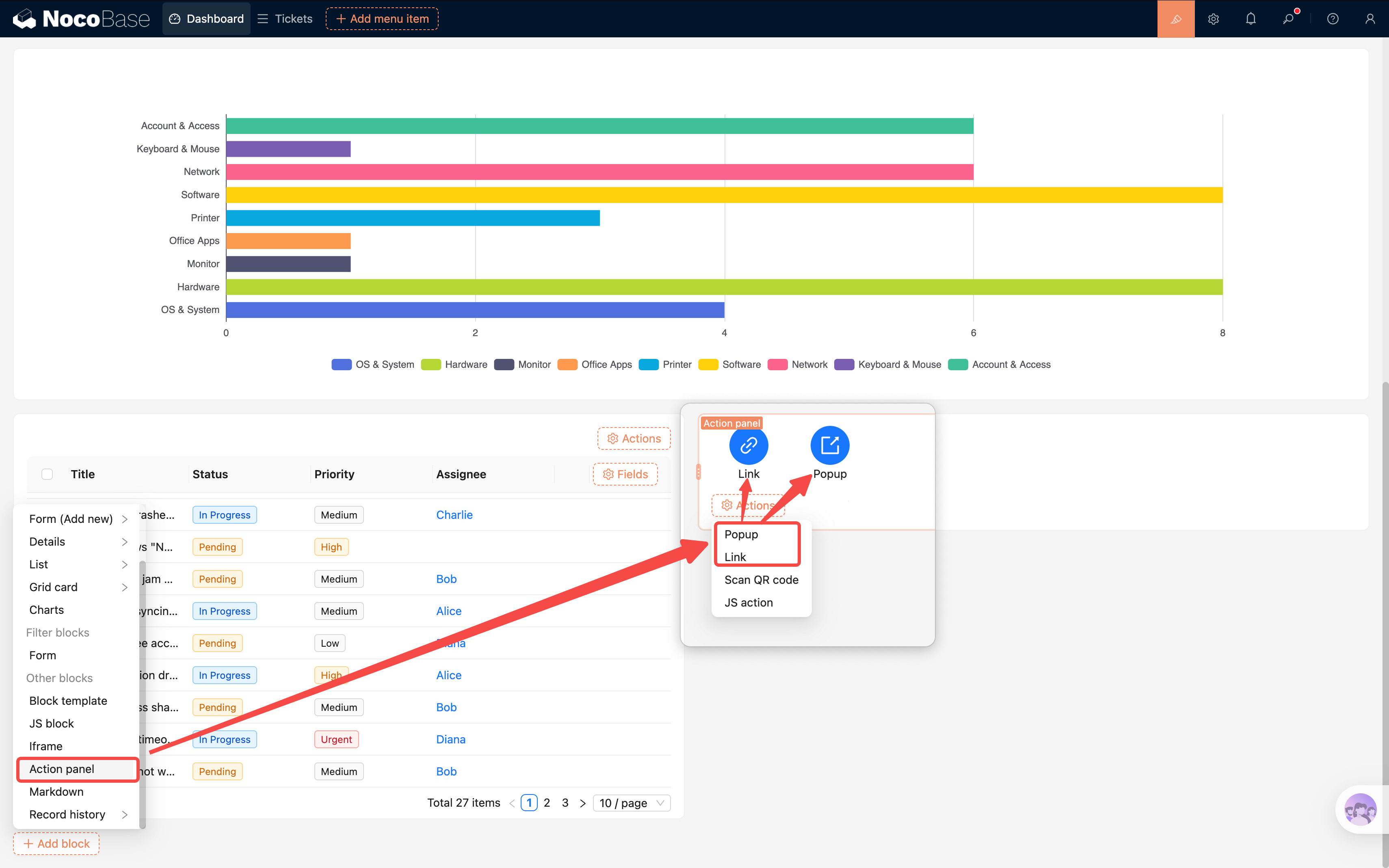
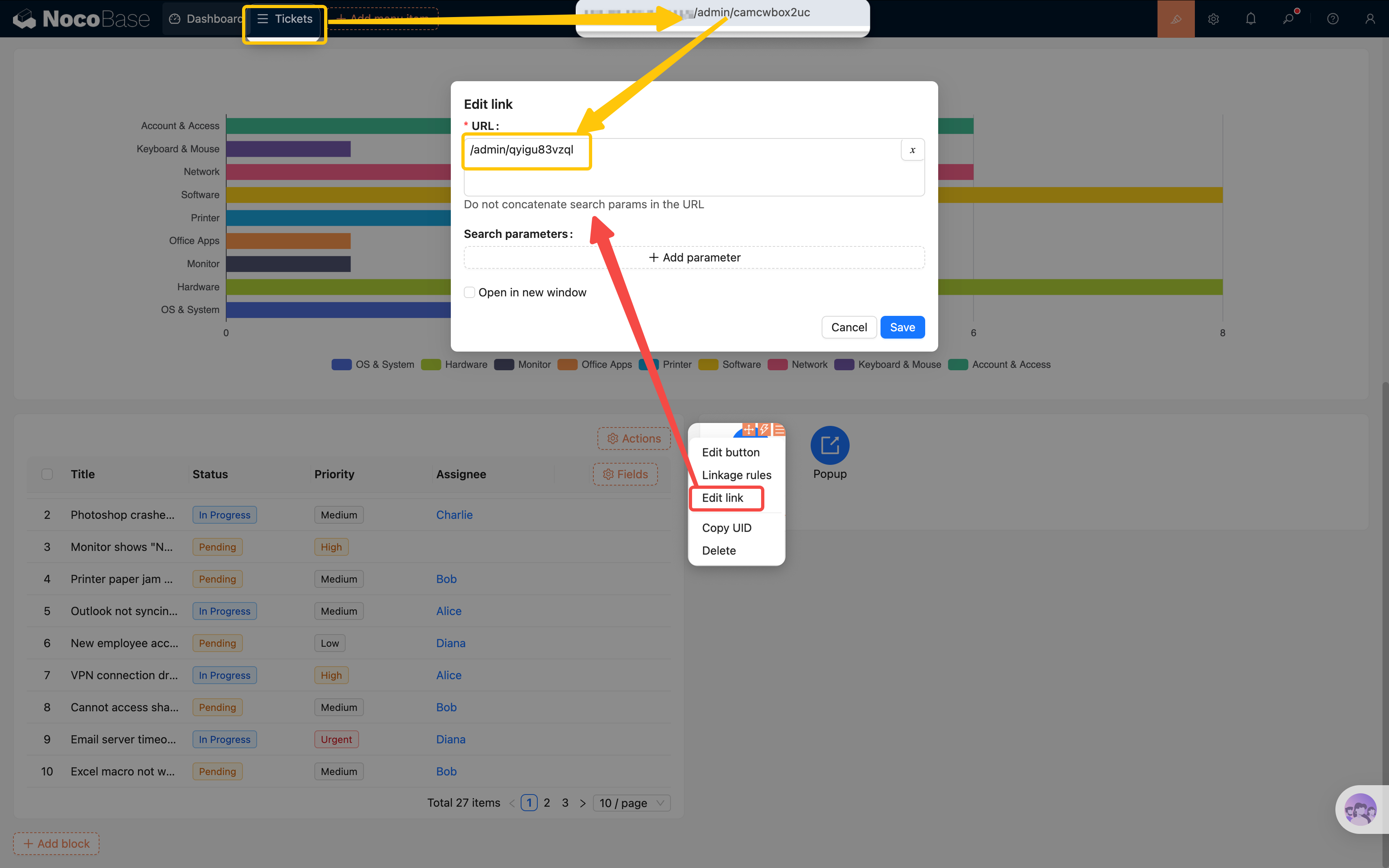
- Link: Go to ticket list — Add a "Link" action and configure the URL to point to the ticket list page (e.g.,
/admin/camcwbox2uc)
- Button: Add Ticket — Add a "Popup" action button and change the title to "Add Ticket"
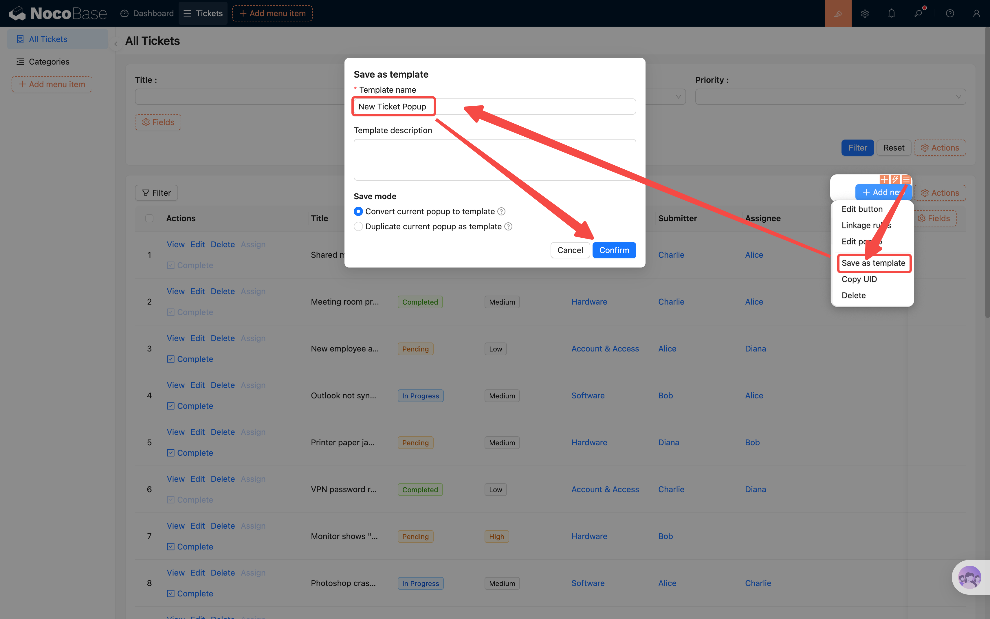
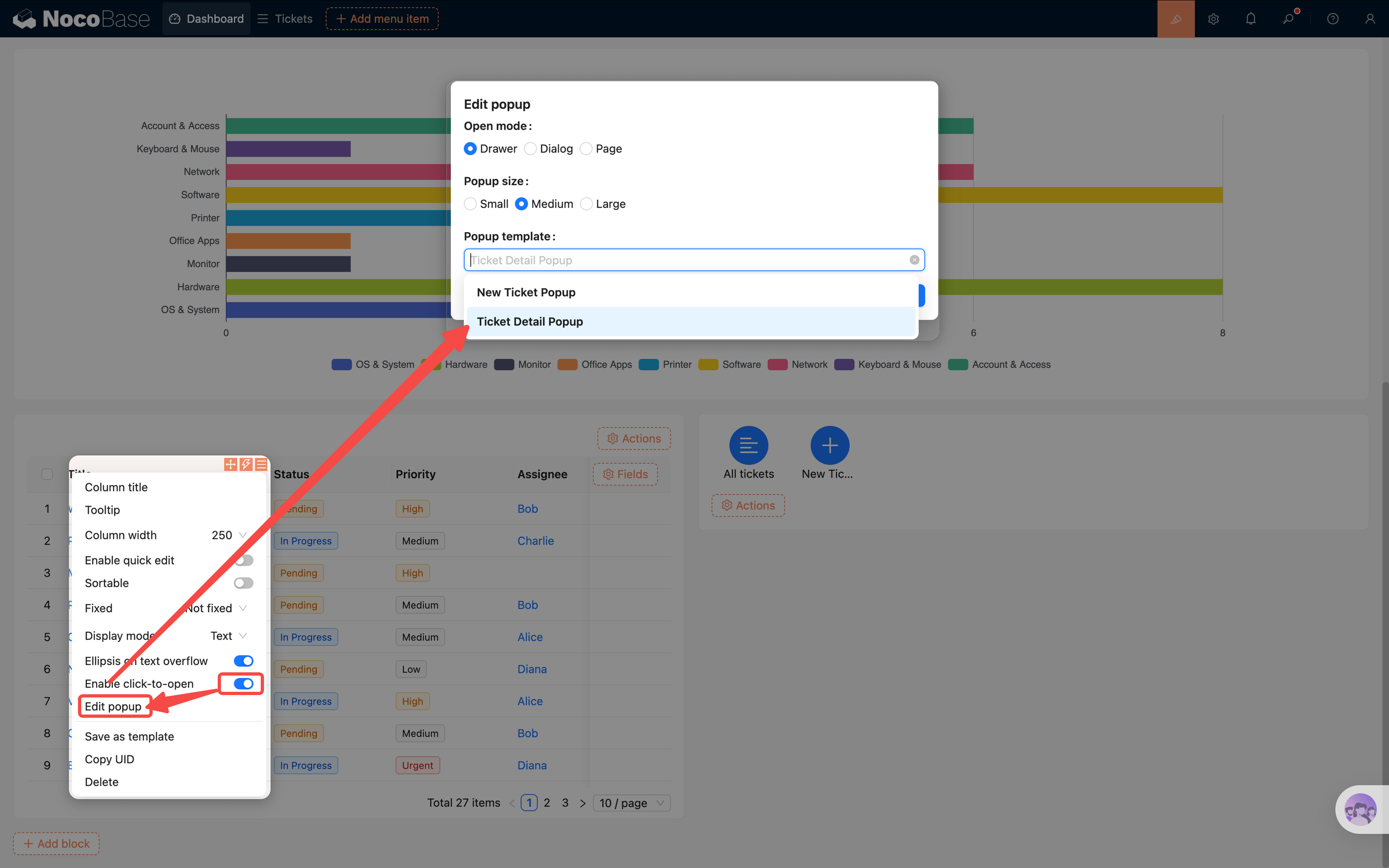
But clicking "Add Ticket" opens an empty popup — we need to configure its content. Rebuilding the entire new ticket form from scratch would be tedious. This is where a very handy feature comes in: Popup Reuse.
Saving a Popup Template
Note: Popup templates are different from the "block templates" we covered in Chapter 4. Block templates save a single form block's fields and layout, while popup templates save the entire popup — including all blocks, fields, and action buttons inside it.
- Go to the Tickets list page and find the "Add Ticket" button
- Click the button's settings and find "Save as template" — save the current popup
- Give the template a name (e.g., "New Ticket Popup")
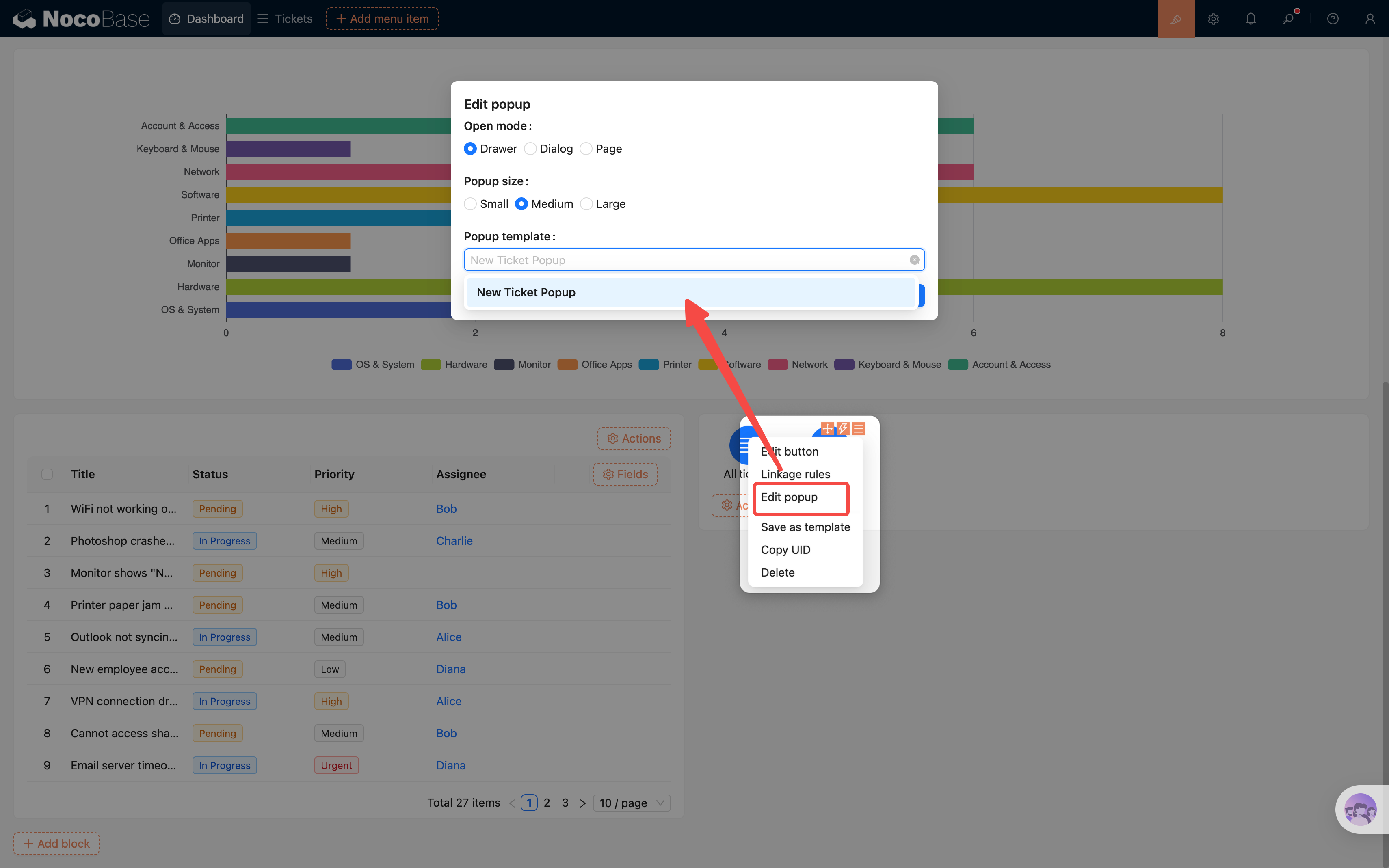
Reusing the Popup on the Dashboard
- Go back to the Dashboard page and click the "Add Ticket" button's settings in the action panel
- Find "Popup settings" and select the "New Ticket Popup" template you just saved
- After saving, clicking the button will open the exact same new ticket form popup as on the ticket list page
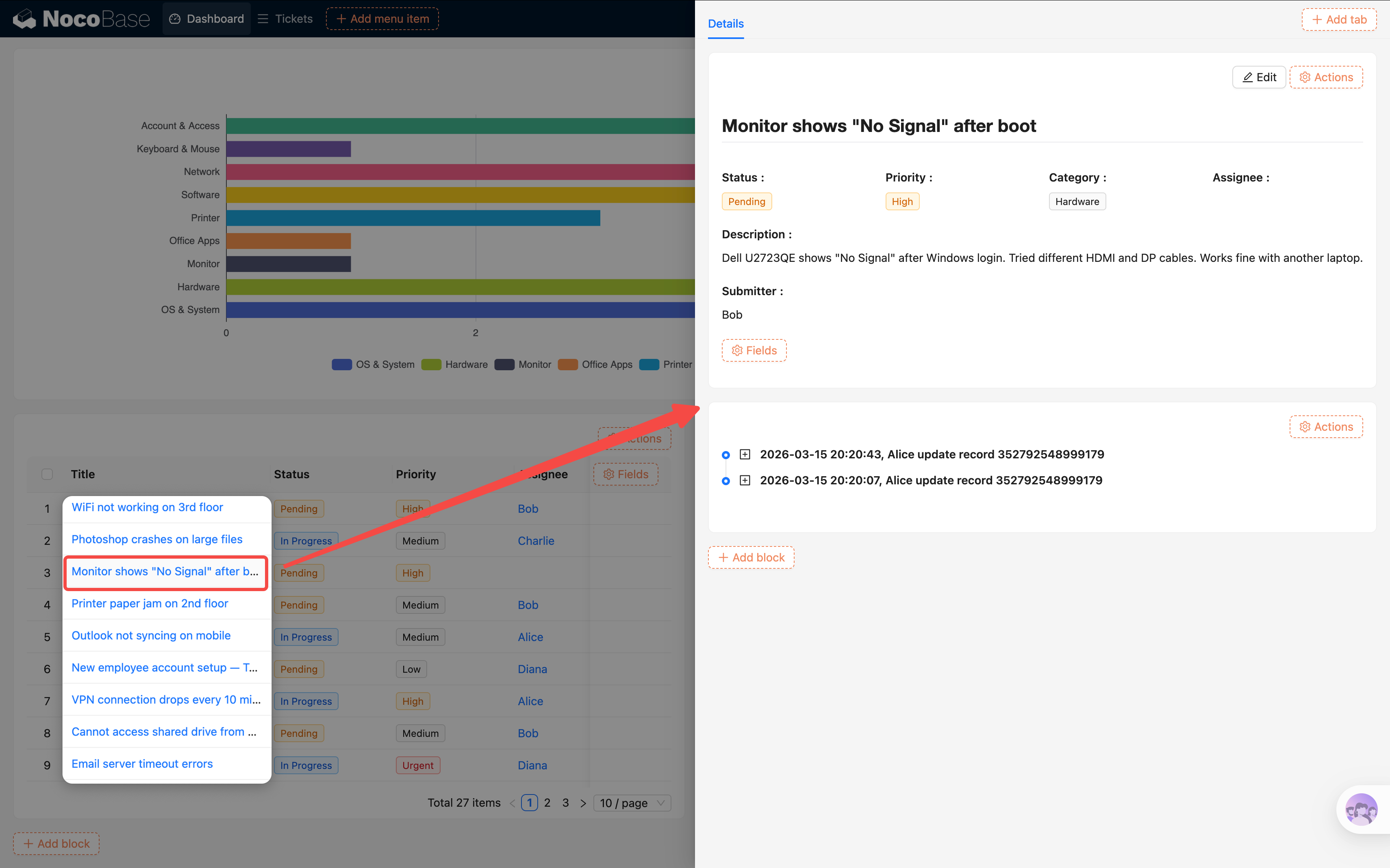
Click Title to Open Detail Popup
Using the same approach, we can make ticket titles in the unresolved tickets table clickable to open the detail view directly:
- First, go to the Tickets list page, find the "View" button's settings, and similarly "Save as template" (e.g., "Ticket Detail Popup")
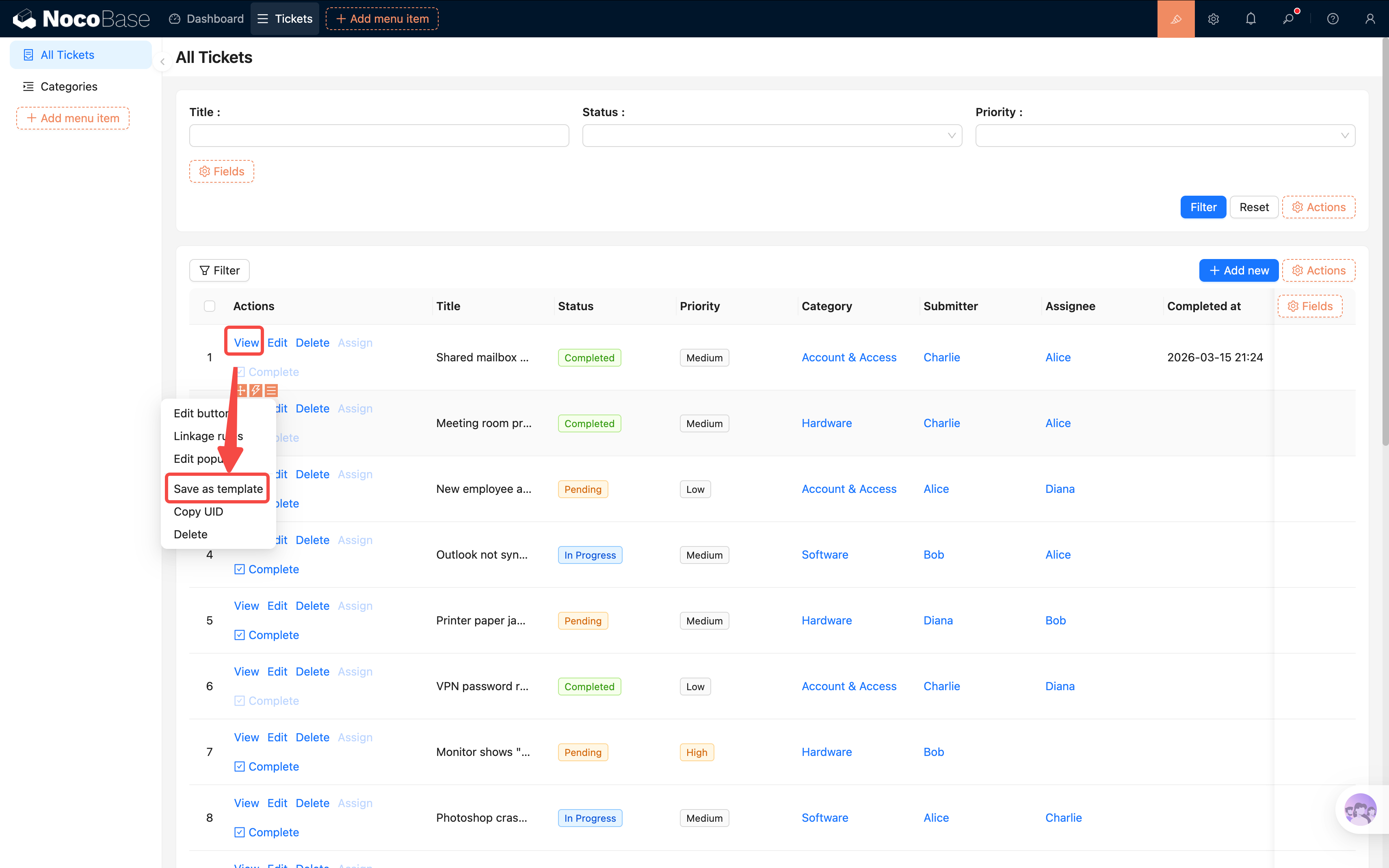
- Go back to the Dashboard page. In the unresolved tickets table, click the "Title" field's settings
- Turn on the "Enable click to open" toggle — a "Popup settings" option will appear
- In the popup settings, select the "Ticket Detail Popup" template you just saved
Now users can click a ticket title on the dashboard to view its details instantly, without navigating to the ticket list page. The whole dashboard becomes more compact and efficient.
Benefits of popup reuse: The same popup template can be used across multiple pages. When you modify the template, all references update automatically. This is similar to the "Reference" mode from Chapter 4 — maintain in one place, apply everywhere.
7.9 Adjusting the Layout
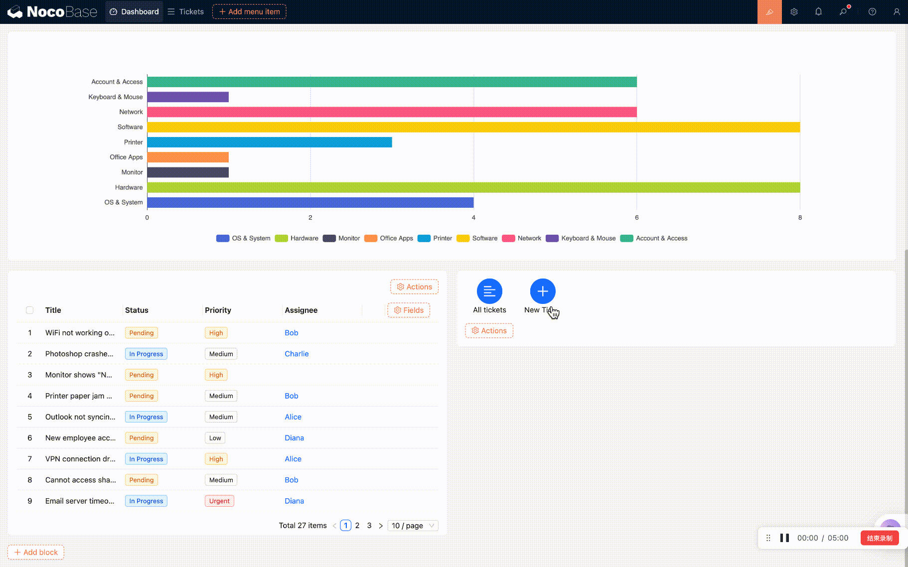
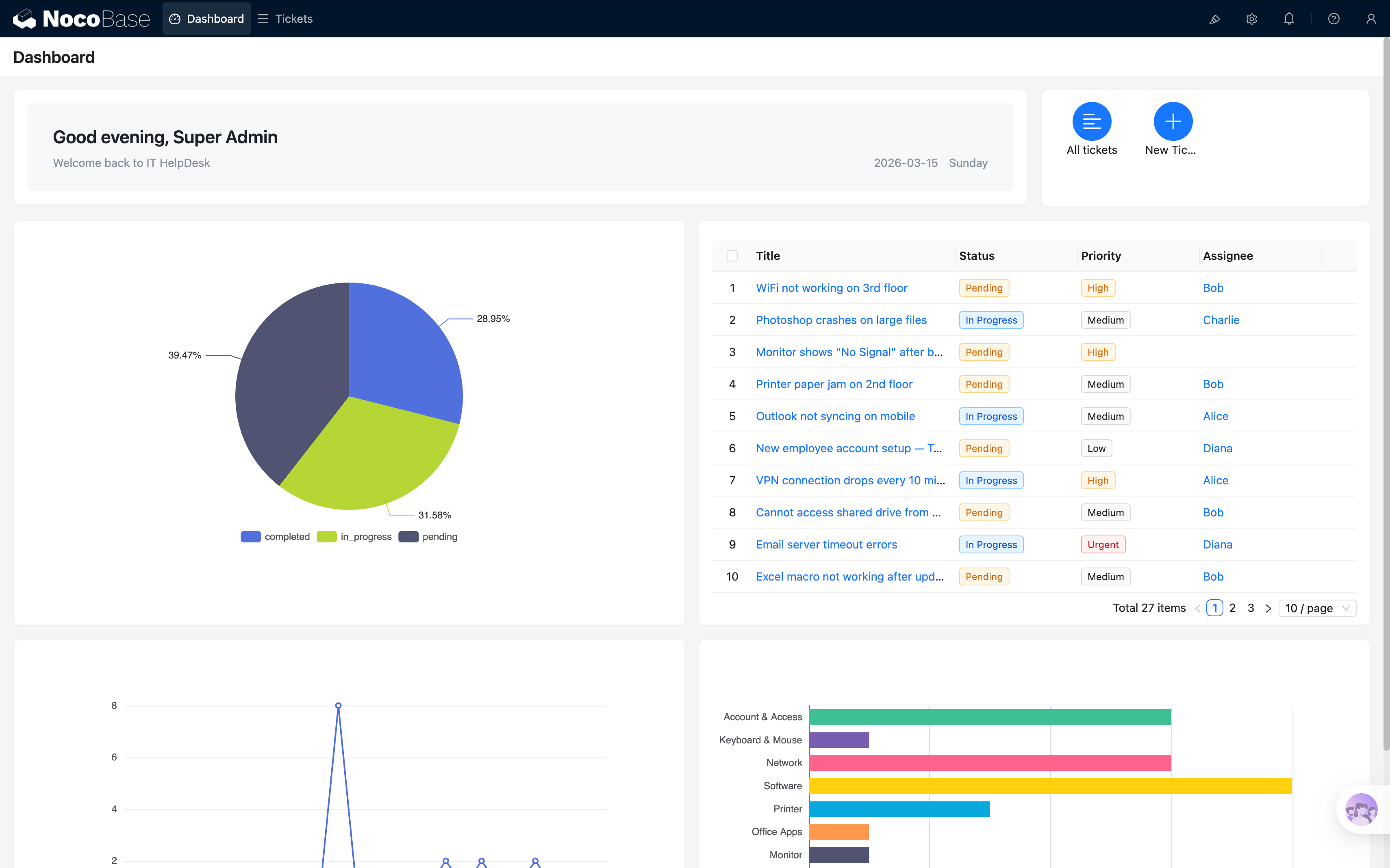
We now have 6 blocks on the page (JS welcome banner + Action panel + 3 charts + tickets table). Let's adjust the layout to make it look better.
In configuration mode, you can drag and drop to reposition and resize each block. Suggested layout:
- Row 1: JS welcome banner (left) + Action panel (right)
- Row 2: Pie chart (left) + Tickets table (right)
- Row 3: Line chart (left) + Bar chart (right)
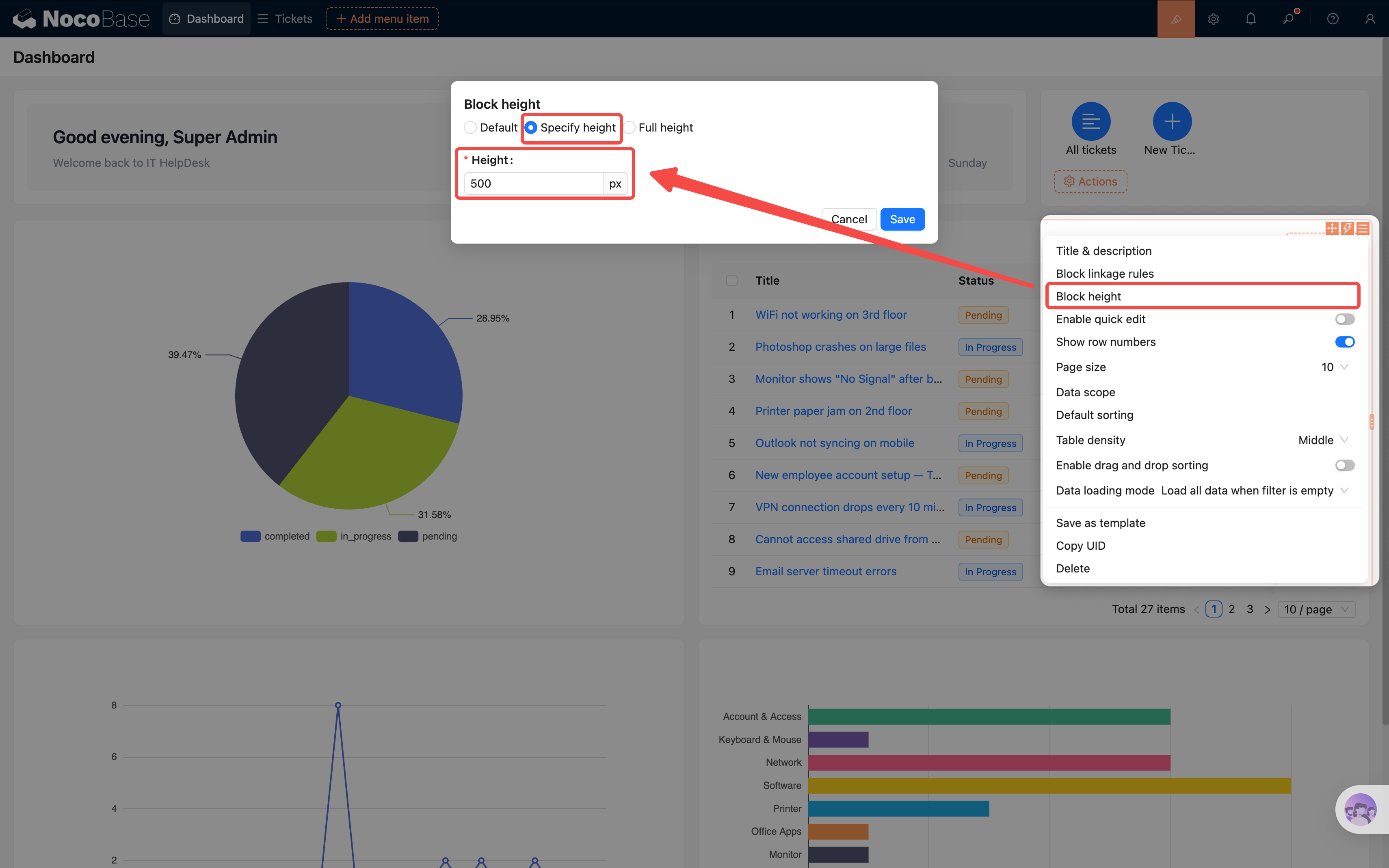
Note: you may find that block heights don't align. You can manually adjust this in Block settings → Block height — for example, set both blocks in row 2 to 500px.
Drag the edges to adjust block widths so the two charts each take up half the row. Try a few arrangements until you find what looks best.
Summary
In this chapter, we built a rich and practical data dashboard with 6 blocks:
- JS welcome banner: Personalized greeting based on current user and time
- Action panel: Quick link to ticket list + one-click ticket creation (popup reuse)
- Pie chart: See the ticket status distribution at a glance
- Line chart: Track how ticket volume changes over time
- Bar chart: Compare ticket counts across categories horizontally — no label overlap even with many categories
- Unresolved tickets table: All pending tickets at a glance, click title to view details (popup reuse)
We also learned an important technique — Popup Reuse: save a popup from one page as a template and reference it on other pages, avoiding repetitive configuration.
Data visualization is a built-in NocoBase plugin — no additional installation needed. Configuring it is just as simple as building a page: pick your data, choose a chart type, map the fields — three steps and you're done.
Next Chapter Preview
At this point, our ticket system is quite feature-complete: data modeling, page building, form entry, access control, automated workflows, and a data dashboard — we've got it all. In the final chapter, we'll do some finishing touches and talk about deploying to production.