Block
Blocks are carriers for data and content. They can be placed in a Page, Modal, or Drawer, and multiple blocks can be freely dragged and arranged.
Block Types
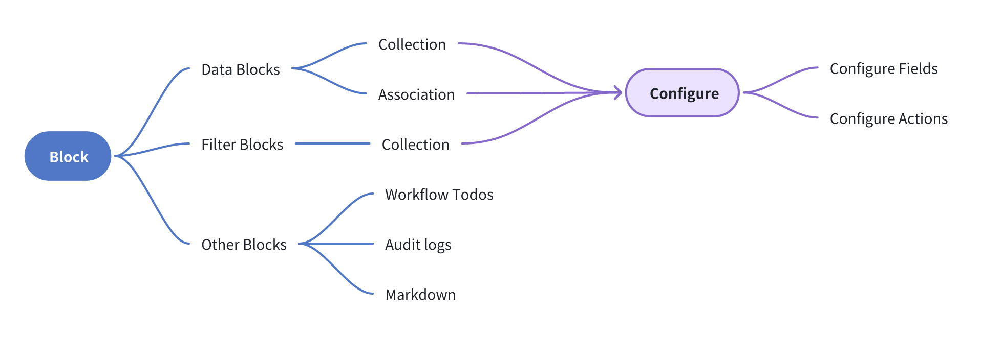
- Data Block: Used to display data from a data source on the interface.
- Filter Block: Used to take data from a data source as filter conditions to filter other data blocks.
- Other Block: Used to carry specific or independent content such as workflow to-dos, audit logs, Markdown, etc.
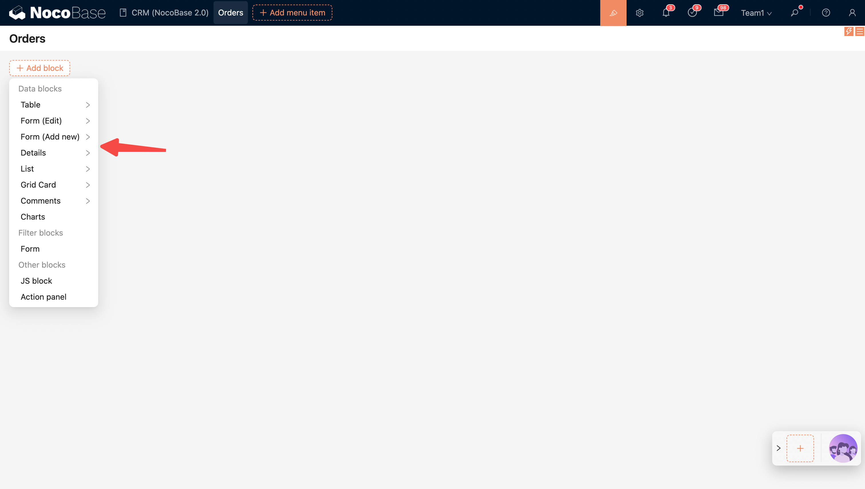
Add Block
Blocks can be placed in a Page, Modal, or Drawer.
Blocks in a Page
Currently, the block types in a page include: Data Block, Filter Block, and Other Block.
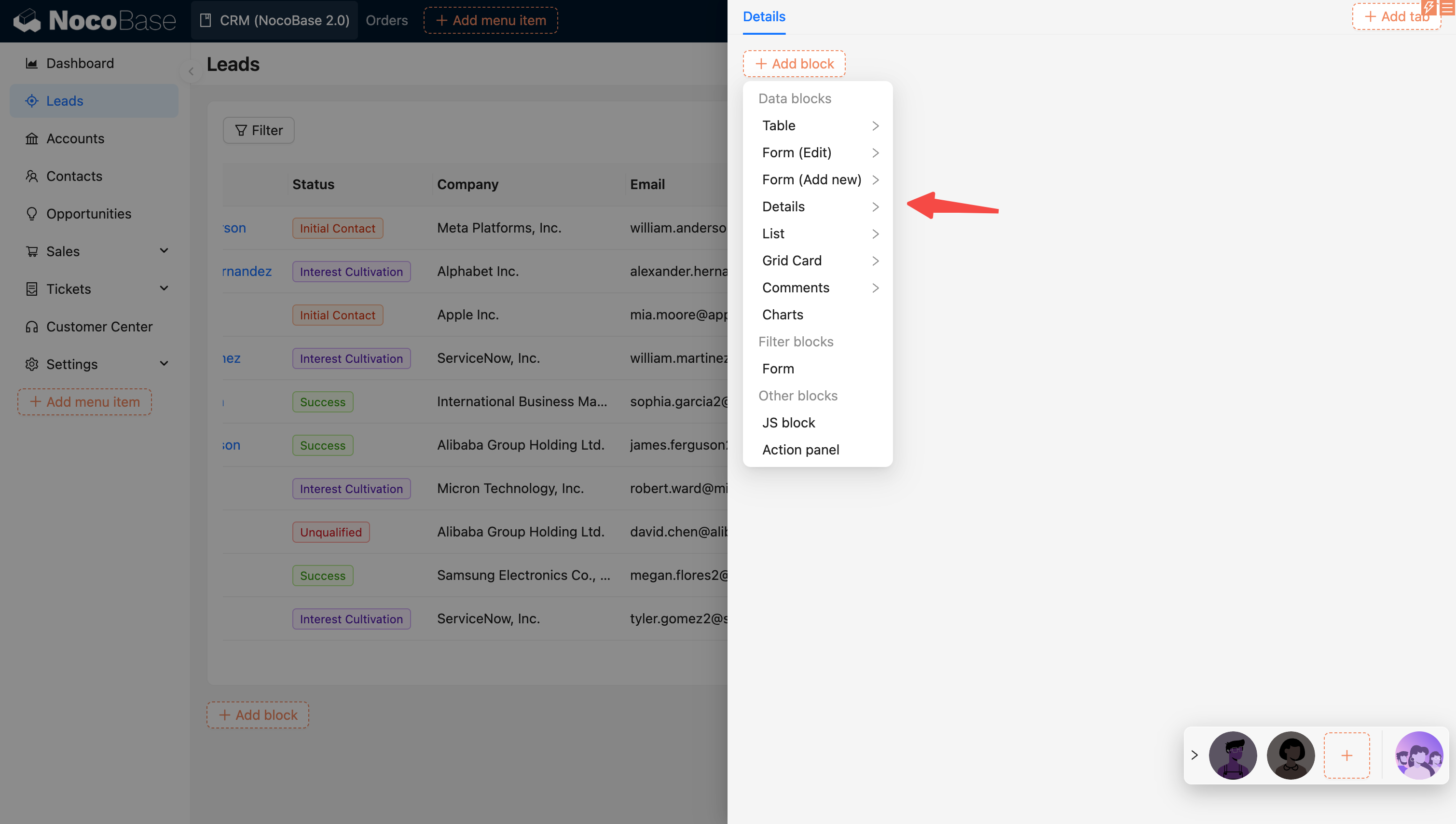
Blocks in a Popup (Modal or Drawer)
Popups come in two types: modals and drawers. Like pages, they can also have blocks added. The difference is that form blocks in popups are usually for adding, editing, or viewing a single record. The block types include Data Block and Other Block.
Block Designer
Each block has three small icons in the upper right corner. From left to right, they are:
- Drag & Drop Layout
- Event Flow
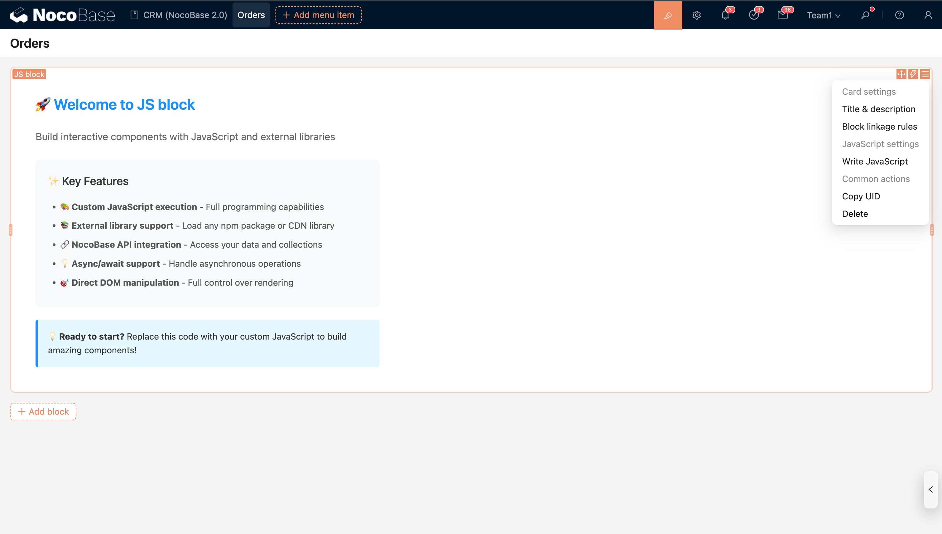
- Block settings
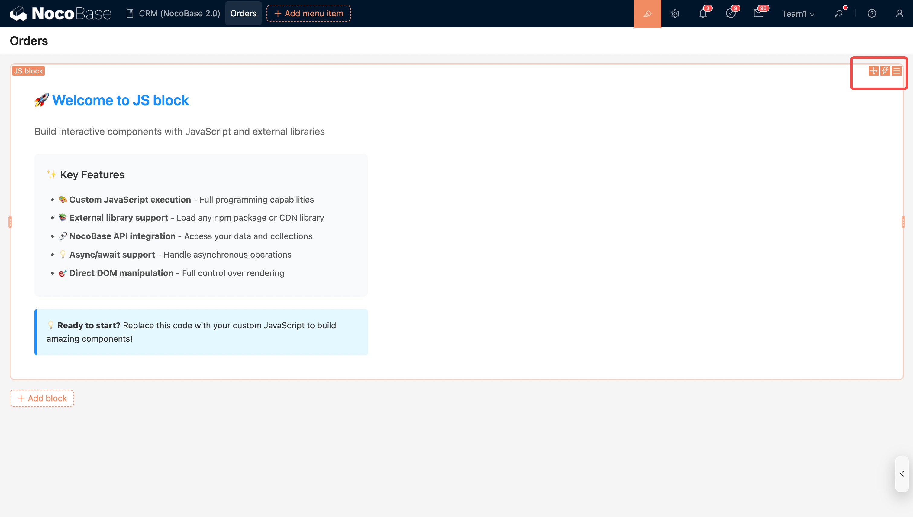
For simple blocks, all configuration options are centralized in 'Block settings', such as the JS Block.
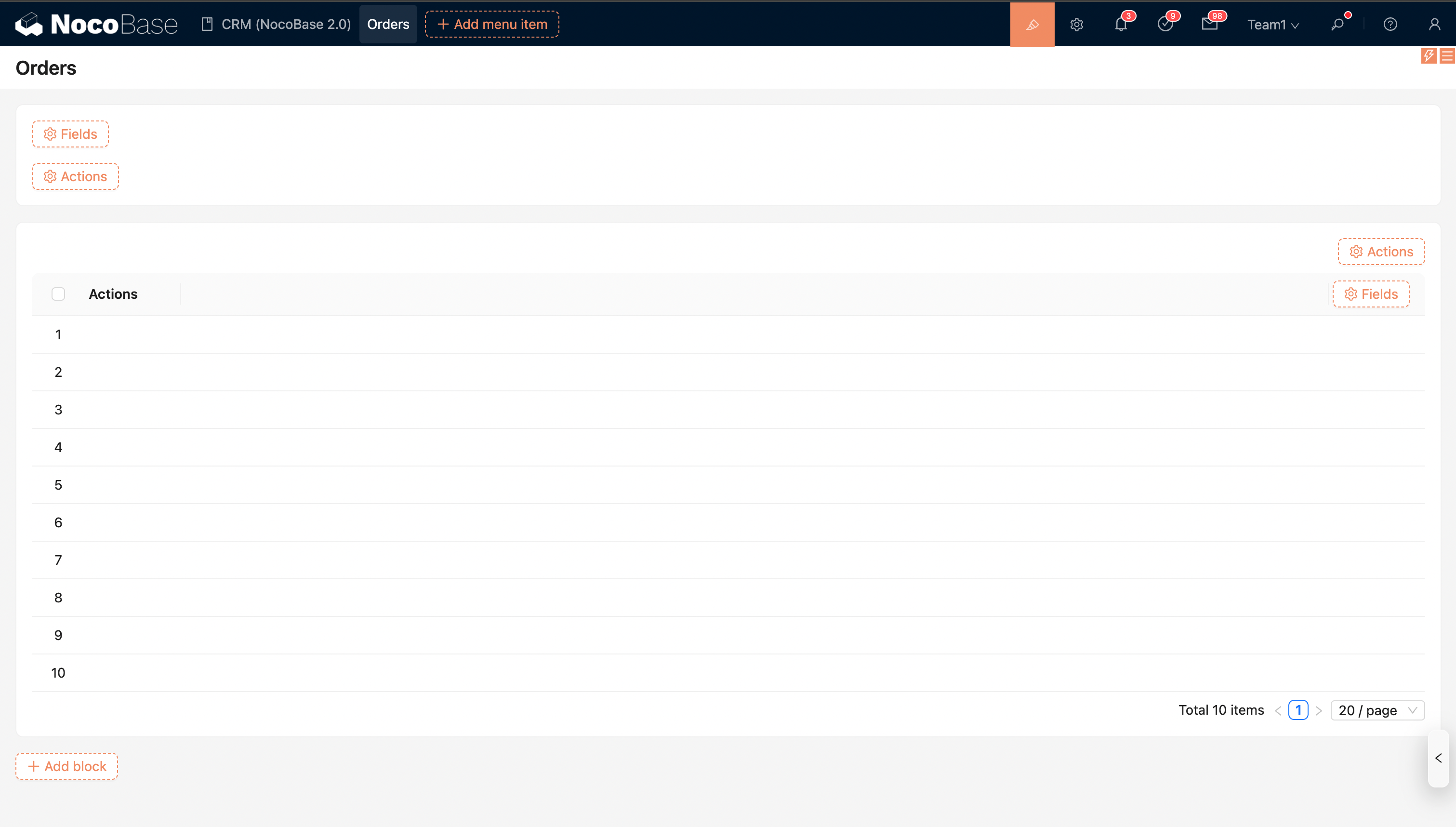
Complex data blocks also provide separate, embedded 'Configure fields' and 'Configure actions'.
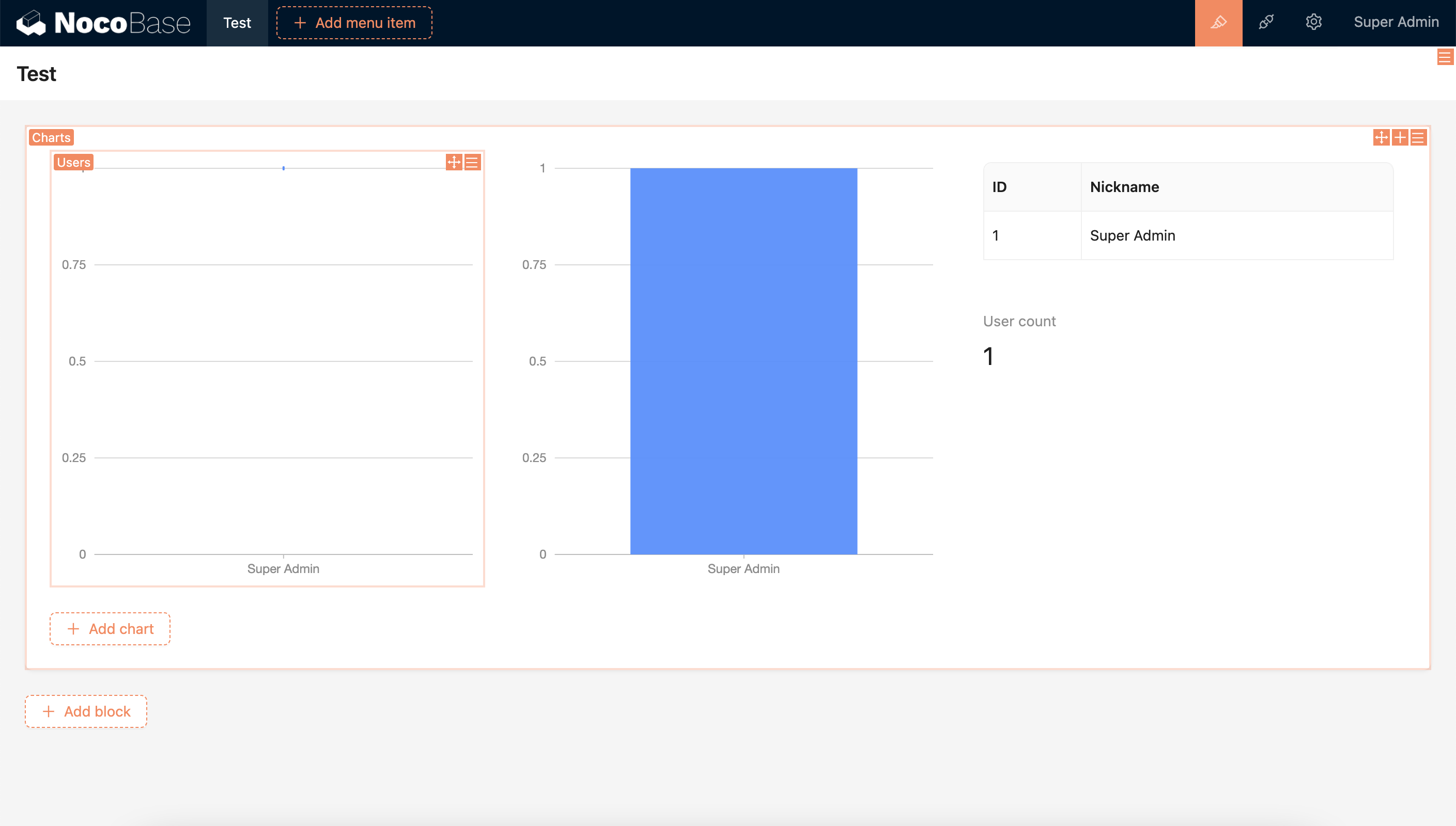
In addition, there is flexibility for more nesting possibilities, as seen in the Chart block.
Block Layout
The layout of multiple blocks can be adjusted by dragging and dropping.