Details Fields
Introduction
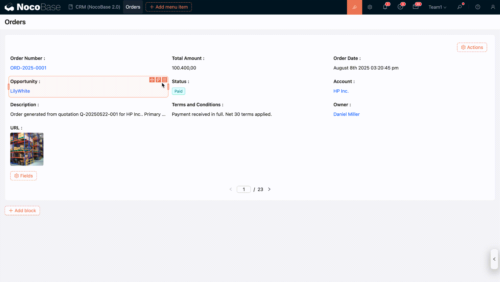
Field configurations for Details, List, and Grid blocks are basically the same, primarily controlling how fields are displayed in read-only mode.
Field Configuration Options
Date Field Formatting
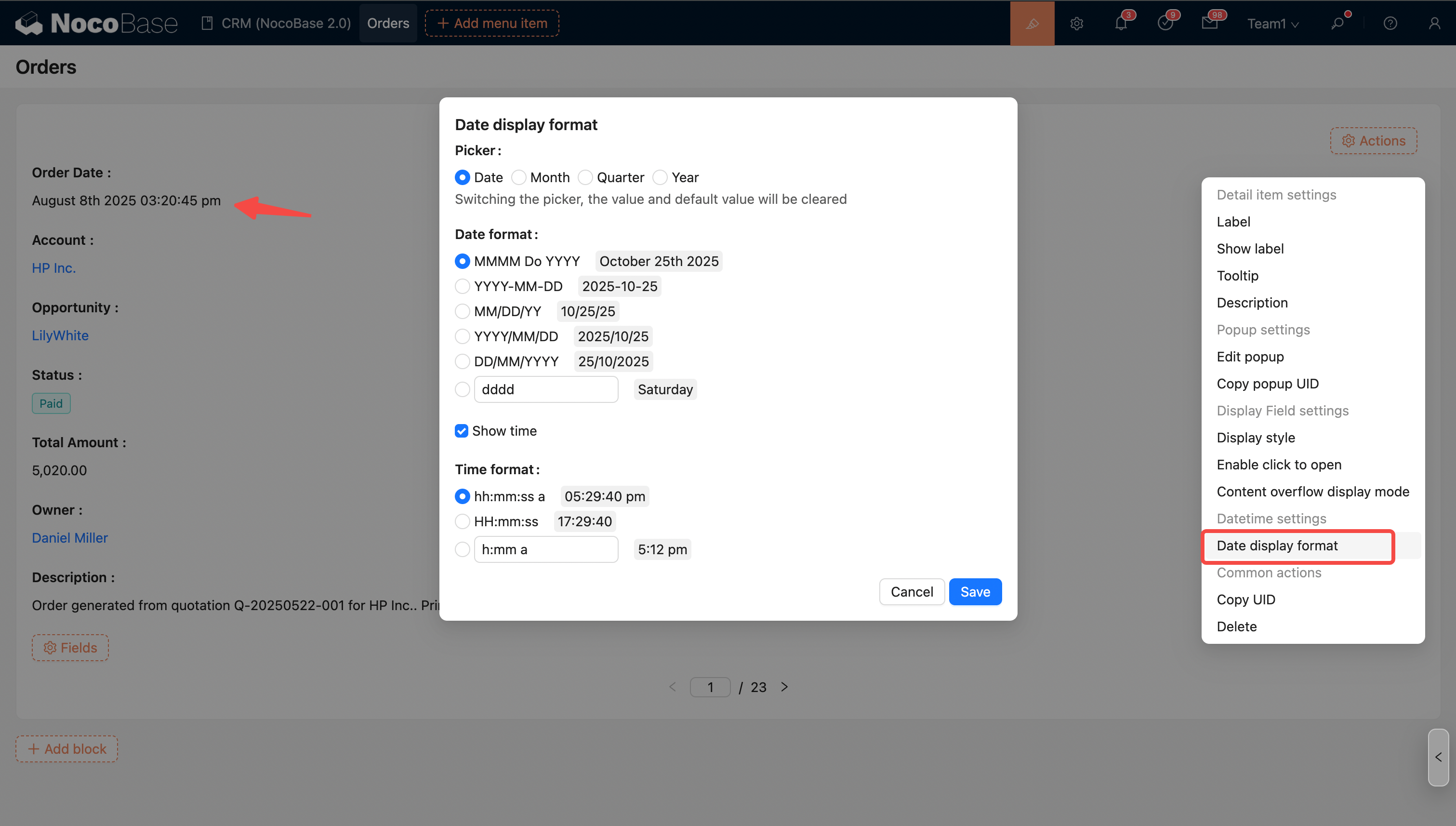
For more details, see Date Formatting
Number Field Formatting
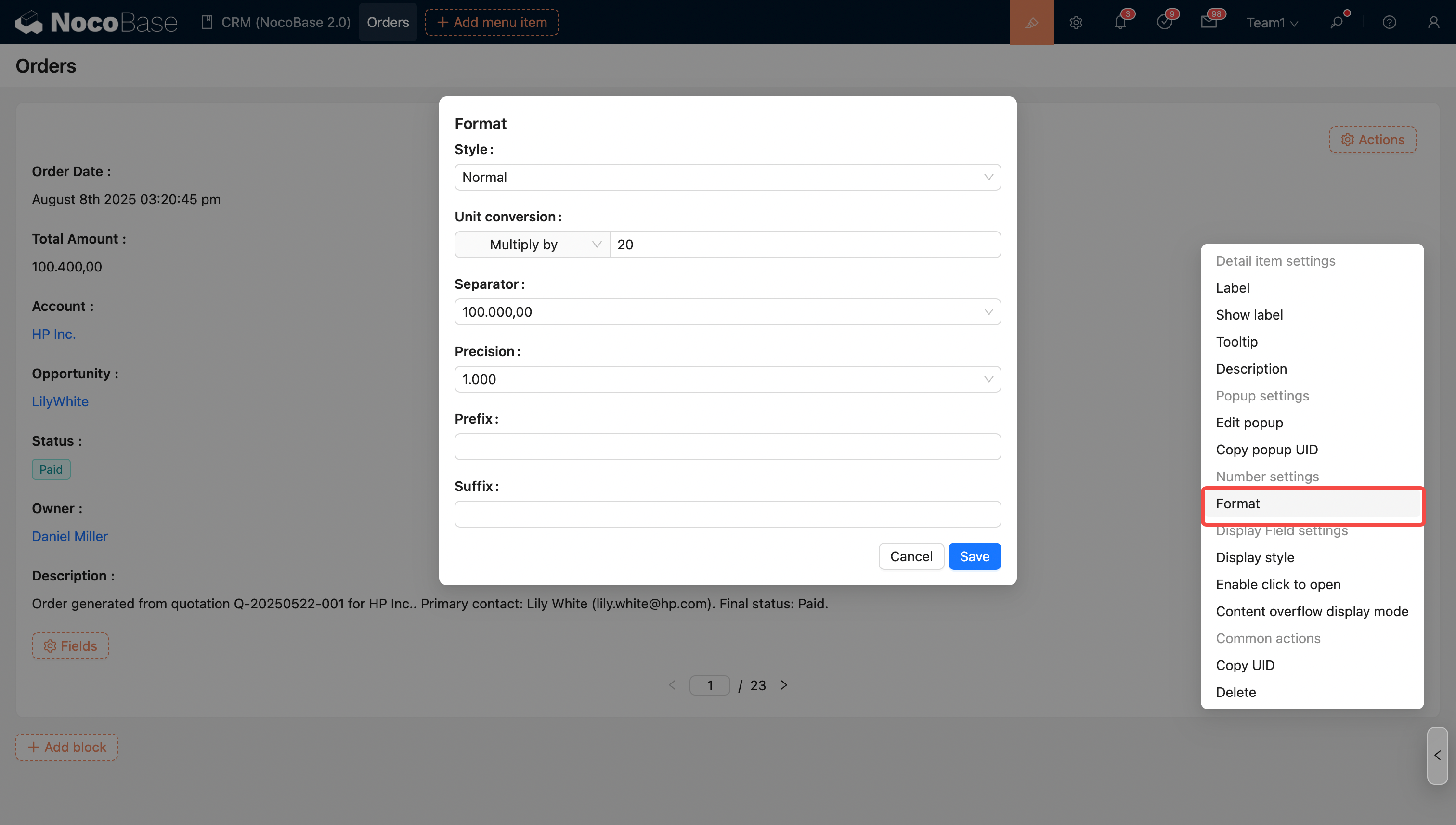
Supports simple unit conversion, thousand separators, prefixes and suffixes, precision, and scientific notation.
For more details, see Number Formatting
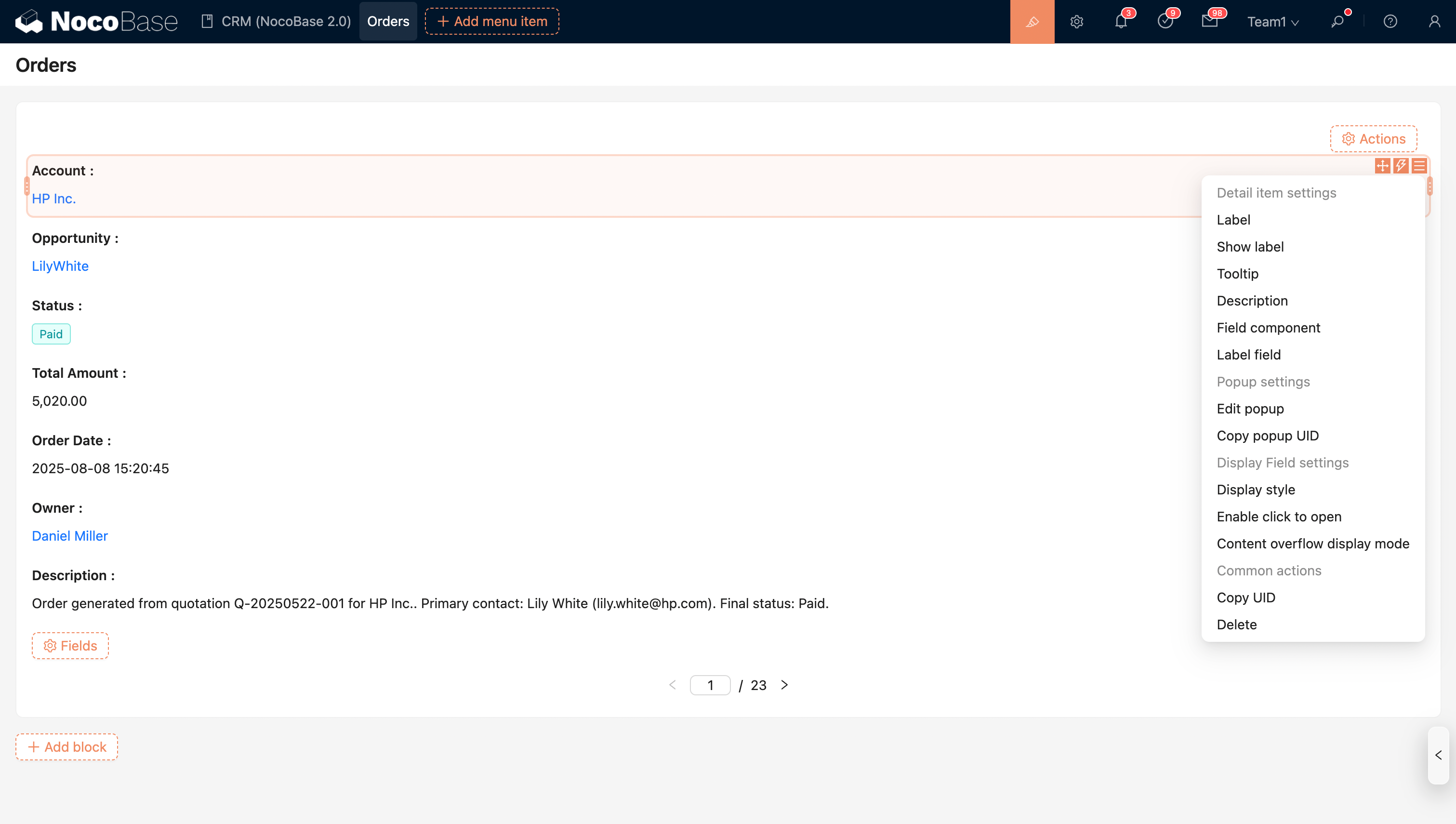
Enable Click to Open
Besides association fields, regular fields can also be configured to open a pop-up on click. You can also set how the pop-up opens (Drawer, Dialog, or Sub-page).
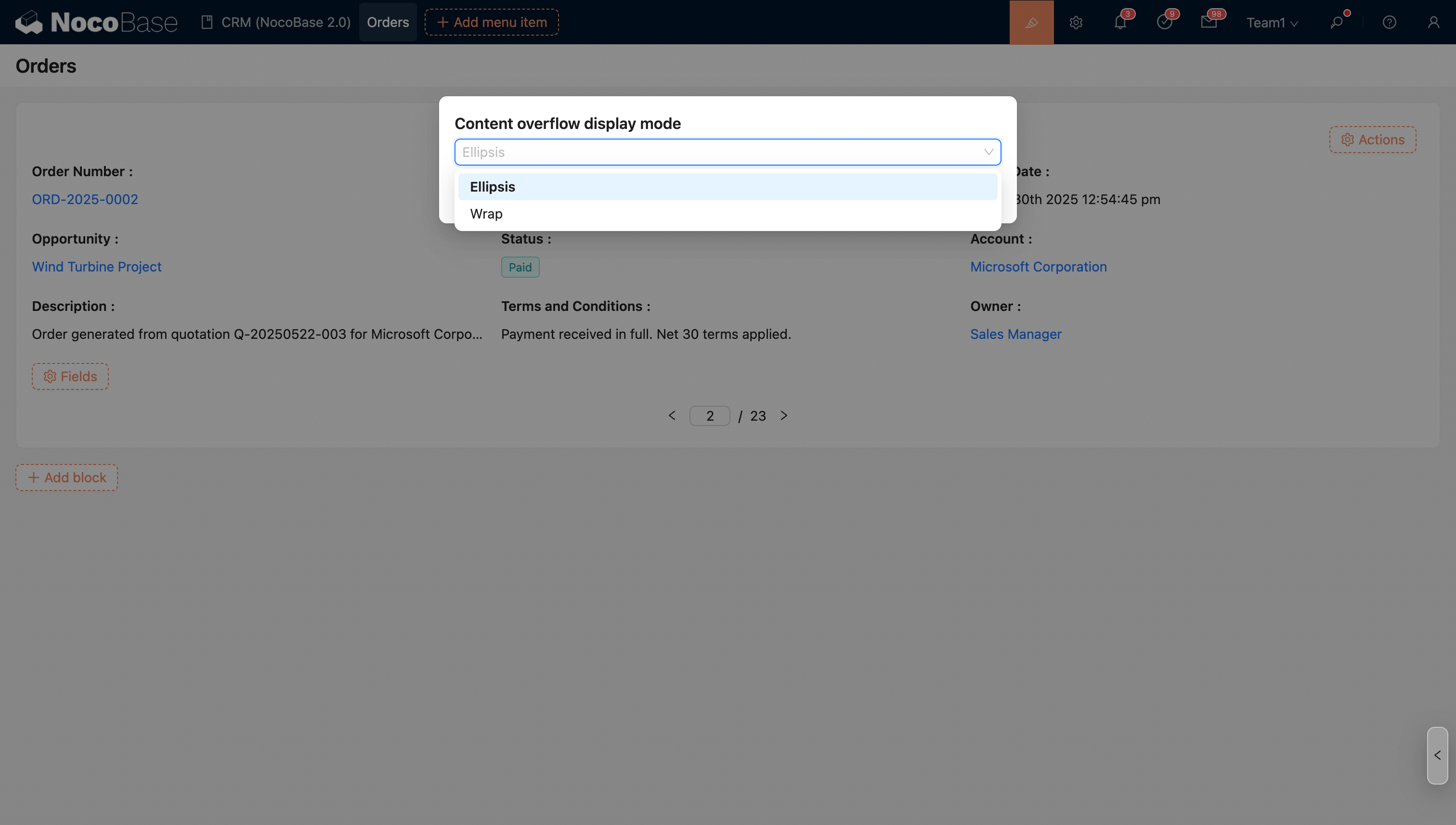
Content Overflow Display Mode
When the field content overflows its width, you can set the overflow mode.
- Ellipsis (default)
- Wrap
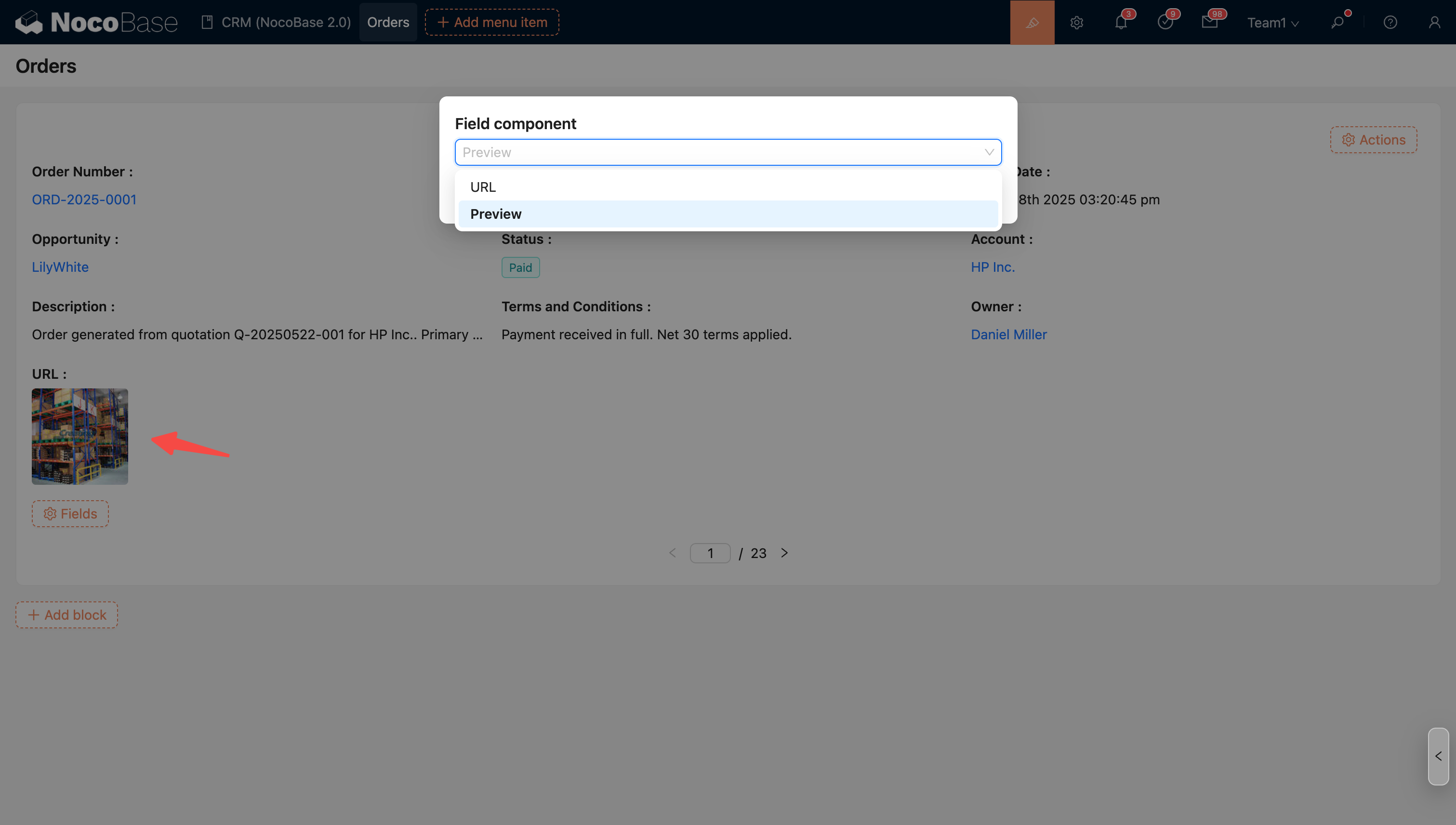
Field Component
Some fields support multiple display formats, which can be achieved by switching the field component.
For example: The URL component can be switched to the Preview component.
For example, association fields can be displayed differently by switching from the title field component to Sub-details to show more content from the relationship.