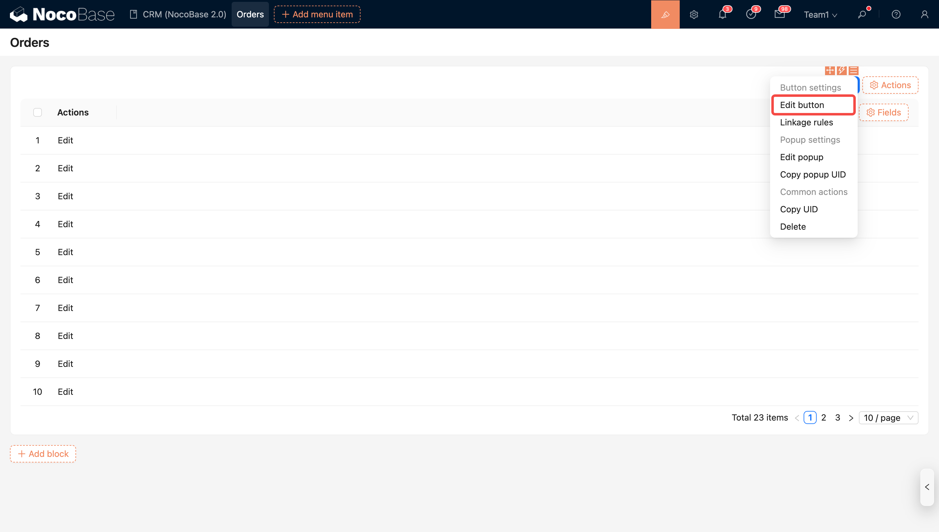
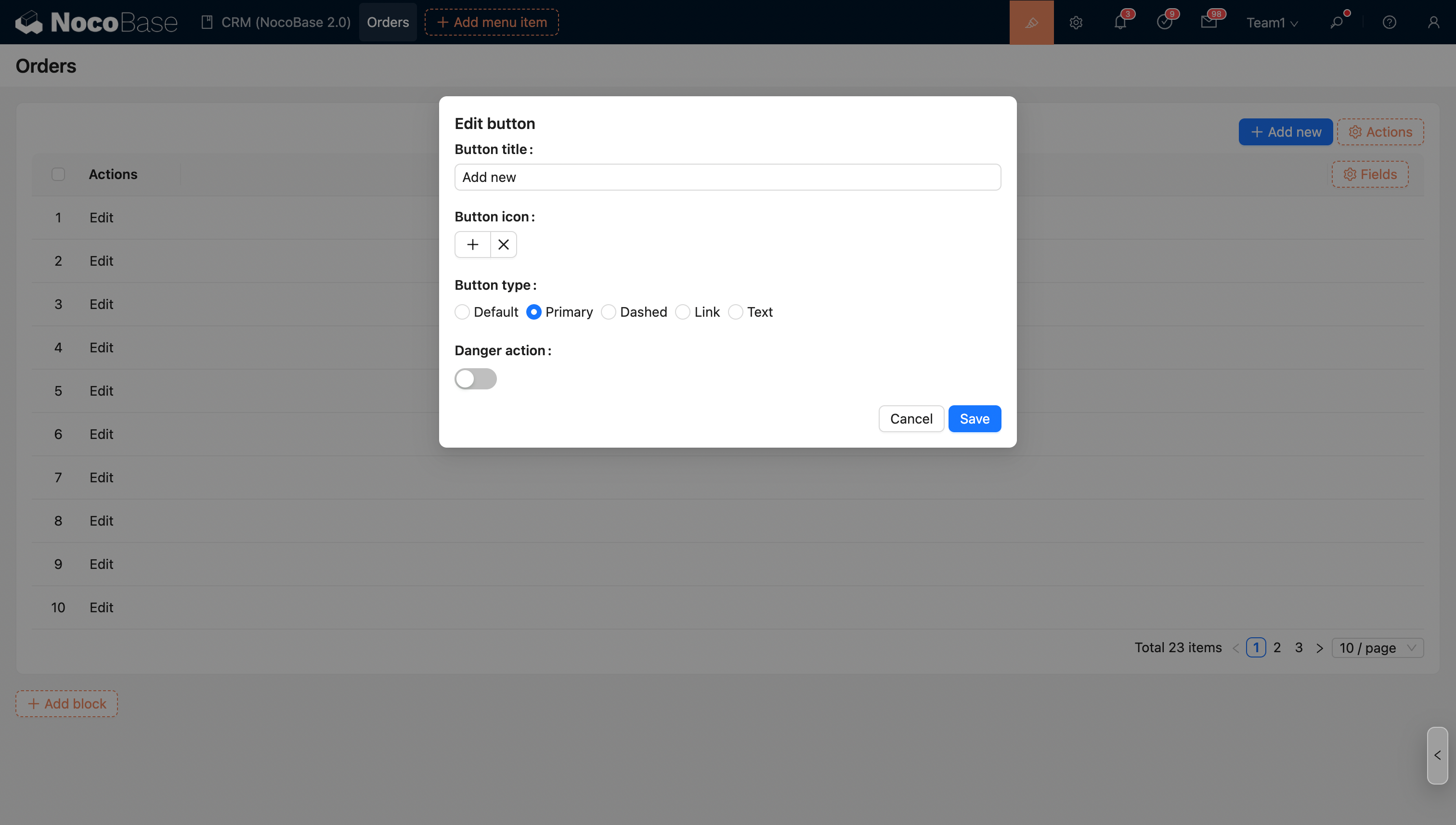
logologo
Get Started
Guide
Development
Plugins
API
English
简体中文
Get Started
Guide
Development
Plugins
API
English
简体中文
logologo
Overview

Blocks

Overview

Data Blocks

Table
Form
Details
List
Grid Card
Chart

Filter Blocks

Form

Other Blocks

Action Panel
Iframe
Reference block
Markdown
JS Block

Block Settings

Data Scope
Layout
Block Linkage Rules
Field Linkage Rules
Sorting Rules
Block Deletion
Block Title

Fields

Overview

Generic Settings

Table Column
Detail Form Item
Filter Form Item
Form Item

Specific Settings

Date
File Manager
Sub-form
Select
Picker
Sub-table
Sub-detail
Title
JS Field
JS Item
JS Column

Field Settings

Default Value
Field Label
Show Label
Field Tooltip
Data Scope
Field Component
Number Format
Pattern
Required
Title Field
Validation Rules
Association Field

Actions

Overview

Action Settings

Edit Button
Double Check
Assign Values
Bind Workflow
Edit Popup
Action Linkage Rules

Action Types

Add New
View
Delete
Edit
Import
Import Pro
Export
Export Pro
Export Attachments
Filter
Link
Pop-up
Refresh
Submit
Trigger Workflow
Update Record
Bulk Update
JS Action
Action Permissions

Advanced

Linkage Rules
Event Flow
Variables
RunJS
Previous PageOverview
Next PageDouble Check

#Edit button

#Introduction

The system supports customizing the button's name, icon, background color, and button type, providing flexible UI customization options to help users adjust the button's display style and functionality according to specific needs.

  • Button name: Users can customize the button's text according to business needs to ensure the button label is clear and intuitive.
  • Button icon: Supports setting an icon for the button to enhance visual recognition, allowing users to quickly identify the button's function.
  • Danger Action: When a button represents a danger action (such as delete, reset, etc.), it can be set to the Danger Action type.
  • Button Type: Buttons support different type settings. Common button types include:
    • Default: A standard button, suitable for normal actions.
    • Primary: Used for important or primary actions, usually with a prominent visual effect.
    • Dashed: A button with a dashed border, suitable for secondary actions or hint-like buttons.
    • Text: A button with only text and no background color, typically used for lightweight actions or links.

20251029124822

20251029124757