

Filter form
Introduction
The filter form allows users to filter data by filling in form fields. It can be used to filter table blocks, chart blocks, list blocks, and more.
How to use
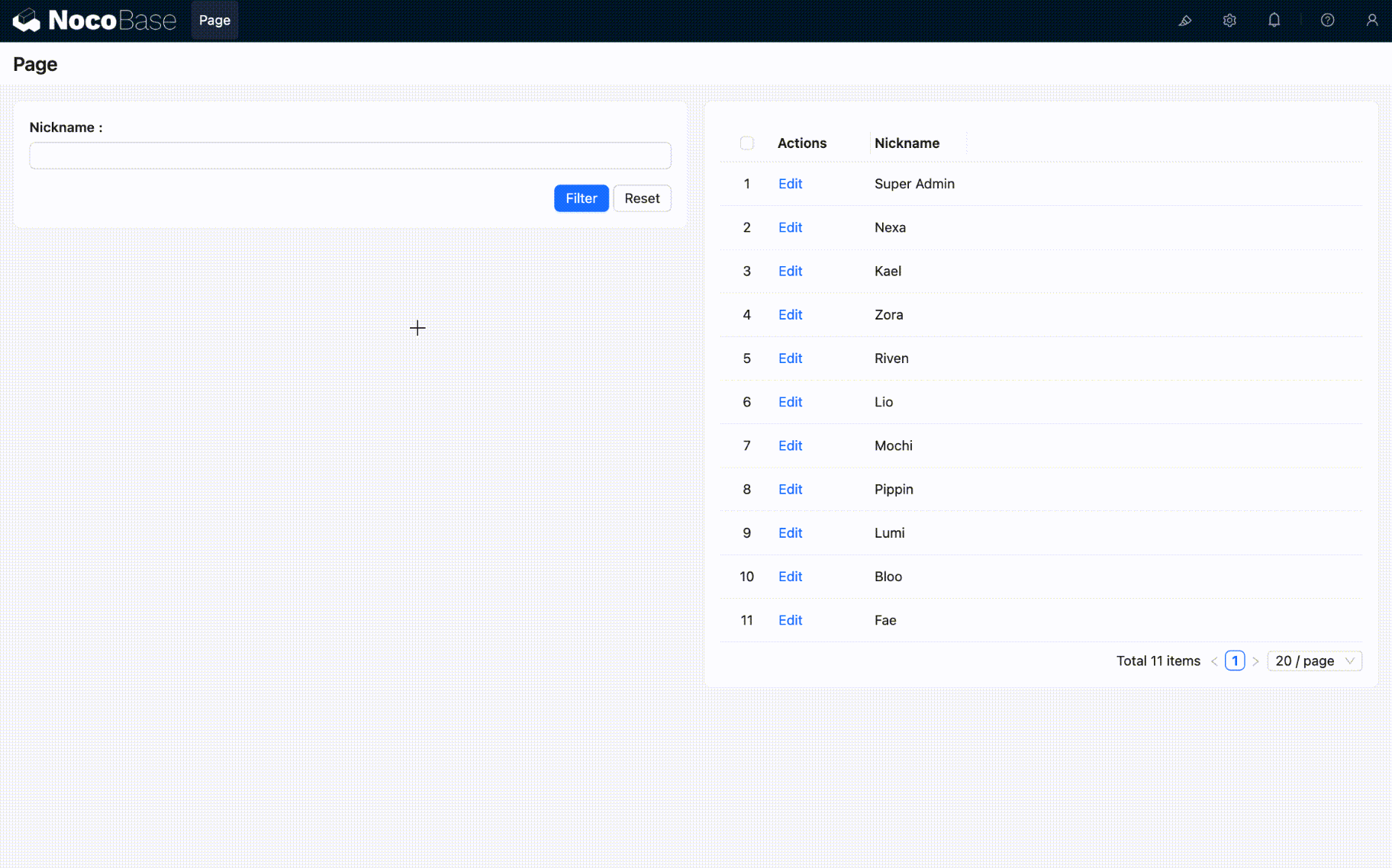
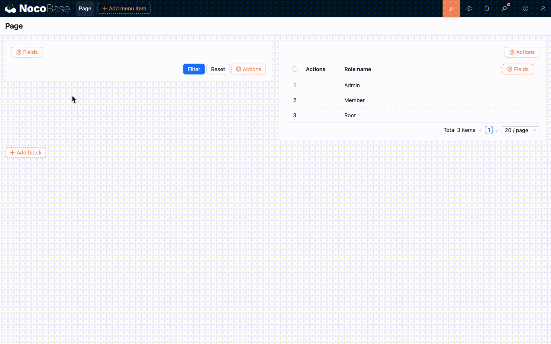
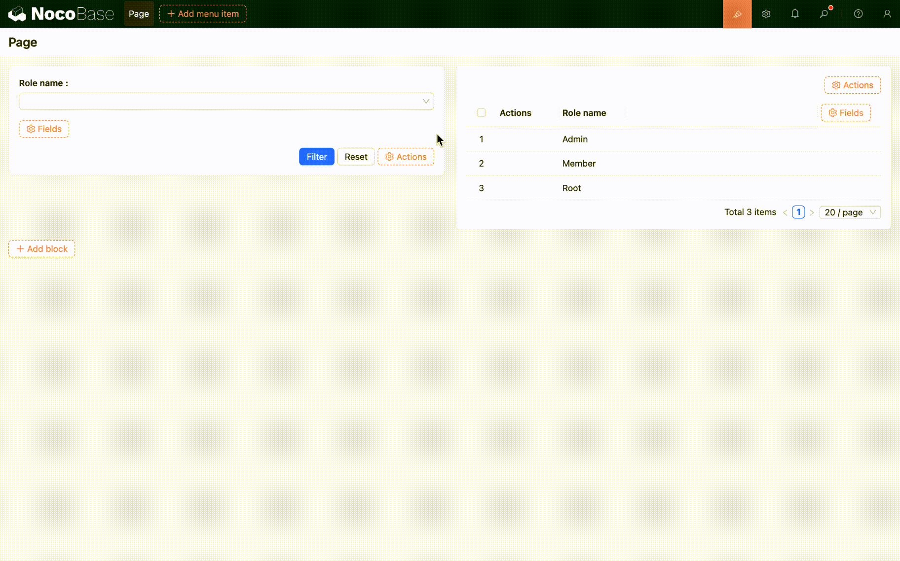
Let's start with a simple example to quickly understand how to use the filter form. Suppose we have a table block containing user information, and we want to filter the data using a filter form, like this:
Configuration steps:
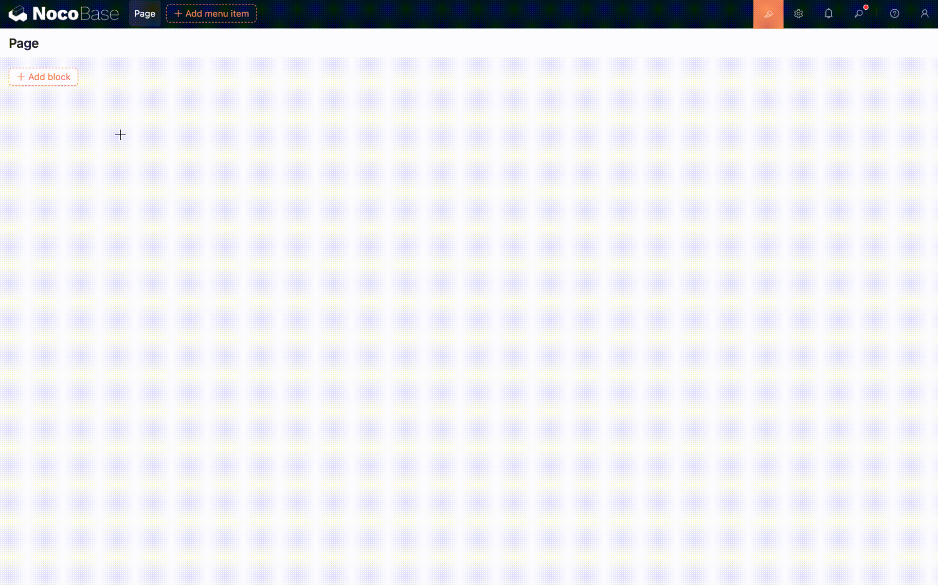
- Enable Edit mode and add a "Filter form" block and a "Table" block to the page.
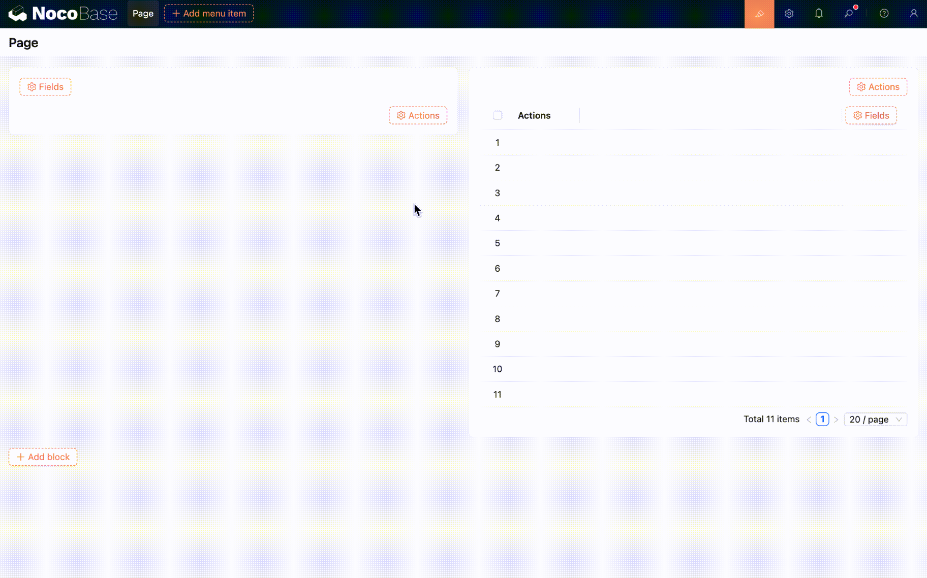
- Add the "Nickname" field to both the table block and the filter form block.
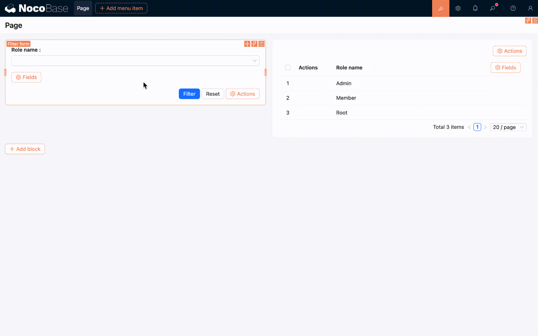
- Now you can start using it.
Advanced usage
The filter form block supports more advanced configurations. Here are some common use cases.
Connecting multiple blocks
A single form field can filter data across multiple blocks simultaneously. Here's how:
- Click on the "Connect fields" configuration option for the field.
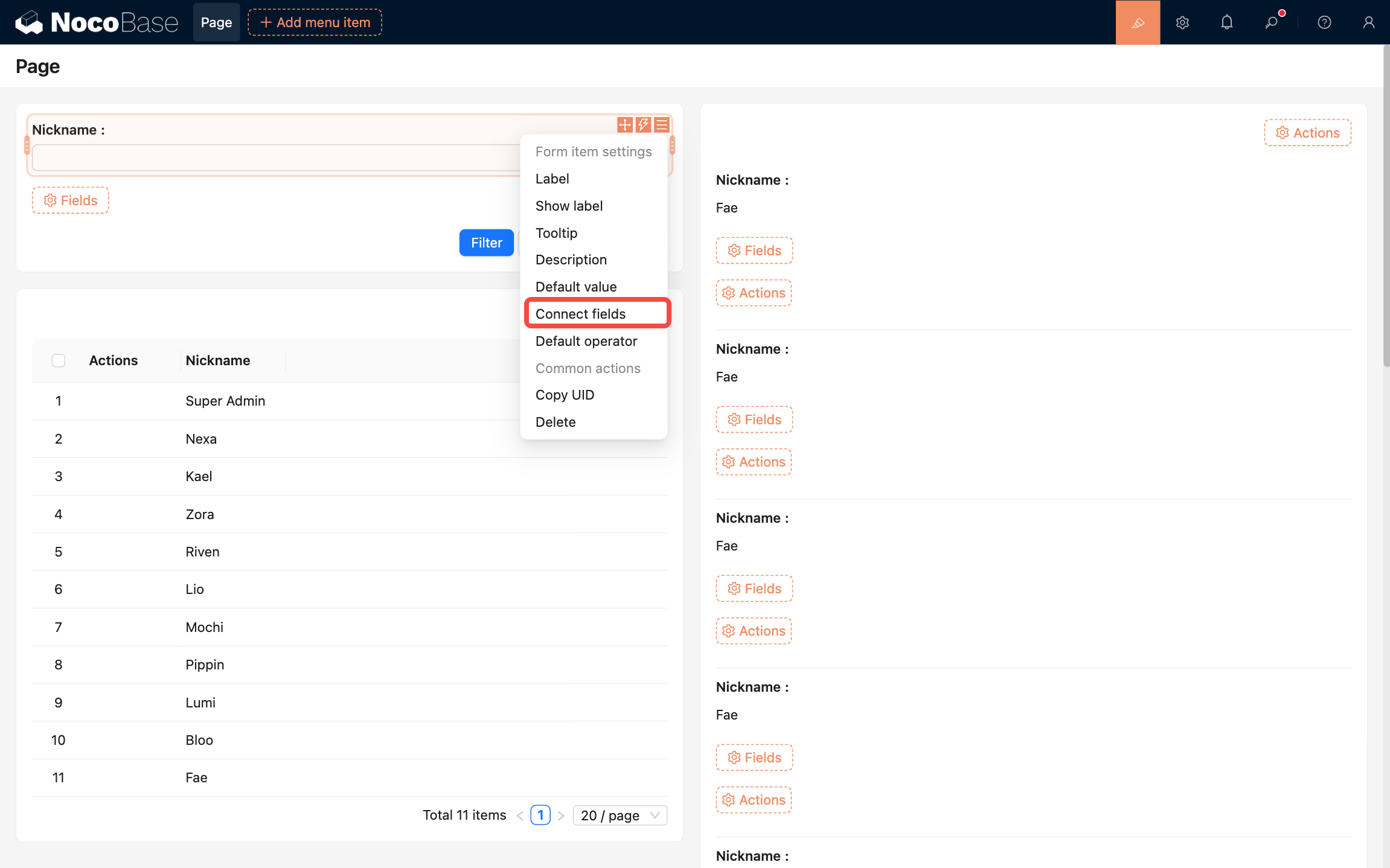
- Add the target blocks you want to connect. In this example, we'll select the list block on the page.
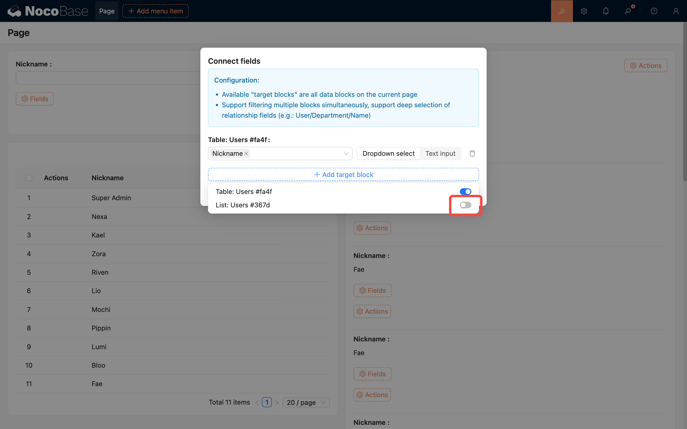
- Select one or more fields from the list block to connect. Here we select the "Nickname" field.
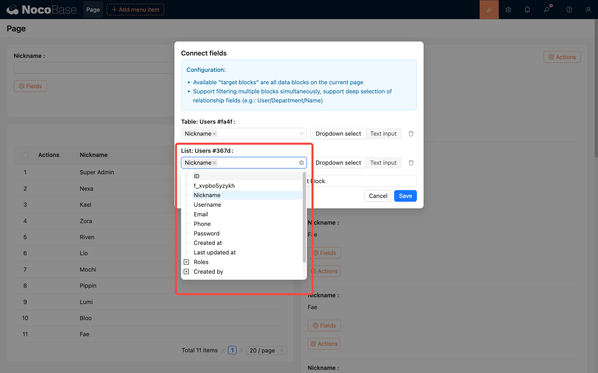
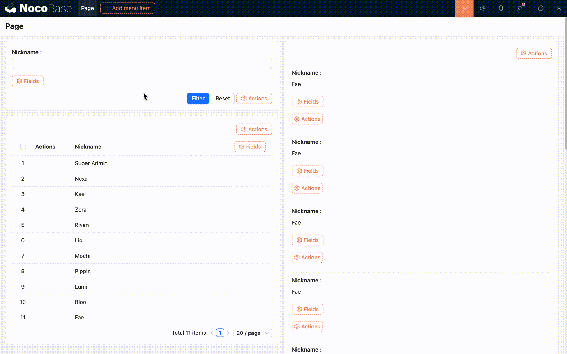
- Click the save button to complete the configuration. The result looks like this:
Connecting chart blocks
Reference: Page filters and linkage
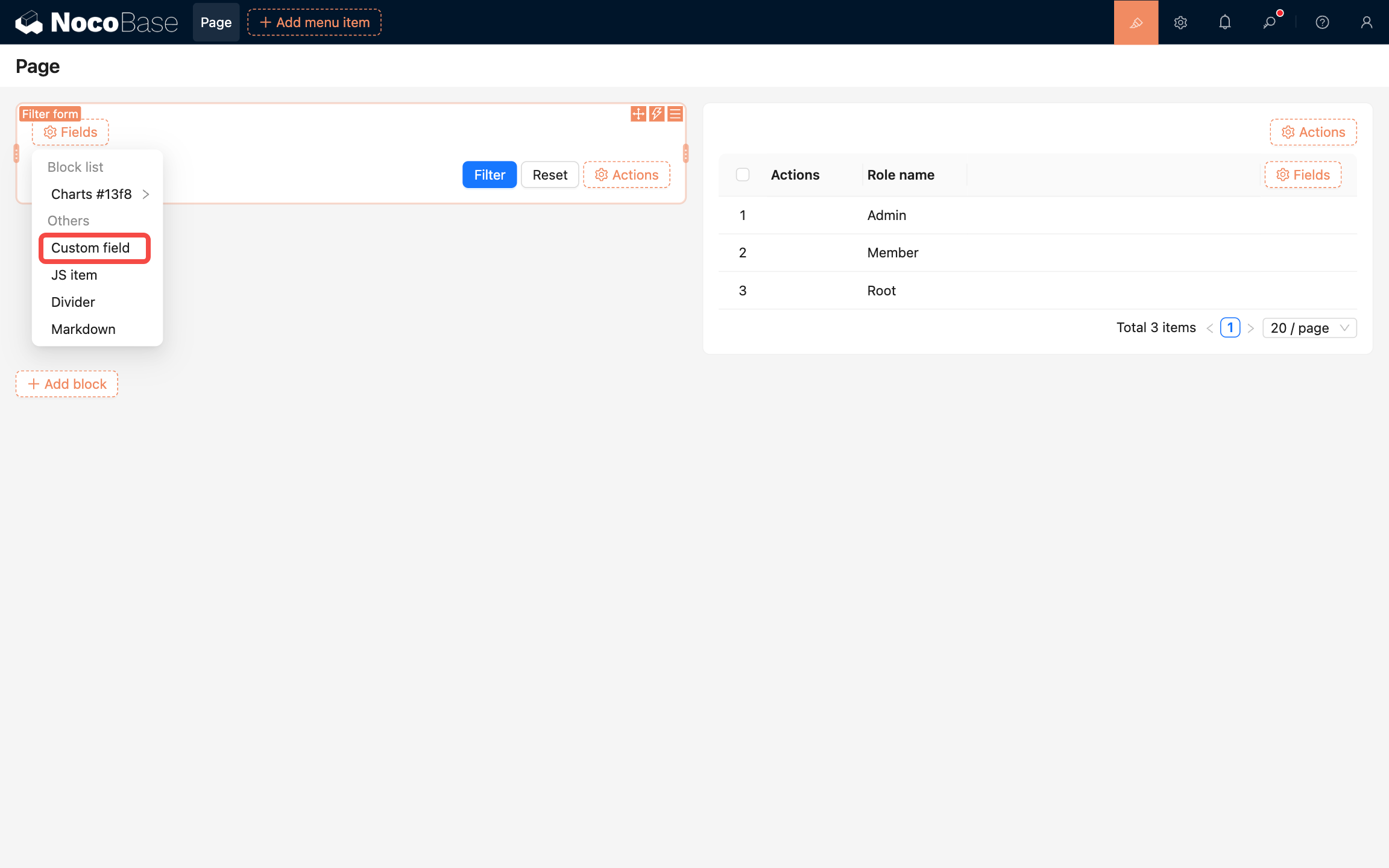
Custom fields
In addition to selecting fields from collections, you can also create form fields using "Custom fields". For example, you can create a dropdown select field with custom options. Here's how:
- Click the "Custom fields" option to open the configuration panel.
- Fill in the field title, select "Select" as the field model, and configure the options.
- Newly added custom fields need to be manually connected to fields in target blocks. Here's how:
- Configuration complete. The result looks like this:
Currently supported field models:
- Input: Single-line text input
- Number: Numeric input
- Date: Date picker
- Select: Dropdown (can be configured for single or multiple selection)
- Radio group: Radio buttons
- Checkbox group: Checkboxes
Collapse
Add a collapse button to fold and expand the filter form content, saving page space.
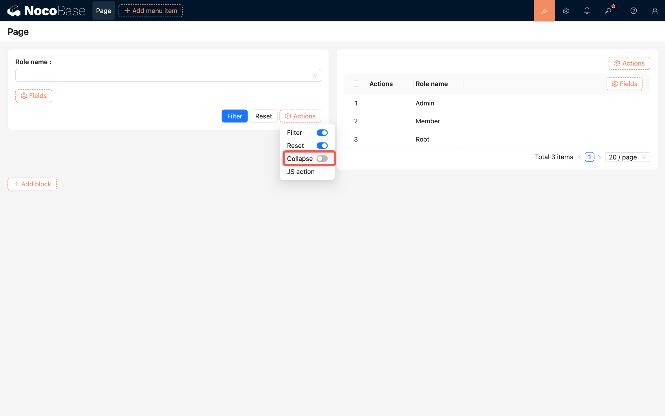
Supported configurations:
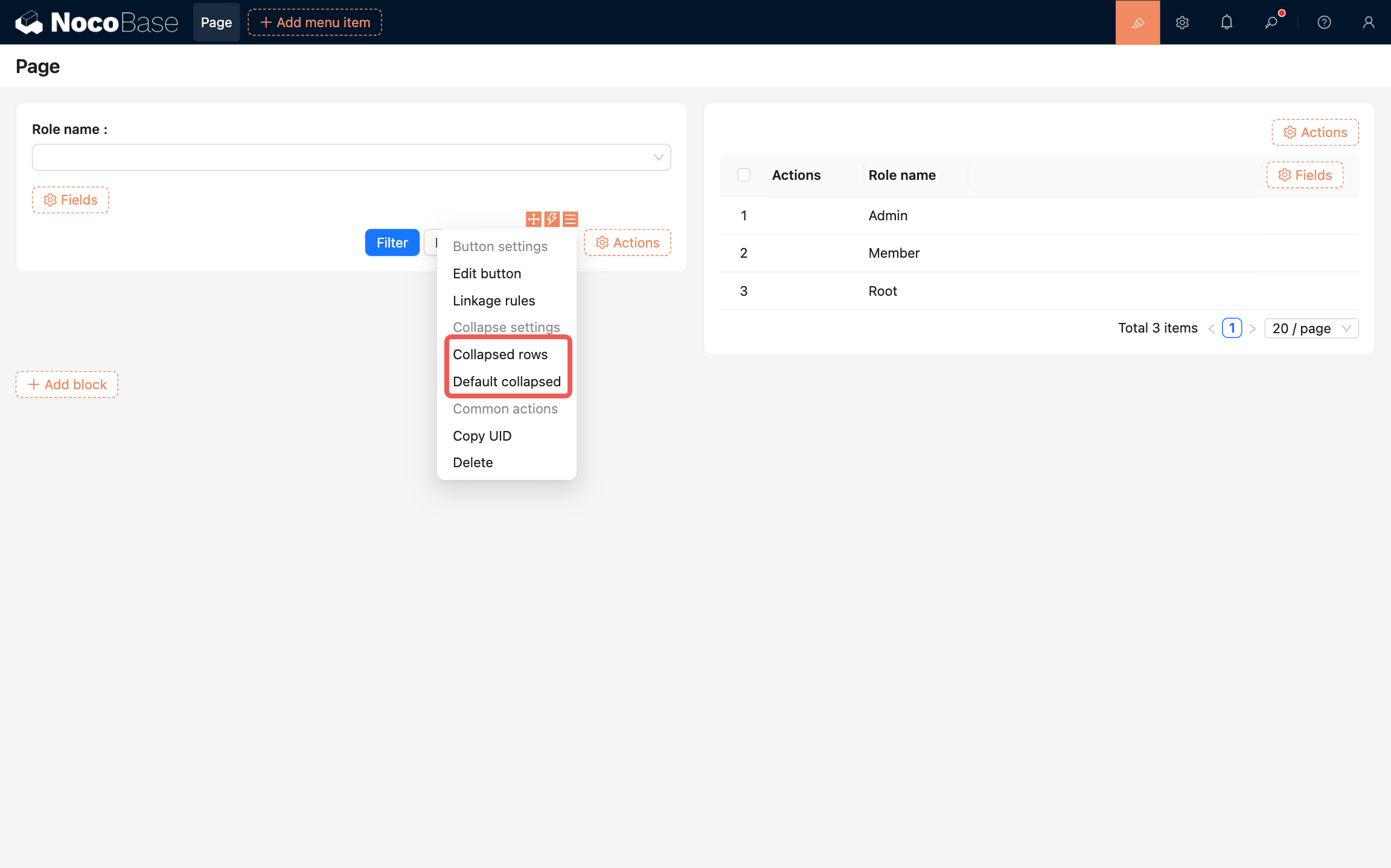
- Collapsed rows: Sets how many rows of form fields are displayed in the collapsed state.
- Default collapsed: When enabled, the filter form is displayed in collapsed state by default.